This is the poster that Sherin was talking about in class, that she wanted to see. It is our promotional poster of the walrus except its on the billboard scene.
--Rajiv Ramakabir
Tuesday, November 20, 2012
Sunday, November 18, 2012
Ken Price
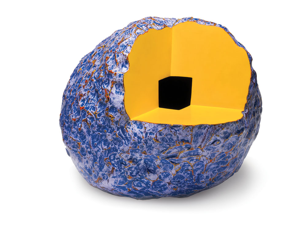
Of all the exhibits I saw at LACMA, Ken Price was definitely my favorite. His style is so unique, I was drawn to his sculptures right away. The abstract shapes are very engaging, but I found his color schemes to be most impressive. His sculptures are coated in many layers of acrylic paint, each of which are revealed when the sculpture is sanded down to a smooth finish. Most of the colors he uses are very bright, though the sculptures overall do not look as bright because, in most cases, the two most prominent colors are complements. As seen in the image below, orange and blue are the two most prominent colors and this complementary color scheme gives complexity to the sculpture even before you start to look closer and notice all the other layers.
The first series of sculptures in the exhibit (two of which are shown) were by far my favorite because of the bright complementary color schemes and the overall metallic finish. Price had another line of displayed sculptures where part of the shape was cut out (as in the piece shown below). I noticed that these pieces tended to embody a more monochromatic color scheme with a few pop colors. For example, the figure below contains a bright blue and a more muted blue with pop colors of bright orange and yellow. This exhibit has definitely inspired me to experiment more with different color schemes. I especially would like to try forming different complementary color schemes using bright colors (which I love) is different harmonious proportions.
Tuesday, November 13, 2012
LACMA Trip
This is a piece by Edward Ruscha who had an exhibit at the LACMA when we went. What I found interesting about his piece is his unconventional medium and material. This, like many of his works is made with gunpowder and pastel which is a crazy combination to think of when you think of art. I just found this work very interesting because of his unorthodox material used.
--Rajiv Ramakabir
--Rajiv Ramakabir
Tuesday, November 6, 2012
Design Fonts
Attached is a link to a good variety of fonts that can be used in many cases. If you are interested in types of font, you should check this link out and possibly apply some cool fonts to the poster of the exhibit for this project.
http://www.youthedesigner.com/2011/11/22/30-sleek-fonts-for-your-minimalist-design/
--Rajiv Ramakabir
http://www.youthedesigner.com/2011/11/22/30-sleek-fonts-for-your-minimalist-design/
--Rajiv Ramakabir
Thursday, November 1, 2012
Teetering Bulb: little fictions
Some of their fabulous creations are below:
"Sometimes, you gotta draw it 6 or 7 times. Or 13 times."
"Astronauts and Dinosaurs!"
"Borrowed Dreams"
for Reader's Digest Asia
"You learn only by doing. Be fearless." -Zelda
Labels:
art i like,
Artists We Like,
random,
Thoughts and Ramblings
Wednesday, October 31, 2012
Dried Gouache
I left a bunch of red gouache on my palette while I was cutting out swatches for my color wheel and came back to find this. It was so beautiful and delicate and I just had to photograph it.
Tuesday, October 30, 2012
Monochromatic Scales
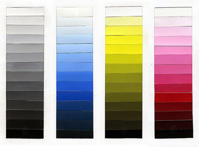
This is an image showing the monochromatic scales of the primary colors and a simple black and white one.
Subscribe to:
Posts (Atom)