
I was interested in hearing about Kelly Poe's photographic practice because she is the wife of
Jeff Poe, the owner of one of the big galleries in Los Angeles (Blum & Poe) and I heard about
her interest in environmental activists involved with ELF. I wanted to see how she
reconciled the worlds of violent activism and the art market.
When I asked Kelly if she sees any parallels between creating a successful activist movement and
creating an art community, and if she thinks there is a way for galleries and art dealers to help support artists who are dedicated to using their skills for activism, she answered with pessimism. She said she did not see any parallels between activist movements and art communities and then followed with expressing her opinion that art galleries are just there to sell art that sells.
The photography project she is currently working on consists of landscape photographs taken at very specific locations in nature provided to her by imprisoned environmental activists. Through letters, phone calls, and sometimes meetings Kelly Poe has maintained many relationships with activists and asks them where they go in their mind's eye while in prison and so far away from nature. She then goes to the places described to her, photographs the landscape, and sends the participant the photograph (4x5 inches prison regulation).
There is a long history of artist activists and artist groups that compromise and innovate in order to bridge disparate allegiances or focuses (for example Group Material). Kelly's lecture
about the friendships she created with imprisoned environmental activist figures such as Rod
Coronado (whose story described in Dean Kuiper’s Operation Bite Back and clearly records the
imposition of post 9-11 laws, which have elevated crimes such as vandalism to terrorism) makes
me think about how one starts from an indifferent individual and becomes a social activist.
Activists who are no longer indifferent start with principle ideas, and through those ideas they create meaning through collective action. (This explains why there are so many large NGOs affiliated with religions such as Christianity. There are set principle ideas that are assumed off the bat, which creates unity and identity formation.) Identity formation is critical for the creation of the activist. It is crucial for the activist to know that there are others that share similar beliefs and views. Through NGOs and transnational networks, activists convince others to take their sides through persuasive communication. When a certain behavior is accepted by state or government actors it becomes an international norm. It is the goal of the activist to share expectations held by a community about appropriate behavior of actors within a given identity, and create high, public standards of behavior because international norms are precursors to international law and declarations.
An activist can be anyone with a principled belief, including government actors (as long as they are not acting in capacity as government actors.) Not all activists are the same, and not all NGOs are the same. There are NGOs that do not care about change and try to maintain the status quo and those that promote hatred such as the KKK. The Earth Liberation Front is an example of an organization that promotes change and rejects the status quo, but employs violent acts as a means of communication. Collective action is used to gain media attention and signal action. The process of framing a movement in a way that aligns with an organization’s claims and also with the nature of the relevant public requires good design.
The design of the movement is critical because it must relate the organization’s programs to the common sense of the target public. Activists are both consumers of existing cultural materials and producers of new ones. Speaking in a simple and understandable way is how activists try to frame their intentions and motivations to gain the attention of the public. It is a war of words, common sense, reason, images, cultural capital, and economy. Activists need to propose frames of understanding that are new and challenging, which resonate with cultural understanding. This is where I think artists are important. Artists study all kinds of constantly updated communication tools whether visual, aural, literary, performative, etc. and need to share expertise with NGOs and other activist groups in order to promote positive frames of understanding.


.jpg)


.jpg)
.jpg)
.jpg)
.jpg)


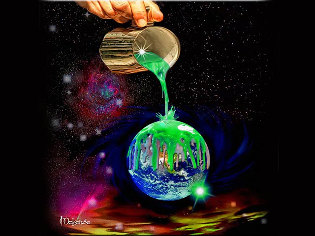

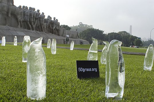

 Posters
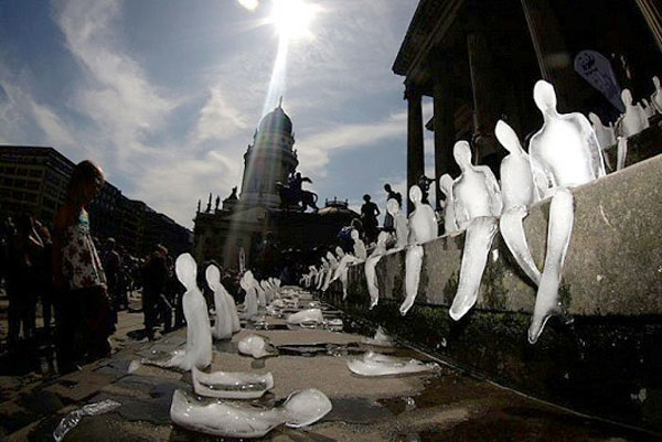
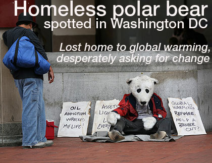