Friday, December 10, 2010

Museum Visit : Action/Reaction


i found the theme of this exhibit, action/reaction, to be very relevant to this time period, especially in the ways that the artists interpreted the theme. although it is very broad and could be completely lost on our generation, the approach that the artiststook made it current and very accessible. for example i really thought that the reusable bags made out of billboards were really innovative and presented such a creative way to react to the issue of shopping bags. the prius billboards made of plants, in my opinion, captured the theme the best. the design is something that is visible to a vast amount of people, and the way that the designers took the purpose of the object they were promoting into consideration whileconsidering the materials i found to be crucial in the representation of the prius. the most interesting design was the house built with the retired airplane wing as a roof. although it proved to be extremely impractical, the product was visually striking and perhaps will inspire other artists, architects, and designers to take a more practical approach to this idea. i really did not enjoy the crystal designs, which were showcased as futuristic suits for strange alien-like woman. honestly i dont understand the artist's vision, nor did i find it visually stimulating. it was pretty ugly, but not in a good way.

Cuties


So I had originally done my observation on pennies even though I know they are all minted to be exactly the same except for the years they were made. But since I am posting this far after my first observations, I decided to do another on the differences between Cuties California Clemetines. I found the following 25 similarities and differences between them:

(1) They all had a round structure but none had an exactly similar circumference
(2) Several had indentions on the sides which varied in location from
(3) directly on the side
(4) on the top enclosing the stem
(5) or in multiple locations on the clemantine
(6) Some of them had white marks on them where it looked like they were scuffed
(7) Others had black marks I am uncertain of what they were exactly
(8) Some had spots covered in mold
(9) Some we cracked open already.
(10) Some had interiors that had turned to mush
(11) Some had completely solid interiors that looked like they hadn't aged a bit
(12) Most lied some where in between the extremes in terms of interior consistency
(13) Some of the stems were level with the rest of the of the Clementine
(14) Others had stems that seemed sucked into themselves
(15) But most of them had a bulge where the stem connected
(16) the bulge on some had ridges
(17) one had a circle around it
(18) some were perfectly smooth
(19) some still had the actual stem
(20) one still had some of the actual leaves
In terms of colors
(19) Some of them were perfectly orange
(20) Some of them were faded yellow
(21) Some of them had green tinted spots
(22) All of them had stickers on them
(23) But each of these were different
(24) All of them had the same citrus smell though each of them had varied in how rancid that smell was
(25) But the one thing that never varied was the fact that none had seeds

California Design Biennial @ PMCA


Rose Apodoca who was one of the 5 curators and also a local professional, explained that each of the artist formulated their projects as a new way of handling the problems we are facing today. And going throughout the museum it was easy to see that the majority of these designs were meant to form a response to the ecological problem that our world is facing today but more than just the going green sense. It was the problem our country but more specifically our people as an American society of are facing today.

Under fashion design Kai Suwannagate who's women's wear was among the most elegant I consider to have ever seen and yet they were handcrated in North Hollywood out of recycled wood, leathers, and local-materials. Rose Apodaca's purse fashion was meant to instill quality over quantity of her set of clutches handmade in Italy from feathers and gold rings which were set up in the showcase to resemble a bird flying from a cage. The oddest design in the I saw as Michel Berendi's First Earth Battalion. He normally makes menswear but in the show he had women's wear which i find difficult even to explain as it is made of leather, fur, a helmet, stalactite heals, and a lot of hair.

Under transportation design my favorite was the Model S designed by Tesla. Another was the Virgin Galactic Space Shuttle which currently takes passengers to the edge of our atmosphere to view the stars. But the design in the show was of a model space ship they will use to take passengers into space.

In architecture the Charlie Sava Swimming Pool stuck to the theme most specifically in my opinion because of its use of concrete and its positioning in a park.

My favorite piece in the show was a music video done by OK GO and created by OK Go and Syyn Labs it was called This Too Shall Pass. They used an intricate set up which I can only describe as a path of destruction of a trail of art. Another piece in the back exhibit that I thought was awesome because I had just based one of my designs on his work was done by Gajin Fujita though I have no idea how it tied to the exhibit as a whole I thought the exhibit was amazing and made me realize how wasteful our society is and what we should be doing to overcome the mess we've put ourself in among our consumer culture.

Thursday, December 9, 2010

Sandeep Mukherjee


Sandeep Mukherjee is another artist whose work I am loving right now. It is along a similar abstract vein as Angeline Rivas'. He often employs marker on mylar, which allows light to shine through the work. He is a Los Angeles artist and UCLA grad whose work was reccommended to me by my drawing teacher. Definitely check out his website:

http://www.brennangriffin.com/artists/view/43

Merry Christmas, everyone!

Katharine Glasheen

Artists I like!

Here are some links to some AWESOME artists/designers that I discovered during my last project!

Florence Manlik
http://www.florencemanlik.com/

http://www.mrahayes.co.uk/

Kimber Berry
http://kimberberry.com/

Kyle Pierce
http://kylepierceillustration.com/

Stuart Lyle
http://www.stuartlyle.name/

Amy Martino
http://www.yellowbirdmachine.com/

Maija Louekari
http://www.maijalouekari.com/

Miina Akkijyrkka
http://www.akkijyrkka.com/

Sanna Annukka
http://www.sanna-annukka.com/

Kevin Lyons
http://www.naturalborn.com/

Mike Perry
http://www.mikeperrystudio.com/


Angeline Rivas


I am really loving this artist right now. I found her work on the Beautiful/Decay website, a site I found out about when the founder of the magazine visited our class to give a talk. I really enjoyed his talk so I've been following the blog since then...

http://www.angelinerivas.com/

These are ballpoint ink drawings. So beautifully detailed.


Katharine Glasheen


The PMCA


The Pasadena Museum of California Art was an enlightening experience. I have never been to a museum as contemporary as this one, and it sure brought me up to speed with the contemporary art world. The theme of the Museum's Biennial was sustainability. I found the theme quite relevant to our present world, due to climate change, renewable energy, and global warming (amongst other issues) being important concerns of our times. By far I thought that the designs which dealt with transportation embraced the theme the best. Most of us use some form of transportation everyday, and it tends to be expensive and/or rather industrial. The designs for transportation were sleek, innovative, and best of all, took account for the transportation's environmental impact. I found the purses made of beetles and/or feathers to be the least compelling. I though that in comparison to transportation and other designs, that they were the least useful and wouldn't appeal or effect on a grand scale that efficient technologies would.

Wednesday, December 8, 2010

Pasadena Museum of California Art by Luis Villanueva

A small museum nestled in the middle of downtown Pasadena, the Pasadena Museum of California Art was an experience to remember. At first glance I didn’t expect much form an exhibition floor that seemed no bigger than a house. However, I found the pieces in this museum to quite interesting and innovative. Never fully seeing the extent to which fashion has become an art form, I was particularly intrigued by the clothing. Its variety ranged from psychedelic jump suits, to razor blade dresses to sustainable clothing made up of recyclable materials, everything in this museum said; “funky-funky-fresh!” Remarkably the trip was worthwhile and I definitely believe I have found a new art venue that interests me.

ART WALK by Luis Villanueva


A few weeks ago I found out about this event that happens here in downtown once every month. It’s called ART WALK. When I first went to this event last month, I seriously didn’t know what to expect. But as I saw the open galleries, the free orderves, and the artwork I was hooked. Beautifully set up and remarkably well-organized, ART WALK has become the place to see and be seen. What is ART WALK you ask?

ART WALK is an event held in downtown’s Gallery Row (Main St.) when art venues are open to the public. At no charge for admission, this event has certainly drawn in local Los Angelinos who never would have considered themselves ‘artsy.’ To me it is remarkable to see the exchange of ideas that goes on in this short-lived event both among artist and non-artist. Seriously, CHECK IT OUT if you haven’t already. The next one is tomorrow Dec. 9th!

ONE TO REMEMBER by Luis


Taking a trip downtown is never short of amazing. It seems like every time I go there a new adventure is to be found; a new art venue to be discovered. A few months ago I found a small shop in the corner of Main and Winston with a series of colorful posters. Upon taking a look inside, I discovered that it was a graffiti shop owned by local street artist ‘Man One’ as he is commonly referred to as among his peers.

It was just mere luck that I stumbled upon such a recognized artist. I took this unique opportunity to ask him a few questions about how his shop came about. At one point during this brief conversation, we came the topic of Los Angeles’ existence as a cultural art center. Friendly, but always in a hurry, Man One hastily told me to check out Gallery Row while I was in the downtown area. As it turns out Gallery Row is one block away from Man One’s shop. Not surprisingly, he has had many exhibitions


throughout the Gallery Row and the greater Los Angeles Area

(as I later discovered). Upon researching Man One’s career further, I found that his artwork is not limited to 
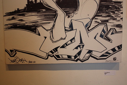
museums and gallery exhibitions but rather displayed throughout the city’s streets. His work has been featured on billboards, murals, executive events, concerts and even construction sites.

Which got me thinking: Isn’t all art public? Isn’t the exhibition of artwork the purpose behind creating it in the first place? Taking this into account, I came to the conclusion that art should have no boundary. Art should be free and public. Understanding what was briefly described by Man One during my visit, it is the purpose of an artist to communicate to the masses a message in a clear eye-catching way. It is always useful to understand the existence of street art as a form of free expression, something that cannot and should not be oppressed.

Point exercice

I- Point between the cats' eyes.
1- It looks straight at us.
2- It intersects with the diagonal of the image.
3- its the highest point of intersection between white and gray on the cat's head.
4- It's elusive.
5- I can't quite see it.
6- It's the darkest part on the cats' head.
7- It's making me think about it.
8- It wish it was bigger.
9- The point with the point between the cats feet cut its in equal halves.
10- the points looks down below the cat.


II- Point at the end on the classroom door top right corner.
1- The point is pointing to the rising sun in the morning before class.
2- I can hand a coat on the point.
3- The point is sharp.
4- The point is pointy.
5- The point falls in front of the white wall area.
6- The point with the top of the tower and the lower left corner of the frame form what appears to the naked eye to be a straight line.
7- The point narrow the door slightly in comparison with its bottom.
8- The point forms a straight line with the other point on the top of the door.
9- The point is a dark edge.
10- The point points downs to the student's head and in a straight line towards the right edge of the white brick elevation.


III - Point at the edge of the table in the top left corner.
1- It's pointing towards the entrance of the classroom.
2- I can use it to cut paper.
3- it's not the only point in the image
4- it's the sharpest point in the image
5- It's the meeting of 2 lines that divide the image in two parts.
6- the point feels to drop into the gray.
7- the point is the furthest point North West.
8- The point touches the darkest gray in the gray zone.
9- The point with the mushed white of piece paper cut the angle into two equal halves.
10- The point inwardly points to the paint mix.

Tuesday, December 7, 2010

LACMA visit

This past weekend I visited the LACMA museum, and I was surprised to see many paintings and pieces of artwork that related to our design class. First, I saw Rothko, who creates large canvases with smooth colors layered on top of each other. The color schemes are very abstract and usually it tends one's eyes to look in a certain area (due to the contrasting colors), like this painting I took a picture of. There is a lighter orange surrounding a darker orange and in the middle a white that looks like it was layered over a few different colors. He gives the viewer a sense that he is layering because it almost looks as though the darker orange and the white in the center are popping out of the picture more. In addition, even though his art is quite primitive, the warm and sophisticated colors he chooses gives a certain mood to the viewer.