
Thursday, December 10, 2009
MAMMA MIA!
For my project I was assigned ITS also known as the International Typographic Style and was assigned Theater. I decided to use Mamma Mia! as my theme. Since the international typographic style is very organized I used the buildings as a way of breaking up what the poster would say. Helvetica is the major font of ITS and so I followed that and used it to make the unity and style clear. I had trouble with following ITS and tried to do so by breaking up the background with many different colors. I painted the image of Greece and created a difference between the roughness and picture like foreground with theh basic color blocks of the background.
Emotion + Inspiration (Poster project redesign)
I was dissatisfied with my poster project because I had this great idea towards the end with little time to expand and finish it in time to turn it in. It was inspired by a bad day and my trip to the indian comic art show. So here was what happened so far.


Heroes and Villains: The Battle for Good in India's Comics

I went to LACMA a few weeks ago for this exhibition of artwork from Indian (from India) comic artists. Comics and comic-style cartoons and animation are fairly prominent in my life. And I didn't know what to expect going to this showcase. What is it that makes these comic artists from India special? When I got there I was moved. I didn't know if I could bring a camera, and now I wish I had.
The showcase moved counterclockwise around the room. And started with the older comics. These reminded me of children's books. The style, framing, and color schemes were simple. The figures were fully drawn in a semi-realist fashion, with proportionate bodies and faces (unlike say the Peanuts characters). The oldest one dated back to 1936 with Pratap Mulick's "Valmiki's Ramayana".
I moved on to the next group which was Jeevan Kang's "Spiderman India". I found it funny on first sight just because I've been conditioned by our American Spiderman. But this comic was a Marvel brand and very well done. It was published in 2004 so computers played a huge part in this comics formation. It was highly stylized and completely devoid of the artist's personal style. When I looked at it a few other artists or works came to mind. Like this and all those other works I thought of could have been done by the same person. On the other hand, I think the culture shined through character clothing.

The last set of works came from a design studio called "Liquid Comics". Large preliminary sketches were displayed. And there was a short video about the layering process of going from a pencil sketch to a full comic page. The illustrations on display were pen and ink over pencil. This was especially effective because you can ascertain the artist's style before it gets to the computer. Each work was a storyboard layout of a page. There were a few character explorations in storyboard form. There was a lot of stylistic variety in the works even from one artist. Demons and bakground figures took on an impressionist style while the main character was highly detailed and exaggerated as contemporary Asian animation does with elongated extremities and so forth. These artists used line in a very meaningful way: outlines, line character and thickness, contour lines as patterns to create forms. All of this is progressive. I don't see that kind of line use in other comics. And again being that these comics are about the deities of Indian culture, the characters and settings are fashioned appropriately (ie. apes dressed in cultural armor). Overall I thoroughly enjoyed the Liquid Comics section and was even inspired to try a little comic animation myself.


Plant a Tree

For my poster, I drew the style 70s/Conceptualism and the subject of Politics from the jar. 70s and Conceptualism can be highlighted by the work of Milton Glaser, Seymor Chwast, and Wes Wilson. The style used elements from older styles such as Art Nouveau and mixed them with a strong color palette. Wes Wilson, for example, used some of the same guidelines and shapes from Art Nouveau in his work but added a distinct style of bubble type that filled space.
Most political issues I brainstormed seemed dry or cliche. Healthcare, one of the largest political issues right now, just seemed like something I did not want to wade into as there is so much being said about it at the moment. Instead, I went for something not cliche... or not. I chose the environment as a topic because it seemed to lend itself to the style. Many of my sketches dealt with pollution and featured imagery like smokestacks. The catchy slogan was what held back many of my sketches. While I had some that I liked, none of them were catchy enough. In the end I settled on this poster, with the phrase, "Plant a tree. Save the world one breath at a time." I wish that I would have developed one of my stronger visual ideas instead, but I committed to this.
I intended to structure the overall layout of the poster to resemble a tree, but to be true to the style, I incorporated some of the curves and shapes found in Art Nouveau. In a nod to Wes Wilson, I used a font that filled these shapes. The poster could have greatly benefited from a greater finesse with the text. Much of the text is far too loose and predictable. It is missing the dynamism of Wilson's text.
I also tried a variety of color schemes but many of them made the poster look too much like something produced in the 70s rather than a modern take on the style. For that reason, I decided to go with the wooden texture for a background to emphasize the treeness of the poster. I also put the graphic in a predictable green to blue-green gradient which came out much less powerful in the print. The poster needed more color, though, as it looks a little dull right now.
In terms of improving the poster, I would of course tighten up the text and expand the color palette. The actual method of production also contributed to the failure of the poster. While the method of making the poster in Photoshop may have worked for a mock-up, it created a very stale poster. A much more interesting poster could be made by actual making the print with ink onto wood.
Jennifer West
Experimentation with materials can lead to a whole new world of work. That's what Jennifer West discovered when she attempted to see what would happen to film when it was exposed to not just the normal set of developing chemicals. She creates films that come out in a dazzling array of colors and run at a seemingly frantic pace. The colors and scratches are all results of intentional scratches and baths in liquids. A former teacher at USC, one of her recent works involved students donning lipstick and kissing each frame of the film. The result is a neon arrangement of lip prints strobing along the screen.
West does not intend for her films to be viewed like narrative movies. Instead, she sees them more as abstract paintings that adorn the walls of a gallery. They just so happen to be painted by projector rather than brush. As she showed films during the talk, West was visibly uneasy by the audience watching her films in their whole forms and one after another. When viewed in this manner, the viewer expects a narrative or some sort of story arc. On the walls of a gallery, the paintings are free to be judged aesthetically and the method used to create them can be pondered.
Last year, West created an exhibited a piece at the Tate Modern Gallery in London. For the piece, she took over a large ramp in the middle of the museum and brought in skateboarders to ride down the ramp over film laid out on the ground. For a few hours, skateboarders took over part of the Tate Modern and took their hobby from the street to the unfamiliar gallery. While West had originally wanted to pull skaters in from the street around the gallery, safety guidelines for the gallery forced her to use professional skateboarders. It is an unfortunate compromise that many artists must make when creating art for larger institutions. West said that though it was disappointing, it did not compromise the integrity of the entire piece. After the day of skateboarding finished, she scrambled to develop the film overnight for a showing the next day. The Tate decided to show her film in a theater the next day where viewers watched the film in it's entirety, making West slightly uneasy. While she concedes that the Tate ended up influencing the piece a little more than she had hoped, the overall experience was a good experience that helped her bring her art to a large new audience. In the process, she also got to slide down the Tate Modern on a skateboard.
Yvonne Rainer
Last week, the influential Yvonne Rainer spoke at the grad building. Famous for her involvement in the creation and exploration of modern dance, Rainer has grown older and seen her roles change. In the 1960s she worked in the same realm as other modern dancers such Merce Cunningham and Steve Paxton.
Her dances focused on the involvement of everyday movements into the medium of dance. Her pieces did not glorify these movement or aggrandize them. Instead, they simply became menial parts of the performance. Rainer's talk focused on these everyday movements and the expressiveness they create. Simply standing in front of the room, she argued, can be as expressive as striking a complex pose in front of a room. At one point in the lecture, she interrupted herself to scream the word "passion". Seconds later she spoke the word in her normal voice. She proceeded to argue that both performances of the word are expressive. Loudness or force has little to do with level of expression.
First performed in 1966, Rainer's most famous work is the 3-person dance, Trio A. The dance is based around fairly mechanical actions and is taught to dancers to this day. Rainer acknowledged that the dance is always a work in progress. She can always find something to critique in the dancers performing the dance today. Performed without music, the speed at which the dance is moves can be complex. To Rainer, the dance must be slow as to emphasize the movements and poses but not too slow as to seem meditative. While some dance is meant to be a meditation, Rainer is adamant that Trio A is not one of those dances.
One of the important characteristics of dance is the temporal nature of the medium. A dance will be performed slightly different each performance even if the same person performs it. When different people perform the dance, they add small parts of their demeanor and posture to the dance. Rainer says that she never corrects the posture of her dancers and allows this small part of the dance to remain natural. Age also plays a large role in how a dance is performed. While originally Rainer performed all her own dances, she is now over 70 years old. Her body will no longer allow her to perform many of her dances. She considers the age of her dancers an interesting contemplation as she composes her dances. With older dancers, she considers the limitations of their bodies interesting problems, much like design challenges. She must work around this or emphasize it in the dance as a commentary on age.
Below is a sample performance of Trio A.
Shepard Fairey

I went to “A Conversation with Shepard Fairey” about a month ago too but forgot to make a post about it. Luckily, I took a whopping 13 pages of mini-sketchbook sized notes during the actual event.
First off, the person who interviewed Shepard Fairey was a straight up noob, and asked some really stupid questions. The interviewer was one of the head faculty members of the Communication department but she was absolutely ________! The conversation managed to be interesting nonetheless.
Fairey started off by sharing his story of how his Obey campaign began. He said that it started off as something silly – an inside joke, but developed into something much more. He printed thousands of stickers of the Obey giant and put them everywhere because he was fascinated with repetition and was obsessed with building something out of nothing and making people question it. He said “People are used to seeing advertising, but when they see something else, they want to get to the bottom of it.”
The most interesting part of the conversation was Fairey’s discussion of intellectual property (and his Obama poster), but since someone else already posted about it (and hit the nail on the head), I’m just going to skip right over it.
The second most interesting part the conversation to me, was Fairey’s discussion on capitalism. As most of you probably know, Shepard Fairey owns a clothing line called Obey, and receives a lot of criticism for it from the art community, street art community, etc. Fairey argues that he uses his Obey stickers and messages to comment on capitalism, while other corporations (ie. clothes companies) use it to fuel capitalism and to sell more product. He admits however, that his clothing line also helps to spread his messages and allows him to make a living doing what he wants to do. As a business major, and possibly an art minor, I think it’s kind of cool that he owns a business and gets to design and do whatever he wants to do too. Maybe I’ll be able to do what he does one day too.
Someone from the audience asked Fairey how he felt about hipsters who wear his brand. Fairey said that he knows that hipsters wear his brand and that “80% of the people who buy (his) shit, buy It because it looks nice or as a status symbol” but that also leaves 20% of the people who buy his clothing that do understand the message. “Everyone wants to be cool, but once it rubs off, hopefully the message will settle.” – Shepard Fairey, what a down to earth guy.
I actually own some of his clothing. I don’t really see his clothing as high end or political though, I just buy his clothing because they’re well designed, fit well, and are actually much more comfortable than your typical tee.
Anyway, another interesting topic of discussion was Fairey’s stance on public space. He argued that since we’re all tax payers, we all own a part of public property. Why should people who have money, be the only ones able to use this space to advertise and generate even more money? He sees public space as one of the few platforms left that people can use to inspire reaction publicly. At the same time, Fairey says he respects private property (though I don’t know how much I actually believe this).

Finally, Fairey brought up one of his ex-interns named Phil Lumbang who stencils “happy bears” around LA in broad daylight. I’ve actually been following this dude for a while now and snapped this picture of one of his “happy bears” while driving by:
2014 Winter Olympics logo
In 2014, the Winter Olympics will be held in Sochi, Russia. Out of several bids, this was chosen as the official logo. As most Olympic logos do, this logo reflects the clean and internationally relatable style of ITS. The font is also one that I feel reflects Russia; it is bold and firm yet quiet, which is more or less what I think of when I think of Russia. I like how the logo is so simple yet fitting for the country. According to an explanation of the logo, the incorporation of the url is meant to be an emblem for the digital generation and also reflects how the Olympics will be seen, through PDAs and laptops. I like the fact that the logo comments on how our society functions now. I think the url is interesting however I think the way it is placed is a little confusing. I don't know if the url is sochi.ru or sochi2014.ru (it's sochi2014.ru) I think that if they maybe switched the placement of the .ru and the rings, the message would be more clear. The placement of sochi 2014 is meant to reflect where the Olympics are taking place. It is meant to be the meeting point between the Black Sea and the mountains. I think that the reflection is nice, though at first i was so focused on the reflection that I had trouble making out that it was a 14. I think maybe if the 4 is a slightly different from the h it would be more clear. Overall, I think this is good logo for the country and for the Olympics, as it shows unity and also individuality.
Poster 3

My poster was for a book with an art nouveau style. I chose to do Alice's Adventures in Wonderland by Lewis Carroll. I created this poster by first drawing out Alice and then scanning it into Illustrator. I also used a picture to create the tree and made the ears and pocket watch myself. I tried to imitate the Beggarstaffs' style while adding some traditional art nouveau elements such as the border and the type. I had trouble making Alice look less awkward. I think the face is a little off, as well as the hair. In retrospect, I think that I should have attached the ears to the "A" in Alice to incorporated it into the title more. Also, I would adjust where things are placed so that the text is not as hard to see and I would take out the leaves in the border. Lastly, I think I would have adjusted the colors so that they were a little more bright.
OMG It Even Has a Watermark.

http://www.itevenhasawatermark.com/
"OMG it even has a watermark" is a website dedicated to displaying the most creative and interesting business cards. It displays a range of business cards, simple to interactive, made for people of all professions, not just designers. One interesting card is one for a yoga director. It displays all the needed information and is unique enough for people to remember. I think what makes it so interesting is definitely that you can put your fingers in to create legs for the woman, something that is unexpected and therefore, memorable. I also like how the back is so clean, which I think reflects yoga.

Another interesting card is one made for a culinary correspondent. It also has all the necessary information and has an extremely unique card that clearly reflects the person's area of business. This card was made of steel. I like how the person incorporated the utensils in his card. I think the placement of his name and website could be changed maybe so that it was all below the utensils but I think overall this is a very good card. I also think that the texture of the card was very clever as utensils are usually metal.

There are many more cards displayed on the website that would be great ideas for eye-catching and memorable business cards everyone in the future so check it out.
Wednesday, December 9, 2009
Designer Review
For one of my extra credit assignments, I decided to do a Designer Review on famous designer Stefan Sagmeister. He is a New York based graphic designer who does a lot of typography, working with his company, Sagmeister inc. He has designed album covers for several well known artists such as the Rolling Stones, David Byrne and Aerosmith. One of his pieces that stands out to me, (though it is slightly disturbing). It is a lecture poster that he made where he had one of his students carve with a blade words into himself so he could be photographed. He gained recognition from this photograph because he "self harmed" in the name of design.
It is seen on his stomach "Style = fart" I am not quite sure what he is trying to say, but I think he is trying to take a lighter approach to design, saying that it really isn't as serious of a thing as most designers make it out to be. But--then again, he is the one carving it into his stomach with a blade--so he created a contradiction.
The picture can be found at this link-- http://compografo.files.wordpress.com/2006/11/0.jpg
One of the pieces that he did that I enjoy more is the album box set for one of my favorite bands, Talking Heads- "Once in a Lifetime" He received a Grammy award in 2005 for winning Best Boxed or Special Limited Edition Package category for art directing its production. It's very lightly colored and has a naturalist feeling at the beach.
Extra Credit Designer Review


For one of my extra credit assignments, I decided to review a famous designer named Dávid Földvári, who's famous catch phrase / motto is a quite interesting one for a designer. Whereas most designers use the motto "the simpler a piece is, the better," he uses the phrase, "Ugly=Beautiful." He has an extensive portfolio, from simple drawings to album covers. He tends to work mostly in black and white/neutral mediums, but has the occasional splash of color in his work. His work tends to have very strong and bold commentary, not only on political stand points but also on media coverage of celebrities. A link to some of his portfolio is here:
http://www.davidfoldvari.co.uk/Site/portfolio.html
One of his images that is very powerful to me is of a man and a woman, the man holding an umbrella and smiling, and the woman not under the umbrella at all. Neither of them are interacting with each other, but it seems as though the woman should be under the umbrella as well. There is kind of an awkward tension, and seemingly selfish mindset of the man.
One thing that is also fascinating is how Földvári depicts shadows. The shadows of the piece are very squiggly and don't accurately depict what normal shadows would. This piece is actually one of his cleaner ones, they usually tend to be more sloppy and follow his "ugly=beautiful" slogan.
Another work of his that I find interesting is one of a professor that is writing on a chalkboard- non stop. It is extremely messy and and says in big bold font, "BLAH." It is referencing the system of education and how kids so often do not pay attention in school and tend to just treat the material they are taught as disposable.
Extra Credit Design Review

For one of my extra projects, I decided to review a famous design of a school called the Esisar school. It is done by Ruedi Baur, a famous designer who tends to work with more media based design such as architecture and beautifying objects rather than 2d surfaces and computers. He is quoted saying, "The questions that concern me are not simply those of graphic design but issues of orientation, identification and information." It is clear through his work that he loves the show what things do/what their purposes are through design. For example, the building for the Esisar School that he designed, is composed mainly of glass but has very unique looking decals put all over the glass surfaces of binary code (ones and zeroes). Since it is a engineering school, it only makes sense to have the mathematical formulaic basis of ones and zeroes, all over the windows to stand for what the school interacts with.
The typography is in a very simple sans sarif font, with many streams of lines of numbers intersecting each-other at different sizes and different positions vertically. It was made in 1997. The one thing that does stay consistent is that they are all a very neutral blue color, and always run horizontally and intersect at the same parallel angle. The building is mainly white but the architecture is very fascinating so it looks very sheik altogether. From a distance, the numbers look 3d, like their are several layers of them going back to the back of the building, but this is just because they are perspectively made to look like this.
The MoMA

On thanksgiving break break this year I returned home to New York City and revisited one of my favorite museums: the Museum of Modern Art (MoMA). In addition to featuring temporary exhibits, the MoMA provides a great overview of modern art. I was surprised to find just how present design and elements of design were in the fine art that was featured in the museum.
The MoMA usually features examples of effective and sometimes iconic product designs such as like Gebrüder Thonet's Rocking Chaise with Adjustable Back, or works of graphic design like posters by Jules Chéret. However, I was most interested in viewing the artwork that blurred the lines between art and design, or works that looked like product design but were intended to be viewed and interpreted as art or fine art.
For example, the MoMA featured works by Andy Warhol like his Campbell's Soup Cans and his Brillo Box sculpture. By removing the function for which these designs were intended (through displaying them as works of fine art, rather then a product intended for use) the MoMA brought my attention the the fact that an effective design, in addition to performing a practical function, can be admired as a work of art.
An example of a sculpture by Marcel Duchamp:

Andy Warhol is not the only artist featured in the MoMA who brought my attention to design. Jeff Koons made a sculpture called New Shelton Wet/Dry Doubledecker that presented a vacuum as a work of modern art and Marcel Duchamp produced In advance of a Broken Arm, a sculpture that was essentially an example of a product design (it consisted of a hanging shovel). Even the artist On Kawara presented elements of design in his paintings because he produces paintings of dates. By literally painting the date of a particular day, the artist is not only brought my attention to that day but the text he chose to use in his work.
An example of a painting by On Kawara:

I suppose I like the like the MoMA in part because I think that the museum has a very accepting view of art. This flexible mindset allows the museum to highlight the importance of both fine art and design, and the effect they have on a viewer or user.
LA Auto Show


I went to the LA auto show on thursday to see what types of new concepts they had for this year. After seeing Objectified, I looked at design from a completely different perspective. No matter what the design, car, shoes, or just everyday materials, I feel that design is something that makes the world. Well, for my experience at the LA auto show, as I walked around the futuristic vehicles on displayed, I can really see what it means to be a designers. Take for example the BMW vision efficient concept( the picture). As I examined this car, I actually feel what the ex- BMW director Chris Bangles was talking about. Cars display our emotions. It, by itself, has a lot of emotions already. For example, all the curvatures it has portrays a very fast and aggressive emotion. In objectified, it also talked about the front and the rear of the car looking like some type of facial expression. In this vision efficient concept, I see it, the agressive shark looking from end, and the almost angry face in the rear. Having never seen car from this point of view, I was astonished to discover so many new characteristics of car. To me, this car also is like an avatar for the person driving it. This person would be someone opulent, fascinated with car, and like to speed. Not only does it correlate with emotion, but it can go with harmony too because of the way it curves. The way the wind flows when driving the car is really harmonious and somewhat in a way can be describe as a melody. Overall, the video really did show me the world of design in a different scope, one that I didn't look from in the past.
Extra Credit Assignment Painting Review

For one of my extra credit assignments, I decided to review a piece by one of my favorite artists, Stanley Donwood, most recognizably, the artist for the band Radiohead. The piece is called ‘Manhattan’ and is similar to the painting on the cover of the “Hail to the Thief” album. The painting is composed of a black background, and depicts a cut out of what appears to be a cityscape filled in with words that suggest sensations within the human mind. There is almost a stream of thought like quality to the painting because of the spontaneity of the choice of words. The painting suggests an overall corruptness of society and living through simplifying the life of a human into little phrases—“TIME IS UP, CLEAN IT UP, SAD, EAT, NO WAY OUT, POWERCUT, CLEAN IT UP, STEAL, BUNKER, DISASTER, TRESPASSING, PHONE” etc. Each word is contained in its own little sector of a misshapen box, within the outline of the city. The color of the text and box varies in each sector and is colored sporadically utilizing a seven color palette—there might even be some boxes where the text appears as if it is missing because the box and text are the same color. The color scheme is very unique and vibrant, yet it still gives this overlying feeling of depression and pointlessness to everyday life. The colors used in the piece are grey, orange, yellow, blue, red, black, and white; they are extremely repetitious which adds to the feeling of isolation and being stuck in a pointless world. Donwood stated that the actual reason for him using these colors were because he explored the city and on logos, billboards, and whatever he saw he noticed a basic palette of seven colors. The words that he chose to put on the painting were taking both from the city, and from the Radiohead album itself. I believe he does an extremely good job of taking the complexity and vastness of the city and life in general, and simplifying it into simple shapes, words and colors. The series of works did a great job of carrying out its main purpose which is representing the “Hail to the Thief” album. The band’s lyrics tend to reflect a common theme of corruptness and complexity within politics and society through very vague statements. The propaganda - like piece and lyrics match well together and certainly are successful in their purpose of being on the cover. Additionally, the words are all written in capital letters, which greatly intensifies the effectiveness of the piece because they are so stagnant and strong—just like the ideas behind them.
Logo Design

An aspect of design I decided to research is logos. A logo is an ideogram, symbol, emblem, icon or sign that with a logotype (a unique typeface) form a commercial logo. They are made for quick recognition and association with a brand. The shapes, colors, fonts and images set it apart. Ideograms may be more effective than just a typeface. Branding attempts to have cross language marketing, for example the Coca-Cola logo. Color can be used to express a certain emotion that the designer of the logo wants to convey, or for people to associate with the product. For example, red attracts attention, red white and blue patriotic, green is health and hygiene, light blue or silver is diet foods. Subdued tones and lower saturation can communicate reliability, quality, relaxation. Logos can also be dynamic, meaning that they are able to change for whatever the company wants. For example, cartoon characters can be shown doing different things such as eating or playing sports. MTV and Google have also used similar techniques.
Objectified

Recently I watched Objectified, a documentary on design by Gary Hustwit. The film focused on effective designs and innovative designers. Objectified explored the creative vision behind successful designs of the Twenty-First Century. The documentary refered to renownd designers like Jonathan Ive, Rob Walker, and Davin Stowell to bring to light the factors that contribute to producing successful designs in addition to looking at the significance of design in contemporary society.
I particularly liked watching the interview with Jonathan Ive (Apple's senior vice president of industrial design). Perhaps this was due to the fact that I am surrounded by apple products, (like the computer I am using to write this post) and was therefore interested in understanding the views of a designer that has a large impact on my everyday life.
I thought it was interesting that Ive felt that the purpose of product design was to help a product/tool perform the function it was created to perform. In other words, he did not stress the concept of design as being a utilitarian version of art. Instead, Ive communicated that the function of design is determined by the function it is trying to fulfill. Designs that distract viewers, and by bringing attention to the design aspect of the products design as separate from its function, Ive's argues, are generally intrusive and ineffective. This of course caused me to think about the question stressed at the beginning of the semester: the difference between art and design.
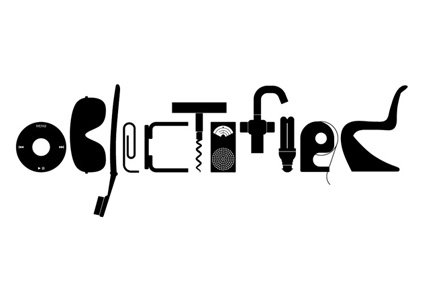
I also liked that the actual film was well designed. For example, the films use of iconic design silhouettes to spell out "Objectified" in the films intro. I suppose that as it provides a commentary on effective design, the documentary itself has a responsibility to display a creative design scheme.
Extra Credit - Hammer Museum
 I went down to the Hammer Museum near UCLA to look at some of the exhibits being presented. Since every Thursday, admission is free, I thought it was a good idea to go check it out. The facility was very modern, and huge. I was impressed just by the architecture when I first stepped into the museum. Then I walked around and visited the Adam and Eve exhibition by R. Crumb. The room itself was almost a maze, with every wall in the room filled with his drawings of the Old Testiment: The book of the Genisis. It was like a comic book illustration but each page was framed individually and put up against the wall. R. Crumb's interpretation of the Old Testiment was created as a comic book format and took him over five years to complete. There were over 200 framed illustration throughout the exhibition, each page had about six panels of comic drawings. All the drawings were in black and white and the frames covered all 4 sides of the walls and continued onto a wall-like circular divider in the center of the room. In the center of the room (inside the circular divider), were modern couches, with a coffee table in the center, displaying R. Crumb's comic presented in a book format. This version was fully colored and it was interesting to see the contrast from the ones displayed on the wall to the actually book.
 What really caught my eye during this exhibition was the style R. Crumb had on illustrating such characters. Although they were very stereotypical comic-like illustrations, I noticed that his way of drawing females were portrayed as very masculine. The body type was very similar to the male drawings in the story and in a way, distracted my attention of art as a whole. I was really trying to read the story and his intake on the popular Adam and Eve story; however, the way the women were drawn really distracted me from doing this and in a way bothered me. With that said, that was my only criticism of the book. I do admire him for his consistency of the overall look of all the comic panels over the five year period he spent on this project. I give him respect for the patience he had to complete this piece.
Ecodesign
I recently read an article about ecodesign, which is designing with concern for environmental impact within the span of the products usage and disposal. It is also called sustainable design. With global warming and environmental issues being pushed to the forefront as of recent, eco design has become even more of a presence within the design world. Ecodesign is a reaction to global environmental crisis, the rapid growth of economic activity and human population, depletion of natural resources, damage to ecosystems and loss of biodiversity. Designers are making products, and architecture more environmentally friendly. Ecodesign can range from totes made out of recycled goods to a solar powered buildings or city planning. Ecodesign can also be applied to the fields of architecture, urban planning, engineering, and fashion design.
The three most important things to consider for ecodesign is 1) consumption of resources (energy, materials, water or land area) 2) emissions of air, water and the ground in relation to humans and the environment 3) miscellaneous concerns such as noise and vibration. The life cycle of a product is divided into procurement, manufacture, use and disposal. Designers should use low-impact materials, keep in mind energy efficiency, quality and durability, design for reuse and recyclability, renewability.
Extra Credit - Tanana Takite
Though Tanana Takite is not a graphic designer, the work that she creates attempts to push boundaries and work with the material at hand in an original manner, similar to a traditional hands-on approach to design. Tanana Takite is a textile and fashion designer from London, but rather than view the surface of the fabric as a flat canvas, sees it as a template to build upon as evidenced when viewing her designs (http://www.flickr.com/photos/39795755@N08/ ; her images cannot be saved or direct linked). In my opinion, her limited number of works does not serve as a detriment, but rather testament to the incredible creative labor involved, likely much more beyond the typical fashion designer.
In her specific experimentation with individual threads (in the 'Hair' set of photographs), she successfully creates an optical illusion based in the movement and quality of her art. Though the thread is a static object, her precise manipulation of every individual thread makes it amazing. My favorite of her limited set of images is the dress entitled 'Cake' under the 'Wound' set of images. The dress functions art itself, seemingly more worth of display than functional wearing. Though there is a bare minimum of information regarding Takite, her textile and clothing design remind me of Impressionist paintings, in concept and color. From far away, they are beautiful and form an impressive seen, but when seen up close, the viewer realizes the incredible amount of technical skill involved. For the Impressionists, this was the use of tiny dots to show movement, while for Takite it is a mastery of tiny threads and texture.
In her specific experimentation with individual threads (in the 'Hair' set of photographs), she successfully creates an optical illusion based in the movement and quality of her art. Though the thread is a static object, her precise manipulation of every individual thread makes it amazing. My favorite of her limited set of images is the dress entitled 'Cake' under the 'Wound' set of images. The dress functions art itself, seemingly more worth of display than functional wearing. Though there is a bare minimum of information regarding Takite, her textile and clothing design remind me of Impressionist paintings, in concept and color. From far away, they are beautiful and form an impressive seen, but when seen up close, the viewer realizes the incredible amount of technical skill involved. For the Impressionists, this was the use of tiny dots to show movement, while for Takite it is a mastery of tiny threads and texture.
Poster Project, Again!

So this is my poster! I was given the topic 'public service' and the theme '70s conceptualism'. The problem is, 70s conceptualism doesn't go too well with public service - pre-eminent conceptualists like Seymour Chwast and Wes Wilson were really more interested in doing drugs than in supporting their local police station, I guess?
So I went for an anti-war poster, and that was a lot of fun! Being able to go for a trippy, 1970s feel made the poster a ton of fun.
Surprisingly, one of the hardest parts of making this poster - by FAR - was the color choice. This is all created digitally, and I probably spent 4 hours just using different color swatches to see how they looked. I really love the final light green - orange - pink color scheme you can see here... I actually stole the color scheme from a series of drawings Seymour Chwast did for a magazine in the 70s; I'm glad I did because they look great.
I have 2 issues with the final project though, none of which I saw coming until it got printed:
1- the whole thing looks too computer-generated! It was very sad, but the second I looked at it on paper it just seemed a little too removed from reality. This is something that's hard to pick up on in Photoshop - I think I need just a better 'sense' at picking this sort of thing up.
2- KINKO'S. They printed all the colors way wrong! Oh my god, Kinko's, for the obscene amounts of money you charge you'd think you could at least calibrate your printer. Everything came out too dark, and that awesome lime green color that makes up the big bomb just became too dark and sad. Awful!
Extra Credit - LACMA
 Although I recently visited LACMA in relation to an early Asian art history class, I ended up exploring more than I had in previous visits. Although I saw many pieces that I liked, what struck me most was not what I was aesthetically drawn to, but pieces that I had learned about in the modern Russian art history class I am currently taking, specifically in reference to the avant-garde and subsequent Constructivist movements. I had previously walked through this part of the museum and never paid much attention to the pieces, not knowing anything about them.
As mentioned earlier, based upon my personal taste, most paintings and drawings of both movements hold no appeal, but understanding them helps to appreciate the art, as is true of any artistic movement. One of the paintings that caught my attention (as I just wrote a paper on the artist) was Liubov Popova's 'Architectonic Painting' (to the right.) Popova was a reluctant member of the Constructivist movement, which forgoed the concept of 'art for art's sake' and looked to achieve the ultimate synthesis of design engineering and aesthetic taste. The greater purpose of art was to break down the high-low hierarchy art, similar in meaning to the street painting of today. But also moving art beyond the canvas, Constructivists used their art as a form of propaganda in promoting the ideals of the artistic movement and the Socialist government that supported it.
In this painting, Popova clearly shows the cubist inspiration absorbed from working with Picasso, as well the beginnings of her experimentation with Constructivist geometric line, color, and movement. The blue serves as a backing to emphasize the stark contrast of the other colors, drawing the eye to the read hand and subsequently moving the eye onto the centered orange mass. Even though it is not a literal figural representation, its sense of movement, specifically forward motion is successfully communicated. Though Popova's later works are not featured in LACMA, this subtle interplay of line and color eventually helped to make her one of Constructivists most prominent artists. unlike many of her contemporaries, whose grandiose ideas were restricted to notepads and sketches, she was able to truly move beyond the canvas into designing textiles and clothing.
Objectified Review
From Gary Hustwit's film, I learned many new ideas about design that I never heard of or actually put thought in. Design can be something very conplex or very simple depending on the designer. Every design has its specific purpose. Whenever people see objects, they make assumptions about the object. In a way, the objects speak to people, telling about their cost, material, functionality, and etc. This film really portrays that design has many different purposes depending on how people see it. There is no solid idea to what design is.
In the opening scene, Alice Rawsthorn describes how design fills everyday life. To her design is something very consistent. She describes how in the past, China's first emperor standardized design for the sole purpose of functionality. If every archer designs his own bow, then during a war, no one else will be able to use his bow. Also, design creates a story. Within every deisgn there is a story that tells of the evolution. Like Hnery Ford stated "Every object tells a story."
Design has to be something that improves people's way of functionaing. It has to innovative, aesthetically pleasing, useful, long-lived, consistent, economically friendly, need as little design as possible, and unobstructive. From what Jonathan Ive says, design has to communicate with people about who developed it, why it is like that. As a designer for Apple, he is obsessed with the way design should give attributes of material, form, functionality and the process of how it is made. Other designers see design in three different ideas. Design has to be form follow function. Design must give symbolism to an object because symbolism guides a designers to how something should look. Lastly, Design should be a technological object with a human object relationship, such as the dyson vacuum, roomba, or even the good looking cone vacuum.
The films continues on to interview different designers and their perception of what design is. To one, designers must be someone who already knows what people need better than they do. One central goal of design is to make something that is both comfortable and suitable for the environment. To the brothers in France who designs furnitures, design is like a melody, it must create harmony. Others, such as Marc Newson collect weird materials for inspiration to get a glimpse of the future and what it is going to be like. Next, to the director of BMW, design should be defined in terms of emotions. Like a car, people look at it like an avatar because it expresses the driver and shows what he or she is like to the outer world. Lastly, design to Karim Rashid is self contained, strong message, engaging, strong relation with the physical product, and interprets the digital world that we live in today. He abhors how even though there are almost billions of design ideas out there that there is still designs in the world that are uncomfortable and unpleasing. This is where David Kelley talks about how design needs to be something that people demand. If people do not demand for better products, than new products will continue to be produce that are poorly design. One company talked about in the film was Target. Target displays the true important of design and how it is attainable to the audience. It makes people want to buy new things. Thus, showing that design has to be captivating.
Overall, I enjoyed the film a lot. At first I thought it was going to be a boring documentary, but it turned out that is was pretty interesting. I would have never thought what other designers out there thought about design. Many of the concepts told in the film was actually a topic we talked about in class, such as the harmony. This film really makes me look deeper into what I design and how I can make it better.
Tuesday, December 8, 2009
Objectified
Gary Hustwit, producer of Helvetica, reminds us that design is a fundamental part of our world through his compelling documentary, Objectified. This film explores the intimate relationship between manufactured objects and the people who make and own them. Through conversations of some of the most influential designers in the world, the film emanates vital principals of design: personal expression, identity, consumerism, and sustainability.
In the opening scene the narrator describes that upon seeing or interacting with an object one makes many assumptions about that object within seconds. Alice Rawsthorn describes that the goal of modern day design is mass production: standardized objects that will serve millions and millions of people. Many of the best examples of industrial design are inconspicuous. In our everyday routines we unknowingly employ many different objects ranging from a fork to a toothbrush.
The film conveys the notion that designers aim to improve people’s lives without them even knowing it. This is seen in creations such as the OXO peeler. Dan Formosa indicates that designers look at extremes rather than medians. For if you create a design that caters to the needs of the special-case, then your product will ultimately serve the normal-case. This concept was applied in creating a revamped design for the peeler, one in which would serve people with arthritis through its rubberized bicycle-like grip.
Dieter rams outlines the principals for good industrial design: innovative, useful, aesthetic, understandable, honest, unobtrusive, long-lived, consistent, environmentally friendly, and simple. Apple is one such company who has demonstrated these concepts through the versatile and simplistic design of its products.
The film also touches upon one of the biggest issues our world faces today: trash. With each year, our world becomes more and more overrun by trash. Keeping the environment in mind, designers stress the need to integrate principals of sustainability and personal expression in design. They explain that a well-designed object will withstand the test of time; it will become better and more satisfying with use. And ultimately these objects become a fundamental part in our lives that define who we are and our personal narrative. Chris Bangle, former design director for BMW, explains that automobiles, which have “faces” and subliminally convey certain characteristics, are one such product that identify people’s personalities.
Overall Objectified was a very though provoking and interesting film. It was educational but also very inspirational. Most importantly, it helped me to realize the fundamental role manufactured objects play in each person’s life. The film left me questioning the role of important objects in my life and what they express about me as a person. This film further cements my desire to pursue a career in design.
Folly- The View From Nowhere

I went to the MOCA on Sunday and had the opportunity to see the exhibition "Folly- The View From Nowhere." It introduced an architectural/sculpture/design concept I had never heard of which is the folly. The folly essentially is a structure that serves no function at all. For example, a memorial, tower, meeting point, or structure in which to view or explore the surrounding area. The exhibition showed a compilation of follies from around the world and then explained them. Some of the follies I saw were "Specere", The Turkish Tent, "Vue de la Glaciere", and the Cabazone Dinosaurs. At the end of viewing all of the follies, there was a folly that the curator constructed right in the middle of the exhibition. It was a circular staircase you climbed to the top and there was a panoramic view of LA once you reached it. The exhibition made me realize the flexible nature of art, sculpture and architecture and the different purposes, or lack there of, that they can serve.

Monday, December 7, 2009
Poster Project

For my project, I was given the theme of books for 1950s/high modern. The book I chose to create a poster for was Black Wind, a book by Clive Cussler. This is an adventure novel filled with suspense and secrets that are slowly revealed as the reader continues to the end of the book. Through this design, I researched on many artist such as Chip Kidd. His work showed me a lot about simplicity and how I should convey the true meaning of the book. As you can see from the poster, the design of lines at the bottom getting smaller portrays a hidden secret that is in the book. The image of the boat shows that the book talks a lot about marine life and how the main environment of the book is in the ocean. The yellow sun in the back give a more political aspect to the poster. Because the book talks about Japan in the past and how the Japanese carried out a secret mission to bomb the US with its deadly weapon. My font choice was inspired by 1950s, just basically coming out right type of style and boldly showing the title. The blue background is suppose to have a little marine environment connotation to it. I had use the colors yellow and blue because I wanted to have a strong contrast between a warm color and cold color.
Subscribe to:
Posts (Atom)