Thursday, December 11, 2014

Artist Yun Mi Kyung

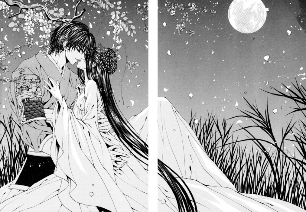
Touching into my Korean side, I've been inspired by Korean's own version of "anime," called "manhwa." 

Different from the more straight-to-the-point drawings of Japanese anime, "manhwa" tends to be a lot more dramatic and filled with details.

I'm not much of a reader at all, but a friend a few months back told me about an artist named Yun Mi Kyung. Her art work is beautiful, and every page is filled with amazing illustrations.

In particular, the movement and background details really grabbed me.
I really dislike the storyline, but the images make up for it.

I tried...

Once again, finals season has me trying new and different things. I always have to procrastinate.


Either way, I've been looking into egg shell art for a while now, because they are so stunning.
Like I've mentioned in one of my earlier posts, something about art that is made out of fragile materials, really draws me as an artist.


I'm in the process of trying to find tools that allow me to create pieces like this! A straight up xacto knife does not work, fyi.

Sand Castles to Another Level

In the midst of finals, art helps me calm down. Lately, i've been dreaming about going to the beach, and I looked up a few pictures when I came across sand art.

I've seen this type of art before, but I've never paid much attention until very recently. I don't know if I'll have the patience to create something as extravagant as these pieces, but I have a strong urge to go and try something, but maybe on a smaller scale.


Isn't it amazing?
There's something that really draws me about pieces like these sand sculptures, that are so fragile in a sense.

Milton Glaser Revamped

I decided to take on a little challenge and played with lines and flowers for a project. I liked the geometric shapes and rigidness that lines could create, as well as how simple straight lines mixed with curved lines could create an illusion. As for flowers, my mom would always show me artwork where artists would use flower petals as a girl's dress, and so flowers/ pressed flowers has interested me. The soft, gentle aspect of flowers mixed with the rigidity of straight lines creates a contrast that intrigues me, and so I wanted to create something combining the two.

Also, when we did research on artists, Milton Glaser stood out to me, but I wasn't able to incorporate his style into my previous projects. I took this extra project as a chance to be inspired by him, and decided to use his Bob Dylan poster as my primary inspiration piece. When I put all of my thoughts about Milton Glaser, lines, and flowers, this is what I created:


When I flipped my piece over to put glue onto it, the back looked like this, which I thought was nice and interesting as well...

Bloomfest LA 2014


I attended Bloomfest in the Arts District in November and it was a blast. What I enjoyed most about Bloomfest was how they opened up galleries and studios to visitors. It was neat to see the artists' actual workspace and the environment that they brainstorm and bring their pieces to life at.

My favorite gallery was David Hollen's Art Studio because all of his sculptures were made out of something as simple as metal wires. He constructed simple objects into intricate and extravagant artwork. Another interesting gallery was the graffiti art studio. People don't usually see graffiti as art, but it really is! There is so much imagination and thought put into it.

I think Bloomfest is important to have because it's a way to connect artists to their audience/community. It's always nice to have your work noticed or shared and this is a cool way for artists to get their art out there, whether it's to tell stories or inspire others.

I would definitely recommend Bloomfest to everyone! It's a nice artsy experience and is a good way to connect with local artists.

Lawrence Azerrad

Lawrence Azerrad makes me want to enter the graphic design field in a heartbeat. He has been able to work with such huge musicians like the Red Hot Chili Peppers, Wilco, and RAC and foundations like The Clinton Foundation. It would be such an honor to work with those clients and to see your design on the face of those titles. Azerrad's designs are very simple yet eye catching and modern -- traits that I hope to achieve in my own work.
Lawrence spoke about many things that I have never really though about. He talked about how making art about music is more abstract because essentially, he's making art about art, which he describes is like making art about someone else's soul. This was such an interesting outlook. He also stated that album covers are cultural markers, which I agree with 100 percent. Art is a stamp of the time period in which it was made in, and it's fascinating to me how a design can capture so much. Another topic he touched on was how once your artwork is done and brought out into the world, it's no longer yours. It becomes something that everyone can relate to in their own way, and everyone has a different interpretation of a piece of art that used to have one interpretation--the artist's.
This was an eye opening speech to listen to, and I hope to research Azerrad more thoroughly!

Simon Doonan


After seeing Simon Doonan speak, I fell in love with him. He is such a personable and charming individual who always thinks outside of the box. I remember he said that he tries to do things the untraditional way and he doesn't like to conform to society's perceptions. The reason why his windows were such a huge success is because of his originality and confidence in his own work. He seems to be fearless when creating concepts for his windows. As an Art/Creative Director, I think that quality is important because he's able to create things that are different, entertaining, and bold. I hope to have such an artistic eye and eccentric personality even at his age. It was humbling to hear and meet a legendary window dresser and creative ambassador.

Project #1: Line

Woot! This is my first class at Roski and completing my first project is a pretty memorable moment to me. I really liked this project because we were able to let our creativity flow with our own idea of a "line". I liked how we were given a certain timeframe to draw in each square and that we kept drawing one after another because I think that constant activity really allows us  to express our mind without the judgment and criticism people usually contemplate over when they stop/pause.
It's funny because this was actually drawn with my eyes closed. This sketch was made when someone else was directing me, and it turns out to be the one I gravitate towards most! I wish I could draw all of my art with my eyes closed.

I also came across an album artwork for a band called Alt-J and realized that it is strangely similar to my project!

Wednesday, December 10, 2014

Project 2: Materialism X 4

Set of 4

Economy & Emphasis 

Movement 

Balance

Proportion 

 I initially struggled picking a concept for project 2. I started with 'bling' but found it to be too specific and narrow. Once I chose materialism, my ideas came to life. After hundreds of sketches, I decided on four images to transfer and cut. Using proportion, movement, economy & emphasis, and balance design principles, I depicted materialism as an addictive, all-consuming condition. Above are the final designs on bristol paper painted with black & white gouache with details done using microns.