This is an article that I found very interesting. It is about an artist who creates works using pieces from geography maps.
http://www.youthedesigner.com/2012/11/28/you-be-inspired-amazing-map-art-collages-of-matthew-cusick/
-Rajiv Ramakabir
Tuesday, December 4, 2012


Monday, December 3, 2012
Drawing Surrealism
Recently I went to LACMA, and one of the exhibits I visited was "Drawing Surrealism." A piece that really attracted my attention was E.L.T. Mesens's The Disconcerting Light (La Lumiere deconcertante) (1926).
 Its medium was a photo collage and photogram. The focal point of this piece is an eye pupil with a light beam extending across the black sky. The eye is embedded into a cityscape with skyscrapers and other city buildings. I can definitely see the juxtaposition of non-related items signature of Dadaism. What defines this piece from the earlier Surrealist works is the assembly of photos creating a non-seamless product. I liked this component of the piece—the photographs layered together added a sense of eclecticism. I also really enjoyed the contrast between the tones of the pitch-black sky and the white light beam. The composition was put very well together and there is harmony despite the contrasting images.
This piece reminded me of the whole gestalt project; I could image it in black and white gouache.
Tuesday, November 27, 2012
Street Art
This is a link to an article about a famous artist named Blu. He chooses to keep his identity concealed, but his street art remains amazing.
http://www.youthedesigner.com/2012/11/23/you-be-inspired-the-street-art-of-blu/
--Rajiv Ramakabir
http://www.youthedesigner.com/2012/11/23/you-be-inspired-the-street-art-of-blu/
--Rajiv Ramakabir
Tuesday, November 20, 2012
Billboard

--Rajiv Ramakabir
Sunday, November 18, 2012
Ken Price

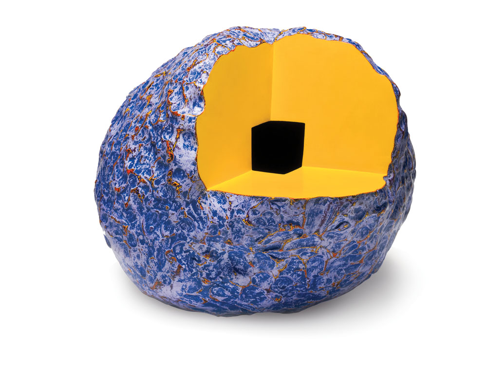
 The first series of sculptures in the exhibit (two of which are shown) were by far my favorite because of the bright complementary color schemes and the overall metallic finish. Price had another line of displayed sculptures where part of the shape was cut out (as in the piece shown below). I noticed that these pieces tended to embody a more monochromatic color scheme with a few pop colors. For example, the figure below contains a bright blue and a more muted blue with pop colors of bright orange and yellow.
This exhibit has definitely inspired me to experiment more with different color schemes. I especially would like to try forming different complementary color schemes using bright colors (which I love) is different harmonious proportions.
Tuesday, November 13, 2012
LACMA Trip

--Rajiv Ramakabir
Tuesday, November 6, 2012
Design Fonts
Attached is a link to a good variety of fonts that can be used in many cases. If you are interested in types of font, you should check this link out and possibly apply some cool fonts to the poster of the exhibit for this project.
http://www.youthedesigner.com/2011/11/22/30-sleek-fonts-for-your-minimalist-design/
--Rajiv Ramakabir
http://www.youthedesigner.com/2011/11/22/30-sleek-fonts-for-your-minimalist-design/
--Rajiv Ramakabir
Subscribe to:
Posts (Atom)