Thursday, February 19, 2009


Project 2 by Katie
For my second project, I concentrated on the style of Aubrey Beardsley...in particular, these pieces:
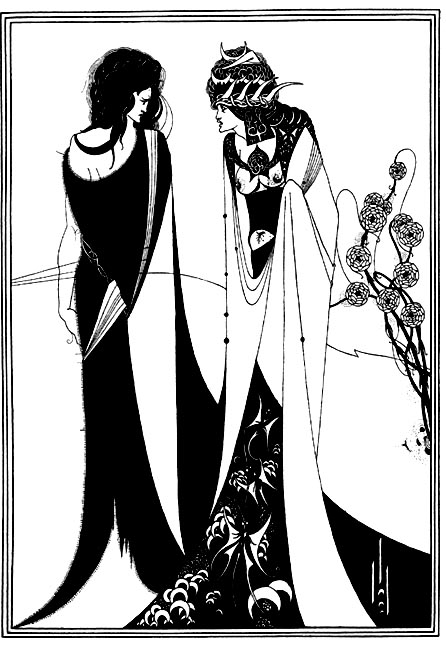
(John and Salome, 1894)
 (Remorse)
and
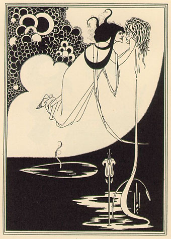
(Salome: The Climax).
I was inspired in particular by the hair and flowers in the pictures above, and from that i made my 4 pieces.

For this picture, I had this major internal debate with myself over whether to use this or the other 8x8 I had made, which was a diagonal view of a naked girl with her hair swirling all around her. I chose this one simply because I liked it better. Since this was my movement piece, I wanted the focus to be on the movement in her hair, whilst appropriating the way Aubrey Beardsley did hair. I do think that it is a bit centered and straightforward, and it wouldve probably been a better showing of movement if the face were tilted up..or potentially placed not exactly in the center as a profile, which i realize is already a static image to begin with. Other ways I thought to express movement were in the shape of her eye along with the lines below it, the upturn of her nose, and the flower headband. I really wanted to see what I could do with this piece, and it definitely helped me in the craftmanship area.

This was my balance piece. I was completely obsessed with Beardsley's Remorse, and so i took the skeleton from that image. I wanted to convey the idea of these organic shapes shooting from the bones of the skeleton. I thought it was an even placement of black and white on the picture, as well as being indirectly symmetrical in that the skeleton is balanced physically by the white shapes coming out of it. Also, conceptually, it kind of displays a balance between the organic shapes of life and the skeleton (death). I wouldve liked to make the skeleton a tiny bit more detailed because all of the detail didnt quite come across when I cut it out, but I decided to leave it as it is to keep the style of Beardsley.

This was my repetition piece. I fell in love with the flowers in the first Beardsley image i posted, so i decided to use a bunch of them together, and keep the gothic atmosphere with the drips coming off of them. I didnt necessarily want it to be blood, but moreso rather, wear...if that makes any sense. I also wanted to challenge myself with the task of cutting out zillions of little circles. Criticism in class was that it was a bit too situated on the left side and left the right side too blank, but I approached this project with a resistance to the conventional repetition filling a page type of thing. The flowers kind of blend together and spiral inwards when you look at them, which is exactly what i wanted. I wanted it to be a (once again) organic looking form with repetition as its core element. I did consider the white space on the right as a potential problem, but I ended up deciding that it acts in the piece as an absence moreso than a blankness, and it adds a silence to the piece that i think wouldnt be there if the whole page was filled up. If i could change the project, i think i would make a design with the flowers that would cover the whole paper -- it would be an interesting contrast to what i have now.

This terrible quality photo is my emphasis and economy piece. I had to take it super close because the details didnt come through on Neidy's iphoneeee. I took the flowers from the third Beardsley piece i posted. I wanted to make a simple piece, and I flipped the piece around so that it would add an element of what else flowers could look like. I know its very simple, and because it's centered (or at least looks that way), it becomes boring compared to a lot of the other pieces that were made in the class. If i could redo this piece, I would make an intricate pattern with the flowers intertwining, down the left side and coming up diagonally to the right up about a quarter of the piece (if THAT makes any sense haha). I'd also vary the sizes of the flowers more...originally the piece was planned to be three of the tulips side by side and all the same, which i realize now would have been super ultra boring instead of just plain boring.
(John and Salome, 1894)
(Remorse) and
(Salome: The Climax).
I was inspired in particular by the hair and flowers in the pictures above, and from that i made my 4 pieces.
For this picture, I had this major internal debate with myself over whether to use this or the other 8x8 I had made, which was a diagonal view of a naked girl with her hair swirling all around her. I chose this one simply because I liked it better. Since this was my movement piece, I wanted the focus to be on the movement in her hair, whilst appropriating the way Aubrey Beardsley did hair. I do think that it is a bit centered and straightforward, and it wouldve probably been a better showing of movement if the face were tilted up..or potentially placed not exactly in the center as a profile, which i realize is already a static image to begin with. Other ways I thought to express movement were in the shape of her eye along with the lines below it, the upturn of her nose, and the flower headband. I really wanted to see what I could do with this piece, and it definitely helped me in the craftmanship area.
This was my balance piece. I was completely obsessed with Beardsley's Remorse, and so i took the skeleton from that image. I wanted to convey the idea of these organic shapes shooting from the bones of the skeleton. I thought it was an even placement of black and white on the picture, as well as being indirectly symmetrical in that the skeleton is balanced physically by the white shapes coming out of it. Also, conceptually, it kind of displays a balance between the organic shapes of life and the skeleton (death). I wouldve liked to make the skeleton a tiny bit more detailed because all of the detail didnt quite come across when I cut it out, but I decided to leave it as it is to keep the style of Beardsley.
This was my repetition piece. I fell in love with the flowers in the first Beardsley image i posted, so i decided to use a bunch of them together, and keep the gothic atmosphere with the drips coming off of them. I didnt necessarily want it to be blood, but moreso rather, wear...if that makes any sense. I also wanted to challenge myself with the task of cutting out zillions of little circles. Criticism in class was that it was a bit too situated on the left side and left the right side too blank, but I approached this project with a resistance to the conventional repetition filling a page type of thing. The flowers kind of blend together and spiral inwards when you look at them, which is exactly what i wanted. I wanted it to be a (once again) organic looking form with repetition as its core element. I did consider the white space on the right as a potential problem, but I ended up deciding that it acts in the piece as an absence moreso than a blankness, and it adds a silence to the piece that i think wouldnt be there if the whole page was filled up. If i could change the project, i think i would make a design with the flowers that would cover the whole paper -- it would be an interesting contrast to what i have now.
This terrible quality photo is my emphasis and economy piece. I had to take it super close because the details didnt come through on Neidy's iphoneeee. I took the flowers from the third Beardsley piece i posted. I wanted to make a simple piece, and I flipped the piece around so that it would add an element of what else flowers could look like. I know its very simple, and because it's centered (or at least looks that way), it becomes boring compared to a lot of the other pieces that were made in the class. If i could redo this piece, I would make an intricate pattern with the flowers intertwining, down the left side and coming up diagonally to the right up about a quarter of the piece (if THAT makes any sense haha). I'd also vary the sizes of the flowers more...originally the piece was planned to be three of the tulips side by side and all the same, which i realize now would have been super ultra boring instead of just plain boring.
Assignment 2 by Blair
By Blair Strong
I guess I need to apologize because 3 of my 4 pieces were picked as people's "least favorites" on Tuesday. I can't blame you guys either- my designs do not represent the caliber of FA-102
or of my own work. I've literally been sick, staying in my bed for two weeks, so I wasn't able to work as much as when I'm healthy. So, yes, I know these are quite dull compared to many of your fabulous works! 


The artist I chose to pull inspiration from is Karl Benjamin. You will see many similarities in my works and his- I wasn't totally sure about how much inspiration we were supposed to reflect in our work...
This is my first piece {MOVEMENT}. I liked the shapes Benjamin used in the piece below mine. I think they lend themselves to motion and are very "fast" shapes (hence my diagonal shape). This one came out looking sort of futuristic, which I like, but with more time I certainly would h
ave added a lot more detail and character to give the piece more emotion.
I
like the chaotic motion of Benjamin's work here, but I wanted to create a greater sense of urgency than he did, that's why I made my shapes move along the diagonal.
This is my second piece {REPETITION}. I think I captured the essence of pitfall of repetition; my piece is boring and predictable. I am repeating the shape, this worn down rectangle, and adjusting its spacing to create a sense of movement. I want
ed to vaguely communicate pebbles worn by water, but ironically place them in very strategic locations (unlike the way pebbles actually would flow and roll).
I like these weird, oblong shapes Benjamin uses in several of his pieces. I wanted to capture the shapes and stress repetition of them, rather than miscellaneousness as he shows.
I made the shapes a little more round, more stone- or pebble-like than did Mr. Benjamin.
This is my third piece {EMPHASIS}. I want to draw the viewer to the top left corner with a dramatic play on positive space. I tend to overuse my negative (black) space, so I wanted to do something different with this assignment and something very dramatic with this particular piece.
Benjamin, with his piece here, had the opportunity to play with color and use bold colors to direct the eye. Since I was limited to black and white, I created a small shape in the top left and allowed my frame lines to curve, while his shapes build a straight frame line.
Here is my final piece {BALANCE}. I sought to balance the weight of the subjects (and thus space) by weighing the bottom left corner somewhat proportional to the top right. I additionally sought to balance straight lines and harsh shapes by overlapping and by creating a fan effect. I wanted my subjects to look like minerals growing from the ground up for from the ceiling.
Again, Benjamin uses shapes that I appreciate aesthetically. When I first saw this piece of his, I was attracted to the appearance of growth of the shapes. I sought to communicate that growth through my own work.
So those are my four pieces and the background stories behind them. I can't wait to work on A3 and show what I can really do! You all blew me away this week- seriously, I am so inspired!
Doug Cottier - Project 2
The artist who I (tried to) model my pieces after in this project was Paul Rand. Although Rand passed away more than a decade ago, his legacy of world-renowned graphic design lives on. He was most famous for designing graphics for many of today's corporate identities: IBM, UPS, Adobe, and Volkswagen just to name a few. He had a number of artistic theories that he applied to his designs. Those that I attempted to incorporate into my project were the notions of 'defamiliarizing the ordinary' and 'making the familiar strange'. In addition, some stand-out quotes from Rand shaped how I went about this project:
 My piece for movement consists of the recycling logo placed over the skyline of a city. When coming up with this idea, I employed both of Rand's quotes and his artistic theories. The recycling sign was featured in quite a few of my preliminary sketches for movement, but it was all by itself, and lacked any substance or meaning. Once we were instructed to correlate our pieces with pre-existing designers, I had almost pre-determined that a revamped recycling sign would end up being my final piece for movement. I am happy with how it turned out - in my personal opinion it is the strongest of my four compositions. I think the recycling sign itself establishes a sense of movement in the piece, although the fact that the movement repeats itself sort of takes away from this effect. I feel like this piece was also my best one in terms of craftsmanship. With these projects, it didn't take long for me and my big clumsy hands to determine that using the X-Acto knife was not going to be easy. But when it came to this piece, I slowed down, took my time, and I think it resulted in a somewhat misleadingly good display of cutting skills.
My piece for balance was primarily oriented around Paul Rand's artistic theory of making th e familiar strange. I wanted to incorporate my admiration for the success of family-friend Chris Martin into one of my pieces. Whenever I see him simultaneously playing the piano and singing, it has always radiated sort of an inexplicable artistic awesomeness to me. When a particular song, titled 'Politik', is played live, all that is visible on stage is Chris spotlighted at the piano, playing and singing. Politik is what I tried to recreate in this piece through Rand's notion of making the familiar strange and keeping it simple. I have never been able to competently represent human
  figures artistically so what I have always fallen back on is drawing them as bathroom-door-people. I thought this could act as sort of a simplification and could be considered making the familiar strange. So in essence this piece is how Coldplay's performance of Politik would look on the door of a restroom. I feel as though this composition could have also been categorized in emphasis/economy, but personally it stood out (and was intended to be) more of a balance one. I think it is relatively balanced simply because the weight distribution isn't off and there is nowhere where it is overwhelmingly black or overwhelmingly white.
My piece for emphasis/economy was also the case of a series of meaningless preliminary sketches that I wanted to advance through Paul Rand's theories and adjust into an acceptable composition. The concept of honour has somewhat of a strange respect in my family and is commonly employed by my dad as a motivating force for me. This method of his has had such a profound impact on me
 that I decided to have it tattooed on my back in Japanese. Before I enrolled in this class, it was virtually the only semi-artistic thing about me. For this reason I really wanted to express it in my physical artwork. I think that Paul Rand was a suitable designer to associate this piece with because I wanted it to be simple and non-esoteric. I considered only featuring the Japanese script in the top right corner, but convinced myself that the lines add a slight sense of depth. Also, I felt that the addition of the English word honour solidifies the message that I was trying to convey because without it, the composition would have very little meaning to an English audience. My understanding of emphasis/economy was using a minimal amount of space to emphasize the meaning of the piece. I am sort of unsure as to whether or not I accomplished this through this composition. My one clear downfall with this one was maintaining the pristine blackness of the gouache. I wish I had taken better care of the black gouache because it evidently takes away from the presentation of the composition.
My repetition piece was the last one that I composed. I feel that this is the weakest of my four compositions in the sense that it does not effectively represent repetition. It's only relatable feature to repetition is the inclusion of two keys and the similar opposing patterns that they establish. Like the recycling/skyline piece, this one was difficult to cut out. Originally in my 8x8'' sketch there were four (thinner) horizontal lines on each key. But my clumsiness prevailed and I was forced to take away a line on both of the keys. Apart from this modification, I think they turned out alright - the fact that they are identifiable as keys is satisfactory to me in itself.
I really enjoyed indulging myself in this project and exploring the limits my artistic capabilities through the methods of Paul Rand and the medium of gouache.
ago, his legacy of world-renowned graphic design lives on. He was most famous for designing graphics for many of today's corporate identities: IBM, UPS, Adobe, and Volkswagen just to name a few. He had a number of artistic theories that he applied to his designs. Those that I attempted to incorporate into my project were the notions of 'defamiliarizing the ordinary' and 'making the familiar strange'. In addition, some stand-out quotes from Rand shaped how I went about this project:- "Ideas do not need to be esoteric to be original or exciting"
- A logo "cannot survive unless it is designed with the utmost simplicity and restraint"
 My piece for movement consists of the recycling logo placed over the skyline of a city. When coming up with this idea, I employed both of Rand's quotes and his artistic theories. The recycling sign was featured in quite a few of my preliminary sketches for movement, but it was all by itself, and lacked any substance or meaning. Once we were instructed to correlate our pieces with pre-existing designers, I had almost pre-determined that a revamped recycling sign would end up being my final piece for movement. I am happy with how it turned out - in my personal opinion it is the strongest of my four compositions. I think the recycling sign itself establishes a sense of movement in the piece, although the fact that the movement repeats itself sort of takes away from this effect. I feel like this piece was also my best one in terms of craftsmanship. With these projects, it didn't take long for me and my big clumsy hands to determine that using the X-Acto knife was not going to be easy. But when it came to this piece, I slowed down, took my time, and I think it resulted in a somewhat misleadingly good display of cutting skills.
My piece for balance was primarily oriented around Paul Rand's artistic theory of making th
 e familiar strange. I wanted to incorporate my admiration for the success of family-friend Chris Martin into one of my pieces. Whenever I see him simultaneously playing the piano and singing, it has always radiated sort of an inexplicable artistic awesomeness to me. When a particular song, titled 'Politik', is played live, all that is visible on stage is Chris spotlighted at the piano, playing and singing. Politik is what I tried to recreate in this piece through Rand's notion of making the familiar strange and keeping it simple. I have never been able to competently represent human figures artistically so what I have always fallen back on is drawing them as bathroom-door-people. I thought this could act as sort of a simplification and could be considered making the familiar strange. So in essence this piece is how Coldplay's performance of Politik would look on the door of a restroom. I feel as though this composition could have also been categorized in emphasis/economy, but personally it stood out (and was intended to be) more of a balance one. I think it is relatively balanced simply because the weight distribution isn't off and there is nowhere where it is overwhelmingly black or overwhelmingly white.
My piece for emphasis/economy was also the case of a series of meaningless preliminary sketches
 that I wanted to advance through Paul Rand's theories and adjust into an acceptable composition. The concept of honour has somewhat of a strange respect in my family and is commonly employed by my dad as a motivating force for me. This method of his has had such a profound impact on me
 that I decided to have it tattooed on my back in Japanese. Before I enrolled in this class, it was virtually the only semi-artistic thing about me. For this reason I really wanted to express it in my physical artwork. I think that Paul Rand was a suitable designer to associate this piece with because I wanted it to be simple and non-esoteric. I considered only featuring the Japanese script in the top right corner, but convinced myself that the lines add a slight sense of depth. Also, I felt that the addition of the English word honour solidifies the message that I was trying to convey because without it, the composition would have very little meaning to an English audience. My understanding of emphasis/economy was using a minimal amount of space to emphasize the meaning of the piece. I am sort of unsure as to whether or not I accomplished this through this composition. My one clear downfall with this one was maintaining the pristine blackness of the gouache. I wish I had taken better care of the black gouache because it evidently takes away from the presentation of the composition.
My repetition piece was the last one that I composed.
 I feel that this is the weakest of my four compositions in the sense that it does not effectively represent repetition. It's only relatable feature to repetition is the inclusion of two keys and the similar opposing patterns that they establish. Like the recycling/skyline piece, this one was difficult to cut out. Originally in my 8x8'' sketch there were four (thinner) horizontal lines on each key. But my clumsiness prevailed and I was forced to take away a line on both of the keys. Apart from this modification, I think they turned out alright - the fact that they are identifiable as keys is satisfactory to me in itself.
I really enjoyed indulging myself in this project and exploring the limits my artistic capabilities through the methods of Paul Rand and the medium of gouache.
Project 2 - Jeff Toye
Project 2
Jeff Toye
Jeff Toye
Alexander Rodchenko was the artist who inspired these paintings. He is a Russian avante-garde artist, sculptor, painter, photographer, and graphic designer. Rodchenko emerged from the Russian Revolution and focused a great deal first on war posters and limited color compositions until moving toward more photo montage work and ultimatley unique photography.
------------------------------------------------------------------------------------------
.jpeg)
Movement


For this piece, I referenced a photograph montage and various posters by Rodchecko. The diagonal lines were strategically placed to move your eye quickly all over the entire composition while the verticle bars push your eye up into the daigonals and into the middle away from the top and bottom of the piece. The one area that is relatively empty and static (the top right corner) is circumvented by the eye throught the turning of the dinosaur's head.
------------------------------------------------------------------------------------------
.jpeg)
Balance

For this piece, I referenced a photo montage by Rodchenko. The diagonal symmetry is vextremely implied by the similar opposite corners creating the balance, however the stacked animals in the center and the different letters create at least a small amount of variety. The way the balance is achieved, I feel, is sort of "cheating" by simply mirroring the image over the line of symmetry, however I think it works in this piece because you read the word "ANIMAL" across the line which takes away from the idea that the two sides are mirrored images.
------------------------------------------------------------------------------------------
.jpeg)
Emphasis and Economy
This piece war inspired by many of Rodchenko's pieces, however it is much representational and impractical compared to most of his posters in this style. The Russian character is the focal point of the piece, however without knowing that the white shape is a shape, the 6 triangles are all pointing into the cente creating a "nothing" focal point right in the middle of their crossing. The emphasis here is blank space which utilizes the economy of having a focal point without actually having a focal point and by using shapes around it to bring emphasis to it.

Repetition

------------------------------------------------------------------------------------------

Repetition

Wednesday, February 18, 2009
Project 2 by Lily
For Project 2, I chose to use artistic inspiration from Shepard Fairey. After looking at his many protraits, I decided that I was most captured by his protraits of certain women.
His protraits then inspired me to do similiar protraits, but with different 'iconic' women in America's pop culture.
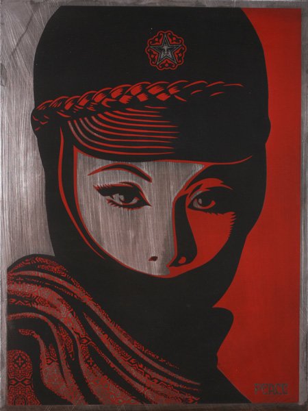
Emphasis & Economy


For my Emphasis & Economy piece, I chose to attempt to draw a portrait of Paris Hilton in a sort of style that was more appropriate for an election campaign. In past entertainment news during the presidential election, Paris Hilton was known for her spoofs that were commonly titled "Paris for President". There were various videos and even music videos that showed Hilton as a potential president elect. I decided to play upon this idea in this piece. The rays of light shining in a diagonal direction are supposed to bring your eyes to the face, emphasizing this aspect of the piece. Minimal detail is given to the facial features, hair, and upper body, which allows the viewer to fill in the image for him or herself.


For Repetition, I used Lindsay Lohan as a starting point and her drug addictions/many random substance abuse issues as an idea. I decided to repeat the words "WILL WORK FOR DRUGS" in the background to create a pattern and to put her figure on the forefront. The wording choice was supposed to replicate that of a homeless person's usual signs that may read "Will Work For Food" etc. The idea of homelessness and Lindsay Lohan was basically inspired by recent pictures I saw of the starlet looking devastatingly thin and unhealthy. So I thought that she sort of resembled a person wasting away, so hence this idea came into being...
His protraits then inspired me to do similiar protraits, but with different 'iconic' women in America's pop culture.
Emphasis & Economy


For my Emphasis & Economy piece, I chose to attempt to draw a portrait of Paris Hilton in a sort of style that was more appropriate for an election campaign. In past entertainment news during the presidential election, Paris Hilton was known for her spoofs that were commonly titled "Paris for President". There were various videos and even music videos that showed Hilton as a potential president elect. I decided to play upon this idea in this piece. The rays of light shining in a diagonal direction are supposed to bring your eyes to the face, emphasizing this aspect of the piece. Minimal detail is given to the facial features, hair, and upper body, which allows the viewer to fill in the image for him or herself.
Balance


For Balance, I chose to depict Britney Spears in a symmetrical portrait style. Balance is achieved through a very basic technique of symmetry, though the revealing of one eye only and the hair covering one side of the face was supposed to throw off the more static feel of the picture. The 'WANTED' idea was just a little take on what I think it is like for most Hollywood celebrities of our time. The whole idea of being under a magnifying glass and constantly being pursued by the media and paparazzi seems to be almost like a wanted prisoner who must run away or else be caught and thrown into prison, stuck and constantly examined.
Movement


For Movement, I chose Megan Fox as my inspirational figure. Movement is created through the wiggly shapes swirling around on the bed sheets and from the figure's position on the bed. This composition is suppose to lead the viewer's eyes from the right hand top corner to the bottom left hand corner before everything just falls off the page. The idea of "make love not war" is another idea that I got when I was researching and found out that Megan Fox was named the "Sexiest Woman Alive" by FHM Magazine in 2008. Basically, it was just a lighthearted idea that there shouldn't be any war if there are such mind-bogglingly gorgeous creatures such as Megan Fox prancing around in our world.
Repitition


gouache project Katie K
Katie Kravit Guash Project
My artist was Milton Glaser. He's a graphic designer and does anything from painting to drawing to computer design. He uses a lot of figures and portraits in his work, so I focused on body parts, shadows of figures or faces.

Emphasis and Economy
For my emphasis and economy piece I was inspired by a painting of a trumpet player that Milton Glaser remade into a concert poster. The concert poster he made really simplified the painting into a shadow and then worked the text into the pattern in the background of the figure. For my piece, I used the same figure's shadow but repeated the background into the figure's body. By reducing the figure into just a shadow, the viewer is able to fill in the rest of the detail itself. The repeating pattern in the background and inside the figure emphasizes the center, but the eye moves around the figure with the detailed design inside of it.


Movement
Glaser uses movement in a lot of his figures' hair. For example, probably one of his most famous pieces, he uses it in Bob Dylan's hair. So I decided to use movement in my figure's hair too. In his earlier work Glaser did very simple portrait drawings of naked women with lots of shadows and emphasis. So I drew my own figure from a downward perspective to focus on the flow of the hair. 
Balance
Here I tried to balance black and white and thin and thick lines. The face and hair are symmetrical but the difference in the eyes don't make the portrait boring. The rippling effect of the lines around the face make the portrait seem less flat. I used the spikey repetition pattern from a cover of New York Magazine that he designed.

Repetition
I pulled the ear from a black and white drawing that Miton did. The side ear was small in the background of the picture and I just repeated it in a kind of Andy Warhol style. I flipped the middle one so it didn't get too boring and to challenge the viewer to see the small difference.
Subscribe to:
Posts (Atom)