Thursday, December 13, 2012

LACMA: Kinetic Sculpture


       This past weekend I had the opportunity to visit the LACMA. Being my first visit ever to the LACMA, I was astounded by the sheer size of the museum itself. There were exhibits varying from Traditional Japanese Art to Surrealism. One of the artist's work I most admired was that of Chris Burden. His exhibit, Metropolis II, is a giant, kinetic sculpture created to depict the ever-moving city. It seemed to resemble a child's image of a "hotwheels track" from heaven- racing cars, trains, and skyscrapers. The exhibit operated during every hour (I believe there is a schedule online available so you can see when it moves, then you won't have to wait for it!). Here are some pictures of Metropolis II- it is truly a spectacle you will want to visit in person.


Cody

The "Day Of The Dead" Exhibit


Yesterday I drove in and out of downtown with a friend as a study break from those stressful finals. We ended up by the Union Station, where there was some sort of Mexican-culture celebration, full of shops, music and dancing. We explored around and went into a museum called “Las Plaza de Cultura y Artes.” There were many exhibits showcasing the history of Mexicans in Los Angeles, past vs. present Mexican culture, the architect of old buildings and a simulation of what Main Street looked like in the past (which was super cool).

My favorite exhibit was the “Day Of The Dead/El Dia De Los Muertos,” which comprised of many sculptural interpretations of the skull – the Mexicans’ main symbol of death. For Mexicans, death is not necessary deemed as devastating; they see death as an inevitable end of life and surprise many with how comfortable they seem to be with the idea of death. Mexicans believed in duality, so where there is day and night, there is life and death. During el dia de los muertos celebrations, they even give each other skull- and skeleton-related presents.

Jose Sacal’s sculptures capture the fascination Mexicans have with death. He takes the formal shape/perspective of the skull and warps them to reveal contemporary dimensions. Sacal fully explores the skull, deconstructs it and rebuilds it using various materials like bronze, silver or resin. He is very ambitious and unafraid in his work, and plays on Mexicans’ affinity for skulls to create sculptures that are stripped down into its core nature. His exhibit is paradoxical in a way, with intact and disintegrating pieces, and naturalistic and abstract elements.

Here are some of the photos I managed to take:
Caldo de muerto (Death soup), bronze
Pan de Muerto (Bread of the Dead), cermaic and electroplate
Saco de boxeo (Punching bag), bronze
Principio (Beginnings), resin
Aberraciones (Aberrations), electroplate
Armado hasta los dientes (Armed to the teeth), bronze


Hope you enjoyed!
- Jenny

LACMA Visit

Our visit to the Los Angeles Coumty Museum of Art was a really inspiring and enjoyable experience. The Ken Price sculptures were probably the highlight of my visit because I would never imagine there could be so much to sculpture. It's astonishing to see how Price incorporated shape, color, patterns, and texture into a 3-dimensional art piece through such a unique process. Quite honestly I have a hard time seeing the aesthetic appeal in some of his works, but the most impressive aspect was the creation of the pieces.

My second favorite has to be Ed Ruscha because I really admire his designs, and to see it in person is really quite a unique experience as opposed to seeing it through a computer screen. The Drawing Surrealism exhibit was personally inspiring for me because I took drawing for the first time this past semester, and I never really understood the importance of line and how to preserve line quality until I saw this exhibition.

Tuesday, December 11, 2012

The Pancake and Booze Art Show


Where else can you get art, endless pancakes, live music and adult beverages for $5?

I went to the Pancake & Booze Art Show on Saturday, Dec. 8, and the event featured just all that. Showcasing the work of 120 artists over two nights at the Lot 613 warehouse between Downtown LA and Boyle Heights, the P&B show provided the ultimate display of underground art, complete with the “ghetto” underground vibe.

The show featured the work of local artists who utilized many mediums including paintings, photography, graffiti and live art/live body painting. All the work was put on the walls instead of in display cases or behind glass protectors, so the show was more interactive, casual and fun than a typical museum visit.

The one piece that stood out to me showed a backwards Hollywood sign and a sunset, just like Ed Ruscha’s “Back of Hollywood” piece from 1977. The differences were that the artist used different proportions (the Hollywood sign is a lot bigger) and a different medium. After our LACMA field trip, I did research on Ed Ruscha and explored his work, so seeing that particular piece at the P&B show was exciting. It is fascinating how the same piece can be interpreted in different ways. I also love any art concerning Los Angeles’ culture.


All the other pieces had its own personality – whether it was a portrait of Marilyn Monroe, animals, a pencil sketch of Martin Luther King, Jr., real/fictional cartoon characters or subjects I can’t even decipher – the P&B show had it all.

Personality, originality and modern relevance.

P&B founder Tom Kirin started this show four years ago when he rented a big warehouse in Culver City. A cameraman who turned it into a photo and film studio, Kirin started looking for additional uses of the space for those empty nights. He started throwing art shows, which led to the creation of P&B. P&B is the culmination of his love of art and breakfast eateries. Add booze in there, and thus, the Pancakes and Booze Art Show was born.

Since then, the P&B Art Show has expanded to San Francisco, San Diego, Denver, Atlanta, Portland, Dallas, Austin and Miami. Kirin also plans to open up shows in Chicago, Brooklyn, Boston, New Orleans and Las Vegas.

Here are some photos from the show:


Check out the Pancake and Booze Art Show website here.

- Jenny

Thursday, December 6, 2012

The Eames House

  Hello fellow FA102 classmates!

Case Study #8: The Eames House


I'm writing to divulge the intimate details of my Eames House Voyage. Just to begin before the details of the trip, here is some background context.  

The Eames. Charles and Ray Eames. The Eames Lounge Chair. Et Cetera... 

The Eames power couple were intricate components in developing the aesthetic of Modern architecture and furniture. Think of two-part lounge chairs, airport chairs, and plastic armchairs -- all components of the Eames legacy. 


The Eames Lounge Chair and Ottoman


Even take a trip down memory lane and think back to the first day of class when we attempted to define the word "design." Charles Eames voiced... Design is "a plan for arranging elements in such a way as to best accomplish a particular purpose.


Arrangement! Elements! Purpose! 

And now to begin. On one unusually foggy Sunday morning, I ventured north to the Pacific Palisades to the home of Charles and Ray Eames. As an experiment for the Case Study Houses, Charles and Ray Eames created an house entirely from industrial, off-the-shelf materials. Translation -- the entirety of their house was ordered from a catalogue (which was revolutionary during the times...) 


Look. 
Look. 
Look. 


1. Steel Framing
2. Opaque Windows 
3. Rayon Linens for Curtains 

The Colors... specifically mixed by Ray Eames herself  (a painter before marrying Charles; also worked under Hans Hoffman, New York School abstract expressionist painter). Earth Whites. Neutral Gray. Primary Blues. and Primary Reds. But no yellows... so the primary triad was not complete. Alas. 

The house... rectilinear, modular, and modern. Divided into two 1) the study space and 2) the living space. Charles and Ray wanted a place where they could live, work, and entertain, PLUS a home that harmonized with nature. Thus, it was built next to a grassy meadow that overlooked the ocean. 


The Meadow!


The Eames were innovative and insightful in their approach to designing this house. Despite Charles's misogynistic affair with a younger woman, the Eames and the Eames house are forces to be reckoned with. I highly recommend the documentary, (found on netflix with 88% on rotton tomatoes AND narrated by James Franco). So on that note, I leave you with some boring iPhone pics...   


The Courtyard. Dividing the Living and Studio Space 


HOPE YOU ENJOYED! 

-- Feibi 

Tuesday, December 4, 2012

Map Art

This is an article that I found very interesting. It is about an artist who creates works using pieces from geography maps.

http://www.youthedesigner.com/2012/11/28/you-be-inspired-amazing-map-art-collages-of-matthew-cusick/

-Rajiv Ramakabir

Monday, December 3, 2012

Drawing Surrealism

Recently I went to LACMA, and one of the exhibits I visited was "Drawing Surrealism." A piece that really attracted my attention was E.L.T. Mesens's The Disconcerting Light (La Lumiere deconcertante) (1926). 
Its medium was a photo collage and photogram. The focal point of this piece is an eye pupil with a light beam extending across the black sky. The eye is embedded into a cityscape with skyscrapers and other city buildings. I can definitely see the juxtaposition of non-related items signature of Dadaism. What defines this piece from the earlier Surrealist works is the assembly of photos creating a non-seamless product. I liked this component of the piece—the photographs layered together added a sense of eclecticism. I also really enjoyed the contrast between the tones of the pitch-black sky and the white light beam. The composition was put very well together and there is harmony despite the contrasting images.

This piece reminded me of the whole gestalt project; I could image it in black and white gouache.

Tuesday, November 27, 2012

Street Art

This is a link to an article about a famous artist named Blu. He chooses to keep his identity concealed, but his street art remains amazing.

http://www.youthedesigner.com/2012/11/23/you-be-inspired-the-street-art-of-blu/

--Rajiv Ramakabir

Tuesday, November 20, 2012

Billboard

This is the poster that Sherin was talking about in class, that she wanted to see. It is our promotional poster of the walrus except its on the billboard scene.

--Rajiv Ramakabir

Sunday, November 18, 2012

Ken Price


Of all the exhibits I saw at LACMA, Ken Price was definitely my favorite. His style is so unique, I was drawn to his sculptures right away. The abstract shapes are very engaging, but I found his color schemes to be most impressive. His sculptures are coated in many layers of acrylic paint, each of which are revealed when the sculpture is sanded down to a smooth finish. Most of the colors he uses are very bright, though the sculptures overall do not look as bright because, in most cases, the two most prominent colors are complements. As seen in the image below, orange and blue are the two most prominent colors and this complementary color scheme gives complexity to the sculpture even before you start to look closer and notice all the other layers.
The first series of sculptures in the exhibit (two of which are shown) were by far my favorite because of the bright complementary color schemes and the overall metallic finish.  Price had another line of displayed sculptures where part of the shape was cut out (as in the piece shown below). I noticed that these pieces tended to embody a more monochromatic color scheme with a few pop colors. For example, the figure below contains a bright blue and a more muted blue with pop colors of bright orange and yellow.
This exhibit has definitely inspired me to experiment more with different color schemes. I especially would like to try forming different complementary color schemes using bright colors (which I love) is different harmonious proportions.

Tuesday, November 13, 2012

LACMA Trip

This is a piece by Edward Ruscha who had an exhibit at the LACMA when we went. What I found interesting about his piece is his unconventional medium and material. This, like many of his works is made with gunpowder and pastel which is a crazy combination to think of when you think of art. I just found this work very interesting because of his unorthodox material used.


--Rajiv Ramakabir

Tuesday, November 6, 2012

Design Fonts

Attached is a link to a good variety of fonts that can be used in many cases. If you are interested in types of font, you should check this link out and possibly apply some cool fonts to the poster of the exhibit for this project.

http://www.youthedesigner.com/2011/11/22/30-sleek-fonts-for-your-minimalist-design/

--Rajiv Ramakabir

Thursday, November 1, 2012

Teetering Bulb: little fictions


Just discovered a fantastic illustration duo, Zelda Devon and Kurt Huggins, who call their team Teetering Bulb (http://www.teeteringbulb.com/). I love the way they use not only color, but value, really well in their pieces. One of Zelda's blog posts says that it is important to "understand color values. Don't wade around in a grey soup. Grab screen stills from powerful black and white movies, like Hitchcock stills. Compare your work in grayscale. Is you work as powerful as a Hitchcock movie still?"
Some of their fabulous creations are below:


"Sometimes, you gotta draw it 6 or 7 times. Or 13 times."

"Astronauts and Dinosaurs!"

"Borrowed Dreams"

for Reader's Digest Asia

"You learn only by doing. Be fearless." -Zelda

Wednesday, October 31, 2012

Dried Gouache

I left a bunch of red gouache on my palette while I was cutting out swatches for my color wheel and came back to find this. It was so beautiful and delicate and I just had to photograph it.

Tuesday, October 30, 2012

Monochromatic Scales

This is an image showing the monochromatic scales of the primary colors and a simple black and white one.

Friday, October 26, 2012

M. F. Husain


These are some paintings by M. F. Husain, a famous Indian artist who passed away last year. During his life, he won several high-standing awards, granted by the government of India. As an artist, he worked with many different themes from different religious backgrounds. Much of his work features deities of Catholicism, Buddhism and Hinduism.  I particularly appreciate his modern depictions of Hindu gods and goddesses (including the last image of the Hindu god, Ganesh).


Tuesday, October 23, 2012

Colored Gouache


As we are starting to work with colored Gouache, I wanted to investigate some paintings that were done with various colors. These are some of the colored gouache paintings that I thought were extremely good. Also attached is a color wheel, which we will be working on over next week or so.

Tuesday, October 16, 2012

Gouache Paintings


These are a couple of really well made gouache paintings. Notice how the painting is extremely consistant and there are no flaws in the paint. No brush strokes detected or spots. The bottom one was done in colored gouache. 

Monday, October 15, 2012

YES! Andrew Byrom

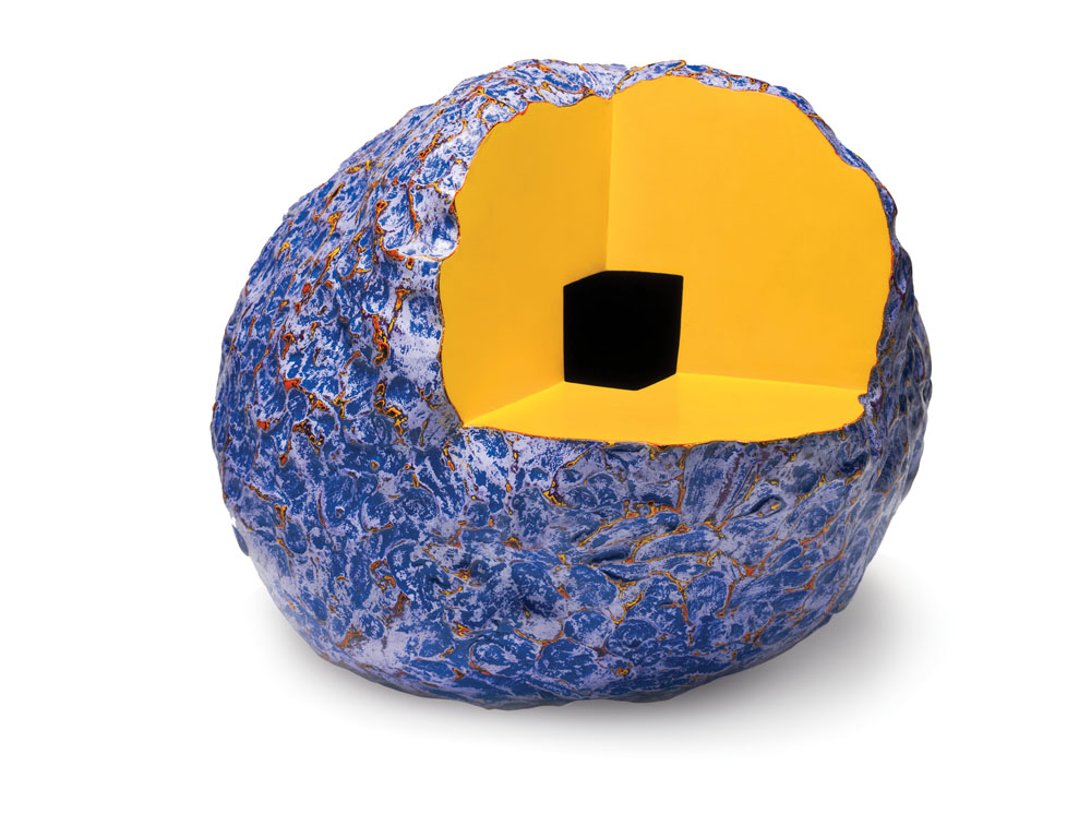
I attended Andrew Byrom’s talk last Friday and it was awesome! (totally worth skipping my class for). He talked a lot about how designers work with constraints and how these constraints allowed him to create his successful designs such as the kites, chair letters, and neon typeface. He emphasized how constraints are important and how a designer should use them to affect their designs.


Furthermore, I found it interesting how he was able to observe everyday objects and turn them into typography! Whether it be desks, chairs, curtains, or even kites, he was able to successfully mold them into an incredible design. What’s even more inspiring is how he didn’t use any photoshop for his works; he built all the designs and took multiple pictures in order to get the right shot. It might have been easier to simply edit them on a program, but the hard work he put in his work clearly shows and further amplifies the design.

Byrom definitely inspired me to continue to plan and work on my designs, but also be open to failure and be willing to scrap all the work I’ve put in if a better design comes to mind.


Some great quotes from Byrom:
“Experiment for fun, give yourself time to fail.”
 “Graphic design shouldn’t have easy answers.”
 “Letters are things, not drawings of things.”
“It might be great, but it might not be the answer.”
 “The uncommon beauty of common things.”
“Allow constraints to shape your design.”
“Be memorable yourself.” (In regards to Business Cards)


-Ivan
Design 102 
Tues & Thurs 9-12

Clever Logos

As design-nerdy as it sounds, I can never get enough of looking at really great logos. Some of my favorites use visual puns or negative space to convey multiple messages as concisely as possible. My favorite part is the magical aha! moment when you notice something that you didn't see before. Below are some example of really clever ones: