Though Tanana Takite is not a graphic designer, the work that she creates attempts to push boundaries and work with the material at hand in an original manner, similar to a traditional hands-on approach to design. Tanana Takite is a textile and fashion designer from London, but rather than view the surface of the fabric as a flat canvas, sees it as a template to build upon as evidenced when viewing her designs (http://www.flickr.com/photos/39795755@N08/ ; her images cannot be saved or direct linked). In my opinion, her limited number of works does not serve as a detriment, but rather testament to the incredible creative labor involved, likely much more beyond the typical fashion designer.
In her specific experimentation with individual threads (in the 'Hair' set of photographs), she successfully creates an optical illusion based in the movement and quality of her art. Though the thread is a static object, her precise manipulation of every individual thread makes it amazing. My favorite of her limited set of images is the dress entitled 'Cake' under the 'Wound' set of images. The dress functions art itself, seemingly more worth of display than functional wearing. Though there is a bare minimum of information regarding Takite, her textile and clothing design remind me of Impressionist paintings, in concept and color. From far away, they are beautiful and form an impressive seen, but when seen up close, the viewer realizes the incredible amount of technical skill involved. For the Impressionists, this was the use of tiny dots to show movement, while for Takite it is a mastery of tiny threads and texture.
Wednesday, December 9, 2009


Poster Project, Again!

So this is my poster! I was given the topic 'public service' and the theme '70s conceptualism'. The problem is, 70s conceptualism doesn't go too well with public service - pre-eminent conceptualists like Seymour Chwast and Wes Wilson were really more interested in doing drugs than in supporting their local police station, I guess?
So I went for an anti-war poster, and that was a lot of fun! Being able to go for a trippy, 1970s feel made the poster a ton of fun.
Surprisingly, one of the hardest parts of making this poster - by FAR - was the color choice. This is all created digitally, and I probably spent 4 hours just using different color swatches to see how they looked. I really love the final light green - orange - pink color scheme you can see here... I actually stole the color scheme from a series of drawings Seymour Chwast did for a magazine in the 70s; I'm glad I did because they look great.
I have 2 issues with the final project though, none of which I saw coming until it got printed:
1- the whole thing looks too computer-generated! It was very sad, but the second I looked at it on paper it just seemed a little too removed from reality. This is something that's hard to pick up on in Photoshop - I think I need just a better 'sense' at picking this sort of thing up.
2- KINKO'S. They printed all the colors way wrong! Oh my god, Kinko's, for the obscene amounts of money you charge you'd think you could at least calibrate your printer. Everything came out too dark, and that awesome lime green color that makes up the big bomb just became too dark and sad. Awful!
Extra Credit - LACMA
 Although I recently visited LACMA in relation to an early Asian art history class, I ended up exploring more than I had in previous visits. Although I saw many pieces that I liked, what struck me most was not what I was aesthetically drawn to, but pieces that I had learned about in the modern Russian art history class I am currently taking, specifically in reference to the avant-garde and subsequent Constructivist movements. I had previously walked through this part of the museum and never paid much attention to the pieces, not knowing anything about them.
As mentioned earlier, based upon my personal taste, most paintings and drawings of both movements hold no appeal, but understanding them helps to appreciate the art, as is true of any artistic movement. One of the paintings that caught my attention (as I just wrote a paper on the artist) was Liubov Popova's 'Architectonic Painting' (to the right.) Popova was a reluctant member of the Constructivist movement, which forgoed the concept of 'art for art's sake' and looked to achieve the ultimate synthesis of design engineering and aesthetic taste. The greater purpose of art was to break down the high-low hierarchy art, similar in meaning to the street painting of today. But also moving art beyond the canvas, Constructivists used their art as a form of propaganda in promoting the ideals of the artistic movement and the Socialist government that supported it.
In this painting, Popova clearly shows the cubist inspiration absorbed from working with Picasso, as well the beginnings of her experimentation with Constructivist geometric line, color, and movement. The blue serves as a backing to emphasize the stark contrast of the other colors, drawing the eye to the read hand and subsequently moving the eye onto the centered orange mass. Even though it is not a literal figural representation, its sense of movement, specifically forward motion is successfully communicated. Though Popova's later works are not featured in LACMA, this subtle interplay of line and color eventually helped to make her one of Constructivists most prominent artists. unlike many of her contemporaries, whose grandiose ideas were restricted to notepads and sketches, she was able to truly move beyond the canvas into designing textiles and clothing.
Objectified Review
From Gary Hustwit's film, I learned many new ideas about design that I never heard of or actually put thought in. Design can be something very conplex or very simple depending on the designer. Every design has its specific purpose. Whenever people see objects, they make assumptions about the object. In a way, the objects speak to people, telling about their cost, material, functionality, and etc. This film really portrays that design has many different purposes depending on how people see it. There is no solid idea to what design is.
In the opening scene, Alice Rawsthorn describes how design fills everyday life. To her design is something very consistent. She describes how in the past, China's first emperor standardized design for the sole purpose of functionality. If every archer designs his own bow, then during a war, no one else will be able to use his bow. Also, design creates a story. Within every deisgn there is a story that tells of the evolution. Like Hnery Ford stated "Every object tells a story."
Design has to be something that improves people's way of functionaing. It has to innovative, aesthetically pleasing, useful, long-lived, consistent, economically friendly, need as little design as possible, and unobstructive. From what Jonathan Ive says, design has to communicate with people about who developed it, why it is like that. As a designer for Apple, he is obsessed with the way design should give attributes of material, form, functionality and the process of how it is made. Other designers see design in three different ideas. Design has to be form follow function. Design must give symbolism to an object because symbolism guides a designers to how something should look. Lastly, Design should be a technological object with a human object relationship, such as the dyson vacuum, roomba, or even the good looking cone vacuum.
The films continues on to interview different designers and their perception of what design is. To one, designers must be someone who already knows what people need better than they do. One central goal of design is to make something that is both comfortable and suitable for the environment. To the brothers in France who designs furnitures, design is like a melody, it must create harmony. Others, such as Marc Newson collect weird materials for inspiration to get a glimpse of the future and what it is going to be like. Next, to the director of BMW, design should be defined in terms of emotions. Like a car, people look at it like an avatar because it expresses the driver and shows what he or she is like to the outer world. Lastly, design to Karim Rashid is self contained, strong message, engaging, strong relation with the physical product, and interprets the digital world that we live in today. He abhors how even though there are almost billions of design ideas out there that there is still designs in the world that are uncomfortable and unpleasing. This is where David Kelley talks about how design needs to be something that people demand. If people do not demand for better products, than new products will continue to be produce that are poorly design. One company talked about in the film was Target. Target displays the true important of design and how it is attainable to the audience. It makes people want to buy new things. Thus, showing that design has to be captivating.
Overall, I enjoyed the film a lot. At first I thought it was going to be a boring documentary, but it turned out that is was pretty interesting. I would have never thought what other designers out there thought about design. Many of the concepts told in the film was actually a topic we talked about in class, such as the harmony. This film really makes me look deeper into what I design and how I can make it better.
Tuesday, December 8, 2009
Objectified
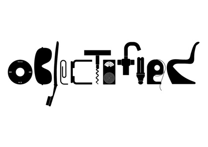
Gary Hustwit, producer of Helvetica, reminds us that design is a fundamental part of our world through his compelling documentary, Objectified. This film explores the intimate relationship between manufactured objects and the people who make and own them. Through conversations of some of the most influential designers in the world, the film emanates vital principals of design: personal expression, identity, consumerism, and sustainability.
In the opening scene the narrator describes that upon seeing or interacting with an object one makes many assumptions about that object within seconds. Alice Rawsthorn describes that the goal of modern day design is mass production: standardized objects that will serve millions and millions of people. Many of the best examples of industrial design are inconspicuous. In our everyday routines we unknowingly employ many different objects ranging from a fork to a toothbrush.
The film conveys the notion that designers aim to improve people’s lives without them even knowing it. This is seen in creations such as the OXO peeler. Dan Formosa indicates that designers look at extremes rather than medians. For if you create a design that caters to the needs of the special-case, then your product will ultimately serve the normal-case. This concept was applied in creating a revamped design for the peeler, one in which would serve people with arthritis through its rubberized bicycle-like grip.
Dieter rams outlines the principals for good industrial design: innovative, useful, aesthetic, understandable, honest, unobtrusive, long-lived, consistent, environmentally friendly, and simple. Apple is one such company who has demonstrated these concepts through the versatile and simplistic design of its products.
The film also touches upon one of the biggest issues our world faces today: trash. With each year, our world becomes more and more overrun by trash. Keeping the environment in mind, designers stress the need to integrate principals of sustainability and personal expression in design. They explain that a well-designed object will withstand the test of time; it will become better and more satisfying with use. And ultimately these objects become a fundamental part in our lives that define who we are and our personal narrative. Chris Bangle, former design director for BMW, explains that automobiles, which have “faces” and subliminally convey certain characteristics, are one such product that identify people’s personalities.
Overall Objectified was a very though provoking and interesting film. It was educational but also very inspirational. Most importantly, it helped me to realize the fundamental role manufactured objects play in each person’s life. The film left me questioning the role of important objects in my life and what they express about me as a person. This film further cements my desire to pursue a career in design.
Folly- The View From Nowhere

I went to the MOCA on Sunday and had the opportunity to see the exhibition "Folly- The View From Nowhere." It introduced an architectural/sculpture/design concept I had never heard of which is the folly. The folly essentially is a structure that serves no function at all. For example, a memorial, tower, meeting point, or structure in which to view or explore the surrounding area. The exhibition showed a compilation of follies from around the world and then explained them. Some of the follies I saw were "Specere", The Turkish Tent, "Vue de la Glaciere", and the Cabazone Dinosaurs. At the end of viewing all of the follies, there was a folly that the curator constructed right in the middle of the exhibition. It was a circular staircase you climbed to the top and there was a panoramic view of LA once you reached it. The exhibition made me realize the flexible nature of art, sculpture and architecture and the different purposes, or lack there of, that they can serve.

Monday, December 7, 2009
Poster Project

For my project, I was given the theme of books for 1950s/high modern. The book I chose to create a poster for was Black Wind, a book by Clive Cussler. This is an adventure novel filled with suspense and secrets that are slowly revealed as the reader continues to the end of the book. Through this design, I researched on many artist such as Chip Kidd. His work showed me a lot about simplicity and how I should convey the true meaning of the book. As you can see from the poster, the design of lines at the bottom getting smaller portrays a hidden secret that is in the book. The image of the boat shows that the book talks a lot about marine life and how the main environment of the book is in the ocean. The yellow sun in the back give a more political aspect to the poster. Because the book talks about Japan in the past and how the Japanese carried out a secret mission to bomb the US with its deadly weapon. My font choice was inspired by 1950s, just basically coming out right type of style and boldly showing the title. The blue background is suppose to have a little marine environment connotation to it. I had use the colors yellow and blue because I wanted to have a strong contrast between a warm color and cold color.
Subscribe to:
Posts (Atom)