Thursday, December 10, 2009

Shepard Fairey


I went to “A Conversation with Shepard Fairey” about a month ago too but forgot to make a post about it. Luckily, I took a whopping 13 pages of mini-sketchbook sized notes during the actual event.

First off, the person who interviewed Shepard Fairey was a straight up noob, and asked some really stupid questions. The interviewer was one of the head faculty members of the Communication department but she was absolutely ________! The conversation managed to be interesting nonetheless.

Fairey started off by sharing his story of how his Obey campaign began. He said that it started off as something silly – an inside joke, but developed into something much more. He printed thousands of stickers of the Obey giant and put them everywhere because he was fascinated with repetition and was obsessed with building something out of nothing and making people question it. He said “People are used to seeing advertising, but when they see something else, they want to get to the bottom of it.”

The most interesting part of the conversation was Fairey’s discussion of intellectual property (and his Obama poster), but since someone else already posted about it (and hit the nail on the head), I’
m just going to skip right over it.

The second most interesting part the conversation to me, was Fairey’s discussion on capitalism. As most of you probably know, Shepard Fairey owns a clothing line called Obey, and receives a lot of criticism for it from the art community, street art community, etc. Fairey argues that he uses his Obey stickers and messages to comment on capitalism, while other corporations (ie. clothes companies) use it to fuel capitalism and to sell more product. He admits however, that his clothing line also helps to spread his messages and allows him to make a living doing what he wants to do. As a business major, and possibly an art minor, I think it’s kind of cool that he owns a business and gets to design and do whatever he wants to do too. Maybe I’ll be able to do what he does one day too.

Someone from the audience asked Fairey how he felt about hipsters who wear his brand. Fairey said that he knows that hipsters wear his brand and that “80% of the people who buy (his) shit, buy It because it looks nice or as a status symbol” but that also leaves 20% of the people who buy his clothing that do understand the message. “Everyone wants to be cool, but once it rubs off, hopefully the message wi
ll settle.” – Shepard Fairey, what a down to earth guy.

I actually own some of his clothing. I don’t really see his clothing as high end or political though, I just buy his clothing because they’re well designed, fit well, and are actually much more comfortable than your typical tee.

Anyway, another interesting topic of discussion was Fairey’s stance on public space. He argued that since we’re all tax payers, we all own a part of public property. Why should people who have money, be the only ones able to use this space to advertise and generate even more money? He sees public space as one of the few platforms left that people can use to inspire reaction publicly. At the same time, Fairey says he respects private property (though I don’t know how much I actually believe this).

Finally, Fairey brought up one of his ex-interns named Phil Lumbang who stencils “happy bears” around LA in broad daylight. I’ve actually been following this dude for a while now and snapped this picture of one of his “happy bears” while driving by:


2014 Winter Olympics logo


In 2014, the Winter Olympics will be held in Sochi, Russia. Out of several bids, this was chosen as the official logo. As most Olympic logos do, this logo reflects the clean and internationally relatable style of ITS. The font is also one that I feel reflects Russia; it is bold and firm yet quiet, which is more or less what I think of when I think of Russia. I like how the logo is so simple yet fitting for the country. According to an explanation of the logo, the incorporation of the url is meant to be an emblem for the digital generation and also reflects how the Olympics will be seen, through PDAs and laptops. I like the fact that the logo comments on how our society functions now. I think the url is interesting however I think the way it is placed is a little confusing. I don't know if the url is sochi.ru or sochi2014.ru (it's sochi2014.ru) I think that if they maybe switched the placement of the .ru and the rings, the message would be more clear. The placement of sochi 2014 is meant to reflect where the Olympics are taking place. It is meant to be the meeting point between the Black Sea and the mountains. I think that the reflection is nice, though at first i was so focused on the reflection that I had trouble making out that it was a 14. I think maybe if the 4 is a slightly different from the h it would be more clear. Overall, I think this is good logo for the country and for the Olympics, as it shows unity and also individuality.

Poster 3


My poster was for a book with an art nouveau style. I chose to do Alice's Adventures in Wonderland by Lewis Carroll. I created this poster by first drawing out Alice and then scanning it into Illustrator. I also used a picture to create the tree and made the ears and pocket watch myself. I tried to imitate the Beggarstaffs' style while adding some traditional art nouveau elements such as the border and the type. I had trouble making Alice look less awkward. I think the face is a little off, as well as the hair. In retrospect, I think that I should have attached the ears to the "A" in Alice to incorporated it into the title more. Also, I would adjust where things are placed so that the text is not as hard to see and I would take out the leaves in the border. Lastly, I think I would have adjusted the colors so that they were a little more bright.

OMG It Even Has a Watermark.


http://www.itevenhasawatermark.com/

"OMG it even has a watermark" is a website dedicated to displaying the most creative and interesting business cards. It displays a range of business cards, simple to interactive, made for people of all professions, not just designers. One interesting card is one for a yoga director. It displays all the needed information and is unique enough for people to remember. I think what makes it so interesting is definitely that you can put your fingers in to create legs for the woman, something that is unexpected and therefore, memorable. I also like how the back is so clean, which I think reflects yoga.
Another interesting card is one made for a culinary correspondent. It also has all the necessary information and has an extremely unique card that clearly reflects the person's area of business. This card was made of steel. I like how the person incorporated the utensils in his card. I think the placement of his name and website could be changed maybe so that it was all below the utensils but I think overall this is a very good card. I also think that the texture of the card was very clever as utensils are usually metal.
There are many more cards displayed on the website that would be great ideas for eye-catching and memorable business cards everyone in the future so check it out.

Wednesday, December 9, 2009

Designer Review


For one of my extra credit assignments, I decided to do a Designer Review on famous designer Stefan Sagmeister. He is a New York based graphic designer who does a lot of typography, working with his company, Sagmeister inc. He has designed album covers for several well known artists such as the Rolling Stones, David Byrne and Aerosmith. One of his pieces that stands out to me, (though it is slightly disturbing). It is a lecture poster that he made where he had one of his students carve with a blade words into himself so he could be photographed. He gained recognition from this photograph because he "self harmed" in the name of design. 
It is seen on his stomach "Style = fart" I am not quite sure what he is trying to say, but I think he is trying to take a lighter approach to design, saying that it really isn't as serious of a thing as most designers make it out to be. But--then again, he is the one carving it into his stomach with a blade--so he created a contradiction. 
The picture can be found at this link-- http://compografo.files.wordpress.com/2006/11/0.jpg
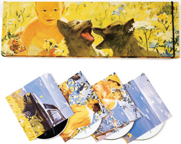
One of the pieces that he did that I enjoy more is the album box set for one of my favorite bands, Talking Heads- "Once in a Lifetime" He received a Grammy award in 2005 for winning Best Boxed or Special Limited Edition Package category for art directing its production. It's very lightly colored and has a naturalist feeling at the beach.

Extra Credit Designer Review


For one of my extra credit assignments, I decided to review a famous designer named Dávid Földvári, who's famous catch phrase / motto is a quite interesting one for a designer. Whereas most designers use the motto "the simpler a piece is, the better," he uses the phrase, "Ugly=Beautiful." He has an extensive portfolio, from simple drawings to album covers. He tends to work mostly in black and white/neutral mediums, but has the occasional splash of color in his work. His work tends to have very strong and bold commentary, not only on political stand points but also on media coverage of celebrities. A link to some of his portfolio is here:
http://www.davidfoldvari.co.uk/Site/portfolio.html
One of his images that is very powerful to me is of a man and a woman, the man holding an umbrella and smiling, and the woman not under the umbrella at all. Neither of them are interacting with each other, but it seems as though the woman should be under the umbrella as well. There is kind of an awkward tension, and seemingly selfish mindset of the man. 
One thing that is also fascinating is how Földvári depicts shadows. The shadows of the piece are very squiggly and don't accurately depict what normal shadows would. This piece is actually one of his cleaner ones, they usually tend to be more sloppy and follow his "ugly=beautiful" slogan. 

Another work of his that I find interesting is one of a professor that is writing on a chalkboard- non stop. It is extremely messy and and says in big bold font, "BLAH." It is referencing the system of education and how kids so often do not pay attention in school and tend to just treat the material they are taught as disposable.  

Extra Credit Design Review


For one of my extra projects, I decided to review a famous design of a school called the Esisar school. It is done by Ruedi Baur, a famous designer who tends to work with more media based design such as architecture and beautifying objects rather than 2d surfaces and computers. He is quoted saying, "The questions that concern me are not simply those of graphic design but issues of orientation, identification and information." It is clear through his work that he loves the show what things do/what their purposes are through design. For example, the building for the Esisar School that he designed, is composed mainly of glass but has very unique looking decals put all over the glass surfaces of binary code (ones and zeroes). Since it is a engineering school, it only makes sense to have the mathematical formulaic basis of ones and zeroes, all over the windows to stand for what the school interacts with. 
The typography is in a very simple sans sarif font, with many streams of lines of numbers intersecting each-other at different sizes and different positions vertically. It was made in 1997. The one thing that does stay consistent is that they are all a very neutral blue color, and always run horizontally and intersect at the same parallel angle. The building is mainly white but the architecture is very fascinating so it looks very sheik altogether. From a distance, the numbers look 3d, like their are several layers of them going back to the back of the building, but this is just because they are perspectively made to look like this.