Thursday, December 11, 2014

Artist Yun Mi Kyung

Touching into my Korean side, I've been inspired by Korean's own version of "anime," called "manhwa." 

Different from the more straight-to-the-point drawings of Japanese anime, "manhwa" tends to be a lot more dramatic and filled with details.

I'm not much of a reader at all, but a friend a few months back told me about an artist named Yun Mi Kyung. Her art work is beautiful, and every page is filled with amazing illustrations.

In particular, the movement and background details really grabbed me.
I really dislike the storyline, but the images make up for it.

I tried...

Once again, finals season has me trying new and different things. I always have to procrastinate.


Either way, I've been looking into egg shell art for a while now, because they are so stunning.
Like I've mentioned in one of my earlier posts, something about art that is made out of fragile materials, really draws me as an artist.


I'm in the process of trying to find tools that allow me to create pieces like this! A straight up xacto knife does not work, fyi.

Sand Castles to Another Level

In the midst of finals, art helps me calm down. Lately, i've been dreaming about going to the beach, and I looked up a few pictures when I came across sand art.

I've seen this type of art before, but I've never paid much attention until very recently. I don't know if I'll have the patience to create something as extravagant as these pieces, but I have a strong urge to go and try something, but maybe on a smaller scale.


Isn't it amazing?
There's something that really draws me about pieces like these sand sculptures, that are so fragile in a sense.

Milton Glaser Revamped

I decided to take on a little challenge and played with lines and flowers for a project. I liked the geometric shapes and rigidness that lines could create, as well as how simple straight lines mixed with curved lines could create an illusion. As for flowers, my mom would always show me artwork where artists would use flower petals as a girl's dress, and so flowers/ pressed flowers has interested me. The soft, gentle aspect of flowers mixed with the rigidity of straight lines creates a contrast that intrigues me, and so I wanted to create something combining the two.

Also, when we did research on artists, Milton Glaser stood out to me, but I wasn't able to incorporate his style into my previous projects. I took this extra project as a chance to be inspired by him, and decided to use his Bob Dylan poster as my primary inspiration piece. When I put all of my thoughts about Milton Glaser, lines, and flowers, this is what I created:


When I flipped my piece over to put glue onto it, the back looked like this, which I thought was nice and interesting as well...

Bloomfest LA 2014


I attended Bloomfest in the Arts District in November and it was a blast. What I enjoyed most about Bloomfest was how they opened up galleries and studios to visitors. It was neat to see the artists' actual workspace and the environment that they brainstorm and bring their pieces to life at.

My favorite gallery was David Hollen's Art Studio because all of his sculptures were made out of something as simple as metal wires. He constructed simple objects into intricate and extravagant artwork. Another interesting gallery was the graffiti art studio. People don't usually see graffiti as art, but it really is! There is so much imagination and thought put into it.

I think Bloomfest is important to have because it's a way to connect artists to their audience/community. It's always nice to have your work noticed or shared and this is a cool way for artists to get their art out there, whether it's to tell stories or inspire others.

I would definitely recommend Bloomfest to everyone! It's a nice artsy experience and is a good way to connect with local artists.

Lawrence Azerrad

Lawrence Azerrad makes me want to enter the graphic design field in a heartbeat. He has been able to work with such huge musicians like the Red Hot Chili Peppers, Wilco, and RAC and foundations like The Clinton Foundation. It would be such an honor to work with those clients and to see your design on the face of those titles. Azerrad's designs are very simple yet eye catching and modern -- traits that I hope to achieve in my own work.
Lawrence spoke about many things that I have never really though about. He talked about how making art about music is more abstract because essentially, he's making art about art, which he describes is like making art about someone else's soul. This was such an interesting outlook. He also stated that album covers are cultural markers, which I agree with 100 percent. Art is a stamp of the time period in which it was made in, and it's fascinating to me how a design can capture so much. Another topic he touched on was how once your artwork is done and brought out into the world, it's no longer yours. It becomes something that everyone can relate to in their own way, and everyone has a different interpretation of a piece of art that used to have one interpretation--the artist's.
This was an eye opening speech to listen to, and I hope to research Azerrad more thoroughly!

Simon Doonan


After seeing Simon Doonan speak, I fell in love with him. He is such a personable and charming individual who always thinks outside of the box. I remember he said that he tries to do things the untraditional way and he doesn't like to conform to society's perceptions. The reason why his windows were such a huge success is because of his originality and confidence in his own work. He seems to be fearless when creating concepts for his windows. As an Art/Creative Director, I think that quality is important because he's able to create things that are different, entertaining, and bold. I hope to have such an artistic eye and eccentric personality even at his age. It was humbling to hear and meet a legendary window dresser and creative ambassador.

Project #1: Line

Woot! This is my first class at Roski and completing my first project is a pretty memorable moment to me. I really liked this project because we were able to let our creativity flow with our own idea of a "line". I liked how we were given a certain timeframe to draw in each square and that we kept drawing one after another because I think that constant activity really allows us  to express our mind without the judgment and criticism people usually contemplate over when they stop/pause.
It's funny because this was actually drawn with my eyes closed. This sketch was made when someone else was directing me, and it turns out to be the one I gravitate towards most! I wish I could draw all of my art with my eyes closed.

I also came across an album artwork for a band called Alt-J and realized that it is strangely similar to my project!

Wednesday, December 10, 2014

Project 2: Materialism X 4

Set of 4

Economy & Emphasis 

Movement 

Balance

Proportion 

 I initially struggled picking a concept for project 2. I started with 'bling' but found it to be too specific and narrow. Once I chose materialism, my ideas came to life. After hundreds of sketches, I decided on four images to transfer and cut. Using proportion, movement, economy & emphasis, and balance design principles, I depicted materialism as an addictive, all-consuming condition. Above are the final designs on bristol paper painted with black & white gouache with details done using microns.

Saturday, December 6, 2014

Erte Research

Since I am new to Roski and don't know too much about famous artists and their styles, I decided to educate myself on another one of the artists from the design principles assignment.

His name is Erte and I love his romantic style. The French artist's work consist of stagnant figures, he does a great job at still creating movement within the piece. This is something that I personally struggled with in my preliminary sketches of the design principle assignment.

Erte is also exceptional at creating balance within a piece without it looking completely balanced. He uses the Rule of Thirds in the third piece. I absolutely love his work and hope to learn even more about him in the future.

Artsy Video

I came across this very artsy and imaginative video the other week when on Youtube. I don't want to give away too much about it before you watch, but this video is an advertisement for Tiji TV of France. I think they did a very good job with taking into account the audience that they were targeting. Also, they were very creative with their ideas.

This idea/concept is very interesting to me because in addition to loving engineering and art, I am also intrigued by marketing and advertising.  It's a cute video. Enjoy!


Spider Web Art

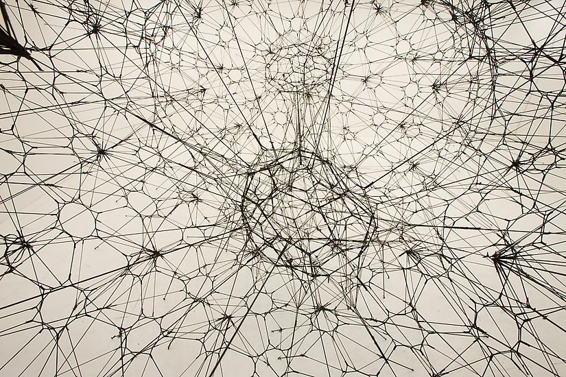
For our final project, my group is focusing on the Nature Lab exhibit at the Natural History Museum. In our preliminary sketches, we focused a lot on spider webs and how we could create an interesting poster through that. So of course I decided to do a little research on my own about spider-web art. The artist I found is Tomas Saraceno of Argentina. He does work with large-scale spider webs like the one below.

I love how the web is 3D just like they are in real life. Also,  the black background works really well to show the detail and elaboration of the web.

It is imperative to know that Saraceno does not create the webs himself. Instead he uses actual spiders in a closed area to build the webs. Naturally, spiders only spin their webs in 1D space. Therefore, Saraceno and his team are constantly moving the orientation of the web, to create the 3D look.

Here is another picture of his work.


His exhibits can be found at the Metropolitan Museum of Art and the Hamburger Bahnhof.

http://www.blouinartinfo.com/news/story/881828/tomas-saraceno-co-opts-the-communal-habits-of-beatnik-spiders

More on Shibori Dye

After participating in the Shibori dyeing that took place two weeks ago, I became very intrigued. I have done plenty of cloth dyeing before, but this dye seemed to be so much more rich and special. Therefore, I decided to do some more research on it.

Shibori dye stems from Japanese decent dating all the way back to the 8th century. The term "shibori" actually comes from the verb "shiboru," which means to wring or squeeze. This term is very fitting as there are so many ways to manipulate the cloth to create such beautiful patterns. We were able to see some of those patterns in class and at the final workshop. One specific technique is called Kumo Shibori. For this design the user must scrunch small portions of the cloth very tightly. This design looks random and spider-web-like.

Store5001_original

Arashi Shibori is another technique. The cloth is wrapped around a pole tightly with thread and then compressed. Once it is dyed, it turns out like this:
shibori-0061

Itajime Shibori  is my favorite that I have seen. This design is created through accordion folds and pressed between two hard objects. Therefore, the dye can only reach the exposed cloth. The end result looks like below!
anchor=

http://blog.needsupply.com/2013/04/21/shibori-a-short-history/

Friday, December 5, 2014

Maude White

Okay, as some of you know I have become recently enamored by cut paper artwork.  Wandering Pinterest, I came across this artist - Maude White.  I'm completely fascinated and determined to learn how to do this.

I thought you guys might be as excited as I am about her...


Here is her website.
http://bravebirdpaperart.com/

Katie.

Thursday, December 4, 2014

Lawrence Azerrad

I had never heard of Lawrence Azerrad before hearing him speak a few weeks ago, but I am glad I went.  His work was interesting, as was his background in Los Angeles.  What really peaked my interest though was his work with different bands like the Red Hot Chili Peppers in designing their album covers.  As a design student, album artwork and branding is something I am extremely into and something I would like to pursue in my future, so seeing someone who turned that into a career was both inspiring and showed what you can do with that line of work.  His work about regarding that retro jet plane was crazy too, I didn't know something along those lines ever existed.

Simon Doonan

A few weeks ago I attended the Simon Doonan lecture, and I am very glad I did.  It was an amazing experience to get to hear Doonan's thoughts on the fashion industry firsthand.  I really liked the way he described fashion as a modern day "spectator sport"; it really is when you think about it.  I had never seen it in this manner but now its the only way I see it.  Different brands are different teams and they hire different designers who are the real players, and of course the regular person wearing the clothing is also competing against their peers.  Competition is fierce in fashion, and it really is sports-like to see what different brands can produce.  Doohan was funny, down to earth, and of course dapper--his shirts are killer.

Wednesday, December 3, 2014

Robert Montgomery

I'm finding myself intrigued by this artist.  I particularly enjoy his Fire Poems...

Here is his website, if you guys are interested, as well as an article of his recent show...

http://www.robertmontgomery.org/robertmontgomery.org/16.html

http://www.someslashthings.com/online-magazine/2014/12/2/someart-robert-montgomery-opening-event-at-ajl-gallery-berlin

Tuesday, December 2, 2014

Alexa Meade

Recently an artist that caught my eye was Alexa Meade. Instead of painting subjects on a canvas, Meade makes subjects the canvas. She applies acrylic paints on human subjects and makes them appear as a painting.

It's absolutely unreal, and I love the angle that she takes in her art.


"I paint representational portraits directly on top of the people I am representing. The models are transformed into embodiments of the artist's interpretation of their essence. When captured on film, the living, breathing people underneath the paint disappear, overshadowed by the masks of themselves." -Alexa Meade


Simon Doonan


I genuinely enjoyed Simon Doonan, as I’ve seen his work before. He started in the department store industry where he eventually began designing window displays in unconventional ways. Fantasy-like, gory, busy and often disturbing, I personally really appreciate his work. I love his touch of humor in many of the examples that were shown in the backdrop during the event. Although however outlandish his displays were, they did exactly what they needed to do—capture attention.
 Doonan also discussed the fashion world, and unsurprisingly he mentioned that he thinks even fashion is subjective, and so it was not in his place to dress people. As a result, he has little to no critique on outfits and style. Personally I appreciate his stance, as I feel strongly about make-up in the same manner. However, I do also think that there can be a standard of fashion, and not to mention, often people have the desire to be trendy but simply cannot. In addition, there is often a limit to one’s style, even if one doesn’t intend it. I don’t see an issue with helping certain people with fashion, and I think that by sharing one’s taste, one can share his or her style. It’s a celebration of different tastes.
 Overall, Doonan was an eccentric personality with great messages to share. I'm a fan.


Monday, November 10, 2014

Petal Fashion

Fashion designs using flower petals. I found these and thought other people would be interesting in seeing them!


Tattoo Designs

Some tattoo designs I did recently for a friend...