I really like the design second to the bottom. The union of pattern and symbols with the organic nature of the silhouettes is aesthetically interesting. It creates a complexity of depth in which the eye has to look around the composition to discern which is the foreground and which is the background. I also like the movement of the lines in the last design, however I think it could have more content and narrative.
Sorry for not labeling! But here they are…still feeling a bit hesitant about how well they represent the principles 1: proportion 2: movement 3: proportion 4: emphasis/economy 5: balance (?) (but i think 9 represents balance better) 6:movement 7: emphasis/economy 8: proportion/movement 9: balance
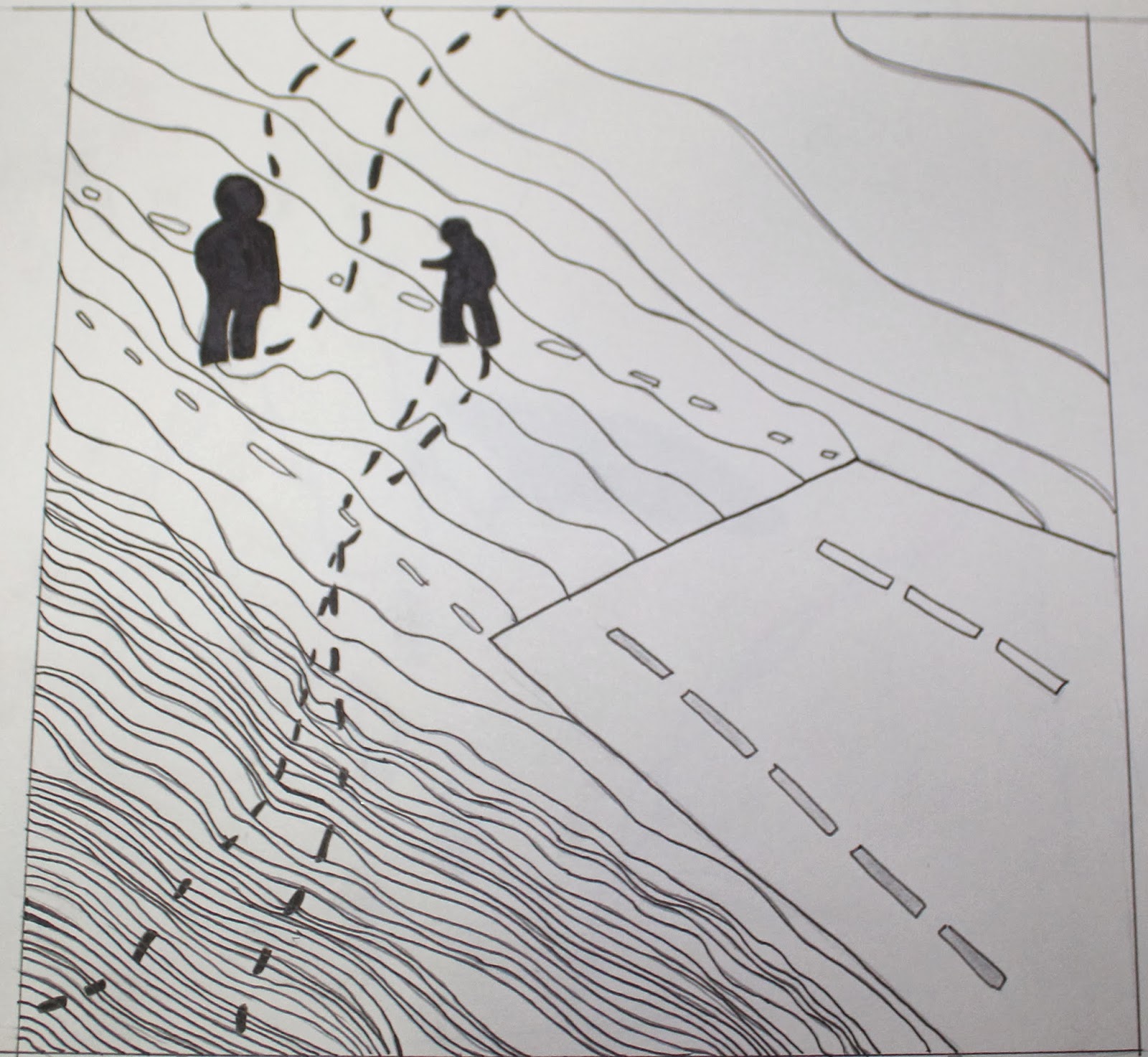
I think #3 works for Proportion because it shows the human figures in proportion to their surroundings. So I think that could work and I really like the patterning of the terrain. I actually like #5 for movement because it look alike wing is blowing through the plant. If not, I think #6 could work for movement or even balance because the light and dark feet balance each other out. I like #4 for Emphasis and economy although I think that image could use some depth and something in the background. If you wanted to do #7 for economy and emphasis, I think the hands should get smaller as they go farther back. My favorite design is the one second to the bottom. I love the mixture of the eyes and patterning and definitely think you should use that.
I think all of your images are aesthetically beautiful. I think number 8 is best for proportion, i think it is visually interesting and uses proportion in a different way that i think is still successful. I really like number 7 but i feel like that focuses more on balance than emphasis.
I think all of your work identifies with a sort of movement in it and i think the patterns are successful, but i also think that they don't really align with that way you categorized it so maybe rethink they categories for them?


I really like the design second to the bottom. The union of pattern and symbols with the organic nature of the silhouettes is aesthetically interesting. It creates a complexity of depth in which the eye has to look around the composition to discern which is the foreground and which is the background. I also like the movement of the lines in the last design, however I think it could have more content and narrative.
ReplyDeletePlease identify the categories Ella, so I can give you precise feedback.
ReplyDeleteyou can start with Images 4, 6 and 9
ReplyDelete4: emphasis/economy
Delete6: movement
9: balance
Sorry for not labeling! But here they are…still feeling a bit hesitant about how well they represent the principles
ReplyDelete1: proportion
2: movement
3: proportion
4: emphasis/economy
5: balance (?) (but i think 9 represents balance better)
6:movement
7: emphasis/economy
8: proportion/movement
9: balance
I think #3 works for Proportion because it shows the human figures in proportion to their surroundings. So I think that could work and I really like the patterning of the terrain. I actually like #5 for movement because it look alike wing is blowing through the plant. If not, I think #6 could work for movement or even balance because the light and dark feet balance each other out. I like #4 for Emphasis and economy although I think that image could use some depth and something in the background. If you wanted to do #7 for economy and emphasis, I think the hands should get smaller as they go farther back. My favorite design is the one second to the bottom. I love the mixture of the eyes and patterning and definitely think you should use that.
ReplyDeleteI think all of your images are aesthetically beautiful. I think number 8 is best for proportion, i think it is visually interesting and uses proportion in a different way that i think is still successful. I really like number 7 but i feel like that focuses more on balance than emphasis.
ReplyDeleteI think all of your work identifies with a sort of movement in it and i think the patterns are successful, but i also think that they don't really align with that way you categorized it so maybe rethink they categories for them?
Great work though! very beautiful!
I love your work and how the theme comes through subtly but surely in all of them. 4,5 and 6 are my favorites. I love the use of the feet in them.
ReplyDelete