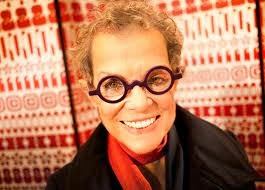
It is always interesting and humbling to hear an iconic figure speak to a group if individuals with like minded goals and interests. Even though we all know the many amazing accomplishments of Deborah Sussman, hearing her speak about them gave all of her accomplishments and experiences that we all read about online a personal touch and realistic effect. A few of the things that especially stood out to me from her lecture:
1. Take a train over airplane whenever possible. This is one of the biggest life lessons Sussman learned from Charles Eames. Not only is the design and functionality of the train much more interesting than that of an airplane but also the scenery and beauty one is exposed to while on a train is unparalleled.
2. Sussman, while working at the Eames house, learned to appreciate uncommon beauty in common items. For example, she described the mesmerizing beauty of the shadows of the willow tree branches on the plastic windows overlooking the meadow and ocean. The ability to look at common, everyday objects and see the uniqueness in them is a special gift. There is a great beauty in designing simple, yet practical pieces.
3. Use the material in the way it wants to be used. Do not try to force something out of a specific material but rather, use it in its natural form.
4. You are what you wear. I also greatly enjoyed Sussman's brief description of her work and life through her dozens of hats. From her work on the 1984 LA Olympics and Finland Olympics to her studies in France, she has a hat marking every major turning point in her life.
5. Collaborating with like minded people is one of the most important and valuable things for a designer. Being aware of your own limitations will only hinder you and working with others will help your creativity and potential. Sussman's largest collaboration project was working on the 1984 Olympics under a serious time an money constraint.
6. The most important thing is not winning but rather taking part.
7. It is important to look at the past and present in order to effectively contribute in the future.
Showing posts with label 100. Show all posts
Wednesday, March 5, 2014
Monday, December 9, 2013
MFA Lecture Series - EXTRA CREDIT (Merlin Carpenter)
![]() |
| Merlin Carpenter, No Re-Entry, 2011 |
![]() |
| Merlin Carpenter, Burberry Paintings, 2010 |
Monday, December 2, 2013
"Come Together Right Now"
Working together is never easy--this project exemplified the roller coaster of collaboration. In the end, it came together and I walked out of the room proud of the work I completed. Our group decided to design our own beer label and in the process we each made our own bottle design. My label and design was titled "Golden State of Mind" and it embodied my personal sentiments regarding urban culture. Each member of my group made their own label, expressing their own message about urban culture and college life to make a complete collection of beer. I believe my work showed how people strive to get what is new and "hip" whether or not that goal is realistic or worth while, that is for every individual to decide. Overall, I believe that this was a great learning experience and I am happy that I was in the group I was in and had to overcome the bumps that I faced. I would do this project again any day and I think this was the most beneficial and fun project of the semester.
Wednesday, November 20, 2013
"Hand Made" Collaboration With 400 Students - Joanna Lee
For this collaborative project, our group decided to work with typography. Instead of solely utilizing computer graphics, we decided to go back to the basics by also experimenting with hands-on, tangible material so that we could explore all realms of type and font production. The idea itself was very general from the start, which opened up all doors for every group member to bring fun, exotic, everyday items that would form letters and eventually pertinent, cute little phrases. During the first group meeting, we brainstormed the concept of our project; we all came to the consensus that we wanted a visual book (almost like something that could be found pleasantly sitting on top of a table at a coffee shop for passersby to stop by and flip through) that provided both the artistic and entertainment elements to its readers.
Link to the E-book, Hand Made: http://issuu.com/michael_bermudez/docs/handmadefont_project
![]() |
| "Hand Made" book cover page |
Doing so brought more life to the text, and showed me that not everything in the design world had to be computerized and technology-based; sometimes going back to working with materials with one's own hands makes the experience even more intimate because one can feel the textures and how the objects themselves physically function and create the piece. Personally, it was a good wake-up call because I had assumed that design immediately associated with only computer-made layouts, spreads, etc. But through the experience that I gained while working on this project, I noticed that you can do both computerized works with an integrated hands-on creative aspect to it as well.
Previously, I had always seen typography with a very skeptical eye because it only appeared to be a very narrow-minded, tedious process of learning the intricacies of text. Working on this project definitely showed me how the letters of the alphabet have unique shapes and symbols that all hold certain significance. Physically forming them with my hands when tying the rubber bands from one pin to another created a tension that I as the artist could feel while creating the rubber band "strokes" to create each letter, and positioning the safety pins in a rational and artistically-pleasing technique was a very fun concept to learn as well. Other different media that were used included grass blades, which had a very sharp and pointy feel to it, the tea bags, which held a very strong and fortified feel to it, sticky notes, which signified playfulness, and pixy dust, which was a very soft medium to work with (which meant that it took a lot of time to form.) The creation of the alphabets took about 2 to 3 class work studio days, and the rest of the work (compilation of the e-book) was done in and outside of class. We decided to include little phrases that correlated with the material used to make the words and the alphabet letter themselves because not only would it be practical, but more engaging because it shows the functionalities and readabilities of the letters we made from the rubber bands, grass, pixy dust, wet tea bags, and safety pins.
Not only did I learn the valuable art of different typographical creations, but I also learned how to work in a group with varying interests and emphases. At first, being grouped up with a pair of advanced level students was overwhelming to me, but it was great that they encouraged us to be free in our thinking and to include input into what kinds of materials we would want to use to make the fonts. It was also a technical project because we thought about how to place and space the letters and which witty phrases to incorporate with each font.
Overall, I really enjoyed participating in this project, and I would definitely want to try it another time if I were given the opportunity to do so because I know for sure that every group learned something valuable, worthwhile, and unique from their own experiences.
![]() |
| Wet Teabags |
![]() |
| Grass Blades |
![]() |
| Pixie Dust |
![]() |
| Safety Pins |
![]() |
| Post-It Sticky Notes |
![]() |
| Rubber Bands and Push Pins |
| Rubber bands + push pins on the wall |
| Rubber bands + push pins on the wall |
| Rubber bands + push pins on the wall |
| Rubber bands forming the alphabet |
Labels:
100,
400,
Brainstorm,
Collaboration,
Concept Diagram,
Critique,
Project,
Project 2: Design Principles,
Reflection,
Review
Tuesday, November 19, 2013
My Favorite Designer: El Anatsui
"Chance Encounters to New Discoveries"
Currently, my favorite designer is El Anatsui. While on an art enthusiast expenditure with my dad in Paris, I first learned of Anatsui. One evening, my dad and I decided to dine at a well-reviewed small French restaurant. The tables were set up family style, so that we could converse with fellow diners. My dad and I were seated next to an older couple. As we conversed with the couple, we learned of the gentleman's occupation of an art dealer. He was in Paris scouting vintage furniture for his gallery in New York City. When he learned of my love of art, he mentioned the Brooklyn Museum's new exhibit with the work of Anatsui. He spoke of the wonders of seeing the work, and highlighted Anatsui's attention to materiality and pertinence to paint and sculpture. I became intrigued. Later that night, I googled "El Anatsui", and I admired what I saw. His work is dynamic and different. The narratives from his background in his work remind me of the narratives that I seek to embed into my own work. Lastly, I highly recommend you to check out the work of Anatsui if you enjoy looking at mixed media sculptures!
To learn more about El Anatsui, please check out this link: http://www.brooklynmuseum.org/exhibitions/el_anatsui/#
Currently, my favorite designer is El Anatsui. While on an art enthusiast expenditure with my dad in Paris, I first learned of Anatsui. One evening, my dad and I decided to dine at a well-reviewed small French restaurant. The tables were set up family style, so that we could converse with fellow diners. My dad and I were seated next to an older couple. As we conversed with the couple, we learned of the gentleman's occupation of an art dealer. He was in Paris scouting vintage furniture for his gallery in New York City. When he learned of my love of art, he mentioned the Brooklyn Museum's new exhibit with the work of Anatsui. He spoke of the wonders of seeing the work, and highlighted Anatsui's attention to materiality and pertinence to paint and sculpture. I became intrigued. Later that night, I googled "El Anatsui", and I admired what I saw. His work is dynamic and different. The narratives from his background in his work remind me of the narratives that I seek to embed into my own work. Lastly, I highly recommend you to check out the work of Anatsui if you enjoy looking at mixed media sculptures!
![]() |
| El Anatsui (Ghana), In the World But Don't Know the World, 2011. Aluminium and copper wire, 560 x 1000 cm. |
![]() |
| El Anatsui (Ghana), Drainpipe, 2010. Tin and copper wire. |
![]() |
| El Anatsui |
Labels:
100,
Artists We Like,
Review,
Thoughts and Ramblings
Reflections: Collaboration Project
Given the constraints of designing objects displaying personal promotion, my group decided to design leave behinds. My group consisted of 402 students, David and Maureen, and fellow 102 student, Darwin. We each created different leave behinds that referenced our own personal aesthetic and interests. For example, I created a leave behind in the form of a paper lily and pad. I decided to use this design because a lily and pad are symbolically connected to the Impressionist movement, as exemplified by the work of Monet. Generally, I enjoy painting impressionistically, so the form of a lily and pad for a leave behind made sense symbolically. Furthermore, to follow a group theme of the importance of materiality, I crafted every part of my design by hand. The lily pad base was modified by a process of staining the paper through adding paint and oil to a bath of water and submerging the paper into it. Additionally, each flower petal was hand painted by a three layer process. Lastly, the words "thank you" were hand scripted on the back of the leave behind. Through my leave behind, I tried to convey a sense of my aesthetic and my skill with color and paint.
The final product:
While we ended up producing an adequate project considering the constraints, I wish we had come up with a project that was truly a collaborative project. In essence, we all created different leave behinds, but it could have been interesting if we had designed something truly cohesive. In the end, due to conflicting ideologies and the waning of time, we decided to adhere to a project focused more on individuality. In future projects, I hope to make cohesion more of an importance.
Overall, I enjoyed this project. Working with design 402 students allowed me to adopt certain advanced design skills. Moreover, I saw what a higher-level design class would be like. This design project was beneficial in many ways, and I am glad we did it.
Subscribe to:
Posts (Atom)


