Showing posts with label Review. Show all posts

Wednesday, November 20, 2013

"Hand Made" Collaboration With 400 Students - Joanna Lee

For this collaborative project, our group decided to work with typography. Instead of solely utilizing computer graphics, we decided to go back to the basics by also experimenting with hands-on, tangible material so that we could explore all realms of type and font production. The idea itself was very general from the start, which opened up all doors for every group member to bring fun, exotic, everyday items that would form letters and eventually pertinent, cute little phrases. During the first group meeting, we brainstormed the concept of our project; we all came to the consensus that we wanted a visual book (almost like something that could be found pleasantly sitting on top of a table at a coffee shop for passersby to stop by and flip through) that provided both the artistic and entertainment elements to its readers. 


"Hand Made" book cover page
Doing so brought more life to the text, and showed me that not everything in the design world had to be computerized and technology-based; sometimes going back to working with materials with one's own hands makes the experience even more intimate because one can feel the textures and how the objects themselves physically function and create the piece. Personally, it was a good wake-up call because I had assumed that design immediately associated with only computer-made layouts, spreads, etc. But through the experience that I gained while working on this project, I noticed that you can do both computerized works with an integrated hands-on creative aspect to it as well. 
Previously, I had always seen typography with a very skeptical eye because it only appeared to be a very narrow-minded, tedious process of learning the intricacies of text. Working on this project definitely showed me how the letters of the alphabet have unique shapes and symbols that all hold certain significance. Physically forming them with my hands when tying the rubber bands from one pin to another created a tension that I as the artist could feel while creating the rubber band "strokes" to create each letter, and positioning the safety pins in a rational and artistically-pleasing technique was a very fun concept to learn as well. Other different media that were used included grass blades, which had a very sharp and pointy feel to it, the tea bags, which held a very strong and fortified feel to it, sticky notes, which signified playfulness, and pixy dust, which was a very soft medium to work with (which meant that it took a lot of time to form.) The creation of the alphabets took about 2 to 3 class work studio days, and the rest of the work (compilation of the e-book) was done in and outside of class. We decided to include little phrases that correlated with the material used to make the words and the alphabet letter themselves because not only would it be practical, but more engaging because it shows the functionalities and readabilities of the letters we made from the rubber bands, grass, pixy dust, wet tea bags, and safety pins. 

Not only did I learn the valuable art of different typographical creations, but I also learned how to work in a group with varying interests and emphases. At first, being grouped up with a pair of advanced level students was overwhelming to me, but it was great that they encouraged us to be free in our thinking and to include input into what kinds of materials we would want to use to make the fonts. It was also a technical project because we thought about how to place and space the letters and which witty phrases to incorporate with each font.
Overall, I really enjoyed participating in this project, and I would definitely want to try it another time if I were given the opportunity to do so because I know for sure that every group learned something valuable, worthwhile, and unique from their own experiences.


Wet Teabags

Grass Blades

Pixie Dust

Safety Pins

Post-It Sticky Notes

Rubber Bands and Push Pins
Rubber bands + push pins on the wall

Rubber bands + push pins on the wall

Rubber bands + push pins on the wall

Rubber bands forming the alphabet

Tuesday, November 19, 2013

My Favorite Designer: El Anatsui

"Chance Encounters to New Discoveries"

Currently, my favorite designer is El Anatsui. While on an art enthusiast expenditure with my dad in Paris, I first learned of Anatsui. One evening, my dad and I decided to dine at a well-reviewed small French restaurant. The tables were set up family style, so that we could converse with fellow diners. My dad and I were seated next to an older couple. As we conversed with the couple, we learned of the gentleman's occupation of an art dealer. He was in Paris scouting vintage furniture for his gallery in New York City. When he learned of my love of art, he mentioned the Brooklyn Museum's new exhibit with the work of Anatsui. He spoke of the wonders of seeing the work, and highlighted Anatsui's attention to materiality and pertinence to paint and sculpture. I became intrigued. Later that night, I googled "El Anatsui", and I admired what I saw. His work is dynamic and different. The narratives from his background in his work remind me of the narratives that I seek to embed into my own work. Lastly, I highly recommend you to check out the work of Anatsui if you enjoy looking at mixed media sculptures!

El Anatsui (Ghana), In the World But Don't Know the World, 2011. Aluminium and copper wire, 560 x 1000 cm.

El Anatsui (Ghana), Drainpipe, 2010. Tin and copper wire.

El Anatsui
To learn more about El Anatsui, please check out this link: http://www.brooklynmuseum.org/exhibitions/el_anatsui/#

Monday, November 18, 2013

Reflections on Collaboration Project

The collaboration project was awesome! I enjoyed making new friends and being able to see what I will be doing in the next few years here at USC. Moreover, I know what to expect for that particular class, which is more satisfying than not knowing what to expect at all. My partners from the 402 class were Julian and Huey and they did a great job at showing me how to go about planning and putting into effect the actual project itself. I thought it was super cool to see my drawings (the cyclops squid eating the fish) on a surfboard as well as all the other little characters on clothes and hats because it inspired me more in regards to my aspirations in the fashion industry. What I also liked were the critiques because I got a sense of what to look for in everyday designs such as the kerning in typography, whether the typography suits the targeted audience, the spacing of objects on a certain design, etc.

Tuesday, January 29, 2013

"Accidental Art" Assignment


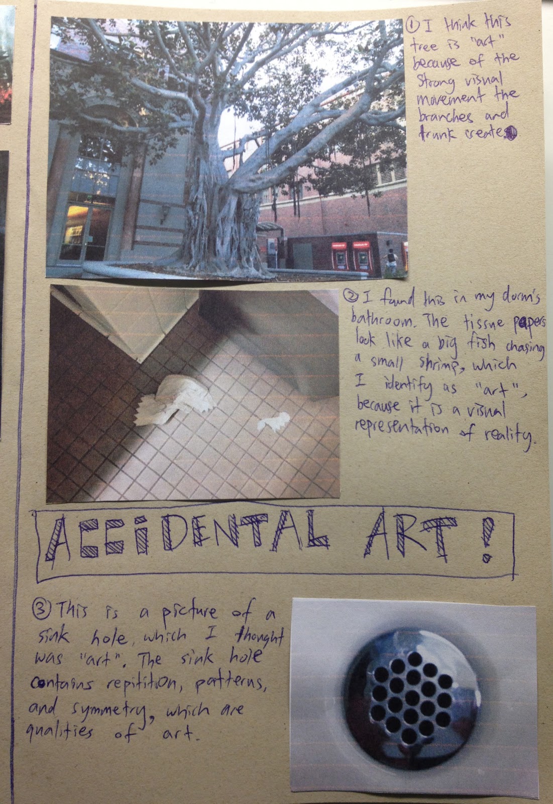
For this exercise, I have documented various objects on my walk, which are both artistic and inspiring. These objects range from squashed persimmons and cracks in the road to feathers, beaded water on a car hood, and even pieces of trash.
-Kaley Farr (Kay)

Observation Exercise

ACCIDENTAL ART!
I documented some "accidental art" in my sketchbook. These are some pictures I took around campus. I realized that a lot of the smallest things have art in them, you just gotta observe carefully.

Favorite Artist/Designer: Feng Zhu

My favorite artist/designer is Feng Zhu. I talked about why I like him and why he inspires me in my sketchbook.

He is very intellectual regarding design. He always knows what he is talking about and that's why he impresses me.

If you have time, check out his youtube: http://www.youtube.com/user/fzdschool.


Wednesday, November 9, 2011

happiness

stefan sagmeister gives a TED talk about happiness.

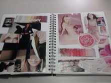
collages


after making these collages, i can't stop obsessing over&appreciating color harmonies. here are some of my favorites:


Tuesday, November 8, 2011

Less is More


I saw this browsing through one website, and I thought it was a good example of how sometimes less is more. Enjoy.

Saturday, November 5, 2011

Stop-Motion

Stop-motion films in themselves are daunting to do. One picture is taken per frame and there are about 24 frames per second of footage typically. Every small movement must be photographed and, as you can imagine, stop-motion requires a lot of patience and time. Now, I don’t have the patience to make such films, but others do and props to them! Here’s a music video all in stop motion that blew my mind. And did I mention that the animated background was all done with… JELLY BEANS?! Prepare to be blown away.


Oh, and if you’re interested in how the music video was made, check behind the scenes! It was a crazy process, but definitely worth the time and effort.

Wednesday, October 26, 2011

Arts & Crafts


You know the scraps of paper you have after you cut out your gauche swatches?


Don’t throw them away just yet! I’m an arts and crafts person and I saw potential in these little strips of paper. So with a hot glue gun at hand, I made...


Nothing should go to waste.

Tuesday, October 11, 2011

Helvetica- A Documentary

I recently watched a documentary on the font, Helvetica, originally named Neue Haas Grotesk, by Gary Hustwit.
It was eye opening to learn about the importance of a neutral font and the world of typography in general.

The film talks about the importance of negative spaces around the letters that holds together the positive space together to form a coherent and clear type face. Made me think about our last project how we utilized negative space to frame our eyes to make strong compositions!

There is much more to the film, but you should definitely check it out for yourself. It's an eye opening 80 minutes into the world of typography!


Check out more information on the film by clicking the picture! 


- Lisa G. Yoo

Thursday, October 6, 2011

Project #2 - The Process

Hello friends!

I just wanted to stop by to share a few process pictures from Project #2. Below are some shots of my "Balance" painting, plus a few avian amigos from my "Proportion" piece.


I actually ended up with a lot of really neat cutouts from this project - hopefully I can use them for something else later on! That's all from me, congrats to everyone for wrapping this project up, I was beyond impressed with everyone's final results.

-Nikki D.

Friday, September 16, 2011

Charles and Ray Eames...and Geology 125.

I was sitting in my Geology class the other day when my professor asked, "Have any of you ever heard of Charles and Ray Eames?" This of course caught my ear, and I couldn't help but think, he can't possibly be talking about the designers, can he?

Well, it turns out he was! (I mean, what're the odds of there being two pairs of Charles and Ray Eamses in the world?) We're currently learning about the structure and composition of the universe, and it turns out the Eames Office created a famous film in 1977 entitled "Powers of Ten," which takes viewers through the relative scale of our universe by you guessed it - powers of ten.


It reminded me of the Michael Bierut reading, which talked about how "not everything is design. But design is about everything." In this case, design was about everything from the nucleus of a carbon atom to the furthest reaches of the universe, billions of light-years away from our own galaxy.

Wrap your mind around that, space cadets.

All my love x 1010,
Nikki D.

Wednesday, August 31, 2011

First Time I've Ever Enjoyed Researching . . .

While researching Michael Beirut tonight, I realized how essential research is to making a good design. This is SUCH AN INTERESTING ARTICLE outlining the entire process behind his redesigning of the Saks Fifth Avenue packaging, and it's fascinating. Also, the design is amazing.


Just look at this.


Cool? I think so.

(Seriously, read the article though. The word "article" never sounds appealing, but I swear I read it of my own free will and I'm the kind of person who never reads from G.E. textbooks. Ever. Which says something for its level of interesting content.)

So, after this, I'm updating my definition of design to something that requires the designer to be genuinely interested in the subject matter and willing to spend a lot of time learning about it. The designer should base his/her designs off of their research, for inspiration, and also to ensure that their designs are applicable and fit the style required. For example, Beirut made sure that his design was based off of previous designs so as to still retain the historical style of the company since its founding and not to completely recreate the image into something unrecognizable. This is essential.

Monday, August 29, 2011

design design design


Design happens when creativity meets functionality.

Paul Rand, an American graphic designer once said that

"Design, just as art, has multiple definitions; There is no single definition. Design can be art. Design is so simple, that's why it is so complicated."

And I completely agree.