Saturday, February 21, 2009

Culver City Galleries


Becca Mann's art really stood out to me as unique and skillful. Oftentimes I don't appreciate more abstract art because it doesn't seem to take as much natural or cultivated ability (I suppose I'm a little old-fashioned that way...)

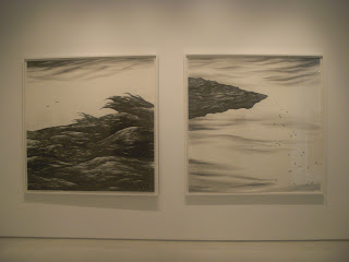
Becca Mann's graphite drawings are not only incredibly detailed and life-like, but she also makes them unique by using ONLY chiaroscuro to define the various forms--she completely leaves out any outlines or sharp delineation. All that she uses to make the impression of form is the values...

She also uses negative space very cleverly in her Romanov Family Portrait (see top) and a few of her other paintings. She makes it looks like positive space, or a form, rather than the absence of that.

Overall, she shows her awesome skills but still adds something new and original..woohoo!

Emily

Friday, February 20, 2009

Culver City Art Galleries

I would like to note that this was my first time actually taking the time in the art galleries and this experience has definitely changed my perception of art galleries - for older, wealthier folks.


The intricacy of the above pieces were amazing.


I was amazed by the crispness and cleanliness of the lines in this piece.


This piece was a bit disorienting. I couldn't picture what it was that made the piece disorienting until talking to Sherin. The girl in the picture is very crisp and everything else is blurry and she just seems out of place in the picture.


This piece was by far my favorite piece. But I would not put this in my room. The way the artist uses the negative space to accentuate the fading of the figures making it more like a reminiscing of a memory. The way the piece spoke out to me was the question of where these figures took place today in society and the thought that they were fading away.


I thought this piece was hilarious. Those little things falling off the piece can be recognized to be people once you step real close to it.


This peace sign was a bit....weird? The way that it was filled with stuffed animals and all smushed together was all wrong. Stuffed animals aren't supposed to be smushed.


"THE MOST IMPORTANT THINGS IN LIFE...AREN'T THINGS"
Hm...


"WHO WROTE THE BOOK OF LOVE?"
Is love not supposed to be a good thing?


"So...How can you tell me you are lonely"


OKAY, so these pieces above are a bit disturbing. First, you think, oh how cute, and then, disturbinggg.


I just wanted to note the basket holding the plant. It's made out of paper! It's crazy. Andrew pointed it out first.


I didn't really understand what the artist was trying to convey with the naked bodies.


This room was quite interesting. A home within a home. Different kinds of homes in the picture frames hung in a room of a house. Interesting concept.


"beauty...it rubs against one's tongue//it hangs there//hurting one//insisting on its own existence//finally it gets so one cannot stand the pain//then one must have beauty extracted"


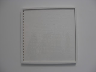
These white frames look like a blank page, but once stepping closer, one can see that it's braille!


These pieces were interesting. The play on words and the space.


This painting was intense. The different hue of the red and the white paint evoked tension for me.


The class.


I took this picture because I thought it looked artsy = rebel look. Don't you think so?


I took this picture because I thought it was interesting that I thought the billboard said "Temporary" but really it was "Contemporary".


Obama!!


I took this picture because it was an inspiration..."No Dream is Too Big."


This is random graffiti on a wall, but I really liked the colors - the metallic gold against smoky black.