I discovered the work of mystic Ram Dass when I was recommended his seminal spiritual text, "Be Here Now". While originally only interested in what he had to say about Hindu-influenced spirituality and psychadelics, I quickly found that the Stanford-educated author's words were not in paragraph form, but rather accompanied by rich illustrations of his abstract concepts. The book is a trip through Dass' strange mind and teachings about metaphysics, but communicates through artwork. The intricate, geometric, fractal patterns on the cover of the book demonstrate the interconnectivity of the world and the delicacy of it's balance, and this theme characterizes most of the illustrations throughout the work. His "Ice Cream Cone" in the sky is one of his most famous concepts, and one of the ones I remember best. The ways he couples typography with drawings make his teachings more memorable for visually-geared learners, and are good examples of purposeful design.
Showing posts with label Secret Geometry. Show all posts
Thursday, December 12, 2013
Tuesday, May 14, 2013
MOCA Exhibition
I couldn't find the Sagmeister exhibit, so I enjoyed the Urs Fischer one instead.
The Urs Fischer exhibit is on display from April 21st to August 19th. I found these three exhibits particularly interesting.
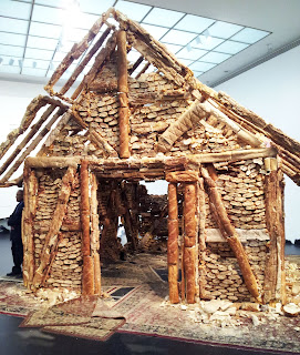
Bread House Portrait of a Single Raindrop
The Untitled piece with a house made of bread has the appearance of a cabin constructed of bread. The long baguette pieces act as structural timbers, while the sliced pieces look like the running bond of masonry bricks. Upon a closer look, the piece is actually constructed of wood and merely covered and filled with bread. I think the piece would have been much more interesting if it were solely constructed of bread, but there are probably structural limitations to how well stale bread can hold itself up.
The Portrait of a Single Raindrop is a huge 'hole in the wall.' I love how the negative piece is resting against the wall in the back, supporting the idea that 'nothing' is wasted. The rough cut of the wall really reveals the massing and draws attention to the structural light gauge steel.
The juxtaposition of these two pieces becomes an interesting way of drawing attention to the architectural structure of construction. The bread shows the concept of connections made by tectonic pieces, while the Portrait of a Single Raindrop becomes a cutaway expression with the lack of structure.
This Untitled piece contains a line of fruit that is elegantly suspended only inches from the ground. Each of the six pieces of fruit hangs from a thin, clear string that is attached to the ceiling. Although the fruits are in sequential order by size, the grape at the end (or beginning) of the line is barely noticeable. As the fruits age and rot, it's clever how the fruits are suspended so that ants won't crawl on them; however, this is in a museum, so they probably make sure there are no insects to disrupt these art pieces.
Sunday, October 7, 2012
"Aha!" Moment: Finding the Golden Mean
I highly highly recommend checking out Irving Penn's works, if you haven't!
Saturday, October 6, 2012
Golden Ratio
Here are my Golden Ratio tracings. You can definitely notice how each image follows the rule. The face and text in the Vogue cover fit almost perfectly within the lines. The nylon advertisement fits with many of the diagonals of the ratio, even though the primary subject isn't centred on the page. The image also creates a clear s-shape curve that works within the Golden Ratio. The final image surprised me as I didn't think such a chaotic picture with so many objects would fit the rule, however, I was proved wrong.
Wednesday, October 3, 2012
Tuesday, October 2, 2012
Golden Ratio Exercise
Here are the magazine pages I chose for this exercise. I put red dots where the lines intersect - where the eye naturally looks. For the Chevy Volt/Fisker Karma picture, the proportions are quite nice, with the cars being in the lower third of the photograph, the buildings being in the middle third, and the sky being in the upper third. For the Dolce and Gabbana advertisement, the focal points on the left are right at the center of the man and his bag, while the right side focal points are on the group of people and the steps beneath them. I am actually quite excited to make more of these.
Golden Mean Activity
These were my three tracings from class today. It was a very enlightening experience for me especially when I did the 2-page Louis Vuitton spread because one of the focal points was right where the Louis Vuitton bag was and the other lines just fell into the right places.

Subscribe to:
Posts (Atom)