Of all the exhibits I saw at LACMA, Ken Price was definitely my favorite. His style is so unique, I was drawn to his sculptures right away. The abstract shapes are very engaging, but I found his color schemes to be most impressive. His sculptures are coated in many layers of acrylic paint, each of which are revealed when the sculpture is sanded down to a smooth finish. Most of the colors he uses are very bright, though the sculptures overall do not look as bright because, in most cases, the two most prominent colors are complements. As seen in the image below, orange and blue are the two most prominent colors and this complementary color scheme gives complexity to the sculpture even before you start to look closer and notice all the other layers.

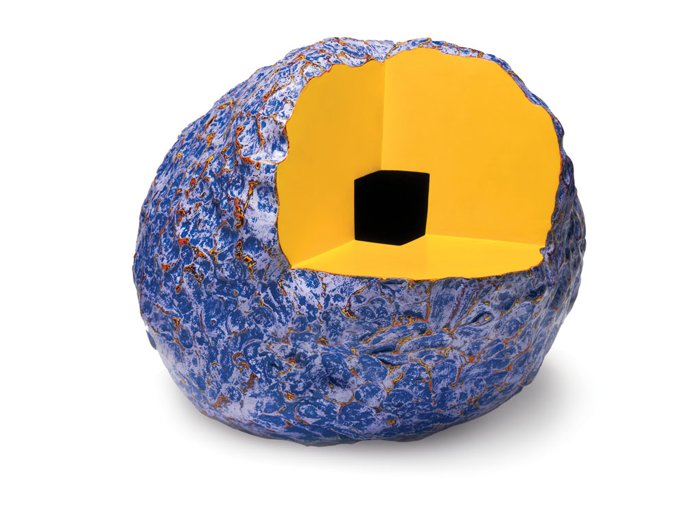
The first series of sculptures in the exhibit (two of which are shown) were by far my favorite because of the bright complementary color schemes and the overall metallic finish. Price had another line of displayed sculptures where part of the shape was cut out (as in the piece shown below). I noticed that these pieces tended to embody a more monochromatic color scheme with a few pop colors. For example, the figure below contains a bright blue and a more muted blue with pop colors of bright orange and yellow.
This exhibit has definitely inspired me to experiment more with different color schemes. I especially would like to try forming different complementary color schemes using bright colors (which I love) is different harmonious proportions.


 The first series of sculptures in the exhibit (two of which are shown) were by far my favorite because of the bright complementary color schemes and the overall metallic finish. Price had another line of displayed sculptures where part of the shape was cut out (as in the piece shown below). I noticed that these pieces tended to embody a more monochromatic color scheme with a few pop colors. For example, the figure below contains a bright blue and a more muted blue with pop colors of bright orange and yellow.