Hello fellow FA102 classmates!
 |
| Case Study #8: The Eames House |
I'm writing to divulge the intimate details of my Eames House Voyage. Just to begin before the details of the trip, here is some background context.
The Eames. Charles and Ray Eames. The Eames Lounge Chair. Et Cetera...
The Eames power couple were intricate components in developing the aesthetic of Modern architecture and furniture. Think of two-part lounge chairs, airport chairs, and plastic armchairs -- all components of the Eames legacy.
 |
| The Eames Lounge Chair and Ottoman |
Even take a trip down memory lane and think back to the first day of class when we attempted to define the word "design." Charles Eames voiced... Design is "a plan for arranging elements in such a way as to best accomplish a particular purpose.
Arrangement! Elements! Purpose!
And now to begin. On one unusually foggy Sunday morning, I ventured north to the Pacific Palisades to the home of Charles and Ray Eames. As an experiment for the Case Study Houses, Charles and Ray Eames created an house entirely from industrial, off-the-shelf materials. Translation -- the entirety of their house was ordered from a catalogue (which was revolutionary during the times...)
Look.
Look.
Look.
1. Steel Framing
2. Opaque Windows
3. Rayon Linens for Curtains
The Colors... specifically mixed by Ray Eames herself (a painter before marrying Charles; also worked under Hans Hoffman, New York School abstract expressionist painter). Earth Whites. Neutral Gray. Primary Blues. and Primary Reds. But no yellows... so the primary triad was not complete. Alas.
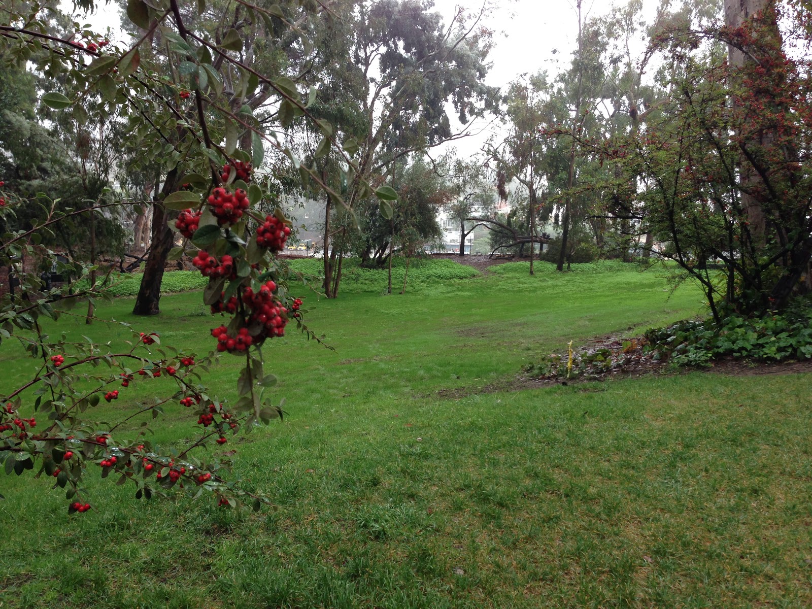
The house... rectilinear, modular, and modern. Divided into two 1) the study space and 2) the living space. Charles and Ray wanted a place where they could live, work, and entertain, PLUS a home that harmonized with nature. Thus, it was built next to a grassy meadow that overlooked the ocean.
 |
| The Meadow! |
The Eames were innovative and insightful in their approach to designing this house. Despite Charles's misogynistic affair with a younger woman, the Eames and the Eames house are forces to be reckoned with. I highly recommend the documentary, (found on netflix with 88% on rotton tomatoes AND narrated by James Franco). So on that note, I leave you with some boring iPhone pics...
 |
| The Courtyard. Dividing the Living and Studio Space |
HOPE YOU ENJOYED!
-- Feibi


