Showing posts with label Artists We Like. Show all posts

Thursday, September 17, 2015

Extra Credit Event: Artist Talk by Michol Hebron

FAIN 315 Internet Studio Presents:
Artist Micol Hebron 
Wednesday, September 23 at 9:15 am in Watt Hall B6.  

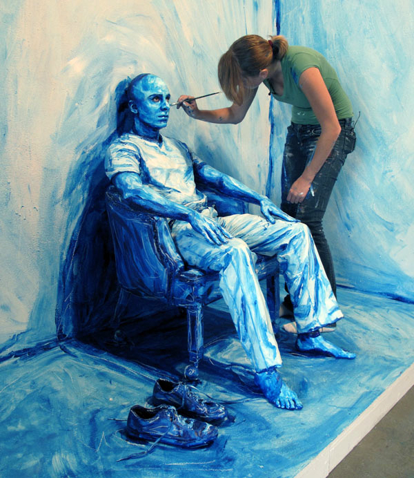
Micol Hebron is an interdisciplinary artist whose practice includes studio work, curating, writing, social media, crowd-sourcing, teaching, public-speaking, and both individual and collaborative projects. She has been engaged in individual and collaborative projects in Los Angeles since 1992. Hebron is an Associate Professor of Art at Chapman University; the founder/director of The Situation Room resource space for the creative community; the Gallery Tally Poster Project about gender equity in contemporary galleries; and the Digital Pasty/Gender Equity initiative for the internet. In the past she has been the Chief Curator at the Utah Museum of Contemporary Art; the director of the UCLA Summer Art Institute; an editorial board member at X-Tra magazine; an independent curator; a conservator at LACMA, and the co-founder of Gallery B-12 in Hollywood in the 90s. She has served on advisory boards at Los Angeles Contemporary Exhibtions, Birch Creek Ranch Residency (Utah), Los Angeles County Museum of Art, and UCLA. She is the founder of the LA Art Girls, and the Co-Founder of Fontbron Academy. She employs strategies of consciousness-raising, collaboration, generosity, play, and participation to support and further feminist dialogues in art and life. Hebron has presented exhibitions, performances, and lectures at numerous international institutions. The best way to reach her is through social media.


Tuesday, December 2, 2014

Alexa Meade

Recently an artist that caught my eye was Alexa Meade. Instead of painting subjects on a canvas, Meade makes subjects the canvas. She applies acrylic paints on human subjects and makes them appear as a painting.

It's absolutely unreal, and I love the angle that she takes in her art.


"I paint representational portraits directly on top of the people I am representing. The models are transformed into embodiments of the artist's interpretation of their essence. When captured on film, the living, breathing people underneath the paint disappear, overshadowed by the masks of themselves." -Alexa Meade


Saturday, October 18, 2014


Project 2!

I began my project in a panicked state as I rattled my brains for a theme that could be somewhat related to my artist models Karl Benjamin and Cassandre. Lego was the best I could think of so I rolled with that. I took a lot of inspiration for my drawings from Cassandre's posters and also from the Bauhaus movement which was coincidentally around the same era that lego was made, 1932. 

I am really happy with the way mine turned out after battling with gluing and having to re-do one. 
clockwise from the top left they are movement, balance, proportion, emphasis and economy.


Tuesday, October 14, 2014

The Art of Clean Up


I've been meaning to post the link to Ursus Wehrli's artwork for a couple of weeks now. He's a Swedish artist with a book called "The Art of Cleanup"
It's unbelievably satisfying and I thought I'd share. I've posted some examples and you can find some more here


Friday, April 11, 2014

Roski Talks: Stefan Bucher

April 1, 2014

Last Tuesday, I had the pleasure of attending a lecture given by Stefan Bucher.  Bucher is a writer, illustrator and graphic designer.  He is California based and is the creator of the design firm, 344.  Before Tuesday, I had never heard of Bucher.  I am always excited to learn about and explore the work of artists and designers, whether new to just me or to many.  Bucher took us on a journey through his own independent artwork and projects he had worked on for companies.  It was amazing to hear him explain the evolution of his ideas; I felt like I had an inside look into his mind and his thought processes.

He discussed his book, The Graphic Eye, first.  This was one of his first creations, and by the end of his lecture, you could truly understand how much his work had evolved from this first coffee table book.  He went on to discuss the creation of the Yeti Story, a project he initially developed as a window display for Saks 5th Ave. that developed into a story book and stuffed animal toy.  After this, Bucher was hired to put together the graphics and design the space in the Monte carlo for the Blue Man Group.  It was neat to hear how much Bucher enjoyed this task and how fun it was for him to design simple things such as the carpets, lights and gift shop; they all came together and looked magnificent!  
Finally, Bucher discussed his Monster series, probably what he is most well known for.  His monsters are creations from ink blots that all have such outstanding personalities.  I found his idea behind them fascinating, that he started with an ink blot so he didn't feel as if the monsters were created out of nothing.  I enjoyed Bucher's talk, mostly because of his extremely eccentric and outgoing personality.  He is a quirky guy, but an excellent public presenter.  He engaged with us as the audience.  
Bucher's website: http://www.344lovesyou.com 

Sunday, March 23, 2014

Corsets and Wynwood

Hope everyone had a good spring break! During my time in Miami, my mom and I visited the Design District and Wynwood, which are two "up and coming" areas in Miami. The overall area contains new restaurants, fine shopping (clothes and furniture/design pieces) and art galleries. We checked out one of the art galleries called Bakehouse Art Complex, which had a ton of contemporary artists as well as some of the artists' offices, where we got to meet and watch the artists in action. One section of the gallery that was interesting to me was the fashion display by Luis Valenzuela. I really liked how he mixed traditional looks with contemporary fabrics. One piece was inspired by Marie Antoinette (as displayed below).

My Trip to the MOMA

Hello! Over president's weekend, I was stuck in the FREEZING cold in New York City. However, this gave me the incentive to do something productive and indoors--visiting the MOMA! Although I have been a handful of times, I always learn about new artists and find artists that I love and want to potentially follow or learn more about. One photographer's collection that caught my attention was Robert Frank's. According to the description next to his display, the photographs were "color instant prints (Polaroid) with hand-applied paint and collage." This display and mix of artistry really created dynamic and depth within each photograph. Some pictures had words, some didn't, but together created some a message. I would definitely check him out online or at another gallery/museum.


Tuesday, March 11, 2014

Roski Talks: Stefan Bucher
April 1, 2014 at 
7:00 PM
Gin. D. Wong Auditorium,
Harris Hall


Stefan G. Bucher is the man behind 344lovesyou.com and the online drawing and story-telling experiment dailymonster.com, which has spawned the wildly successful Monster Maker iPad app. 
He is the author of several books, including "100 Days of Monsters" and "344 Questions—The Creative Person’s Do-It-Yourself Guide to Insight, Survival, and Artistic Fulfillment." He has created designs for David Hockney, Judd Apatow, and The New York Times. He designed the titles for the motion pictures "The Fall," “Immortals” and “Mirror, Mirror” by director Tarsem. 
His time-lapse drawings appear on the Emmy-award winning TV show “The Electric Company." He recently designed the Blue Man Theater at the Monte Carlo Resort and Casino in Las Vegas, and in December of 2013 Saks Fifth Avenue adapted his illustrated book “The Yeti Story” into animatronic holiday window displays for their flagship store on Fifth Avenue. 

ROSKI TALKS ARE PUBLIC LECTURES FEATURING CREATIVE LEADERS FROM ACROSS THE FIELDS OF ART, DESIGN, FASHION AND MARKETING. 

DIRECTIONS:Take the Expo Line to Expo Park/USC and follow the map. Meter parking available along Vermont and campus parking available for $10 cash/credit card at Gate 1 on Watt Way and Exposition Blvd.  

Tuesday, February 18, 2014

Roski Talks: Michael Lejeune, February 4, 2014

Greetings to all!
My name is Ella and I am a freshman Fine Arts major.
On February 4, I attended my first Roski Talk in the Gin D. Wong Auditorium.  It was held at 7 pm and the featured guest of the night was Michael Lejeune, who is the Creative Director for Metro LA (formally known as Los Angeles County Metropolitan Transportation Authority).  Lejeune was the first person to hold the title of creative director at Metro.  He came in with Metro needing help in appealing to the public and attracting citizens of L.A. to use public transit.  The first thing Lejeune talked about was how he noticed immediately that the name needed to be shortened.  He comically noted how nothing with the word 'authority' in its name would appeal to the public.  Lejeune continued to talk about how he dove headfirst into his job and became responsible for creating ad campaigns that were aesthetically pleasing, eye-catching and most importantly persuasive.  In addition, he and his team re-did the route maps, brochures and security signs.  Lejeune's presentation was far from mundane; his presentation felt like a journey through the creative life of Metro.  He not only presented images and explained the ideas behind certain campaigns, but also doled out supportive advice regarding careers in design.  He left with one small, yet powerful tip: always communicate who you are, and what your story is.   Always have your personality shine through and illuminate your work.
After hearing Michael Lejeune speak at Roski, I felt excited to take the Metro and explore LA!  He showed me that design and art can be meaningful in the most unexpected areas.
Here are some images of Metro's ad campaigns to give you a taste of Lejeune's bright ideas and hard work.  (the first of which hits close to home!)

Monday, February 17, 2014

Hi guys!
I thought I would share a design I really love with everyone just for fun. A few years ago, I visited a friend of mine who had the most interesting stuffed animal sitting on her bed. I instantly fell in love with this stuffed rabbit with a mustache and had to get one for myself. After doing some research, I found out the little guy was called a "labbit" and was a creation of Kidrobot. Kidrobot produces what they call pop art and "designer" toys, most of which has kind of an adult or mature spin on it. Anyhow, after snagging up my first labbit, I later found out Kidrobot had created a mini one, and I had to have it. So my labbit on my bed was joined by one more little companion. A few months later they created a mega labbit (not kidding this thing is about 2 feet long and 1 foot high) and not your average stuffed animal. I had grown so in love with these guys and ended up with one more, basically having them take over all my space. I just thought I would share this with everyone, because I consider these guys art, and everyone who sees them can't get enough! So check out http://www.kidrobot.com and some of their awesome stuff! And here's a few picture of my labbits so you all can understand how fun they are!


Wednesday, February 5, 2014

Los Angeles Art Convention

How great is it that we could attend a well-known art convention just a mile down from USC? I was blown away with how many artists and the diversity of artists the convention had on display. It was nice to walk around and recognize artists, such as Damien Hirst and Mr. Brainwash, and also discover knew artists that intrigued me. I was very fascinated by Craig Alan’s work—most of his artwork had a 3-dimentional aspect. I was also very intrigued by Edie Nadelhaft’s work. For example, he had a display of pills with different abbreviations on them, which brought a light, witty vibe to the white wall (see photo below).

If you did not get a chance to experience this art convention, I encourage you to visit next year!


GAGOSIAN GALLERY DISPLAYS WORK OF RICHARD AVEDON

The famous GAGOSIAN GALLERY in Beverly Hills had a exhibition on the work of Richard Avedon during my first semester of school. For those who are unfamiliar with Richard Avedon, he is a photographer known for his fashion/women photography. 

In one section of the gallery, the room was dark, with lighted pictures of different famous women. I loved how there were just small pops of striking colors. I was drawn in to each small picture, observing the different lights/pigments.

The rest of the gallery (completely separate from the dark room) had a very calming feel, with tones of white, blue and grey. I liked how some photographs were very large and spread out, so that there was white space in between—it made the room feel taller and more spacious. It was appropriate for the calm approach to his room. 

It was really interesting to see how many women Avedon had photographed too, women famous in both this time and also women that perhaps our parents and grandparents knew very well. And yet, women who are currently alive or those who have passed, were all jumbled together on one wall—there was not a defined pattern to how he displayed each photo, because each photo had equal importance.

I encourage everyone to check out his work, as well as to check the website of the Gagosian Gallery to see what exhibitions are coming up! 
For more information, here is a link--I would definitely check out some of Avedon's work! 
http://www.gagosian.com/exhibitions/richard-avedon--november-01-2013


Tuesday, February 4, 2014

DVF Exhibition at LACMA

DVF Exhibition at LACMA by Valerie Gard
Diane von Furstenberg’s signature piece is the wrap dress. I find it so interesting that over years of new trends, this dress has still been a best seller. I also found the prints on her dresses from different years interesting when displayed next to each other: some coordinated nicely together with similar color palettes, and even some designs were similar. I love how the main room where all the dresses were displayed had no white space. Each section of the room had a different pattern on the wall, that even flowed onto the floor. The design was busy, yet feminine and tasteful.
When you first enter the exhibition, there is a gallery of photographs—all of DVF herself. The display was very empowering—it was clear that this exhibition was all about “girl power.”
What I admired most about the exhibition, and DVF herself is that she stuck to one item and created a forever lasting trend and ideal/vision of how a classy, empowering woman looks/wears/feels. For more information, here is the link http://www.dvf.com/wrap40/, and below is a picture I took...

Saturday, January 25, 2014

Eames Piece at LACMA

I was at LACMA today for the free museum day, and was wandering around the galleries when I stumbled across a Charles and Ray Eames screen. I hadn't seen this particular item when I was browsing their work on google, but it seems in the same vein as their famous chair and other pieces. I also saw this really cool radio in the same area.


Monday, January 20, 2014

Introduction: Ella Charon

Hello to all!

I'm Ella.  I am a Freshman Spring admit, so I am among the newest of the students at USC.  I am from Baltimore, Maryland and extremely excited to be living on the west coast after experiencing many years of brutal winters.  I am a Fine Arts major in Roski and my area of interest is photography.  Being in a design class is a completely new experience for me, but after just two classes, I feel eager for the rest of the semester and all this class has to offer to help me improve my design skills.

For this first blog post, I would like to share an art initiative that was born in my hometown.  I came across the Baltimore Love Project my senior year of high school when its founder, Scott Burkholder, came to speak at my school on Valentine's Day.  The end of my senior year, I interned with the Project for two weeks.  During this time, I learned so much about the flourishing art community in Baltimore and witnessed how powerful art can be to people.

The Project aims to connect people from different parts of the city through public murals, all of the same design, hands spelling out the word LOVE.  They are truly beautiful to me, and during my internship, I painted an actual mural with Michael Owen, co-founder and designer for the Project!

Check out the website to learn more: baltimoreloveproject.com 
Check out Michael Owen's other artwork: michaelowenart.com

Here are some pictures of the mural I helped to paint

Here are some other beautiful murals that Michael has painted in Baltimore that inspire me every time I drive or walk past them


Sunday, January 19, 2014

Hi! It's Vedika

Hello, my name is Vedika, and I am a sophomore studying Business Administration. I am hoping to start a minor in Communication Design. I am what one would call a third culture child as I was born in Hong Kong but have also lived in New Zealand and India.

One of my favorite artists is a New Zealander called Max Gimblett. His work is may seem extremely simple from the surface however, there is a lot of thought that goes into his work. After seeing his work up close and watching videos of him making works, his whole artistic process intrigues me. His works reflect his European heritage and his Buddhist beliefs.  This mix of Western and Eastern ideals is greatly present in me as well.


Friday, January 17, 2014

A Bit About Me

Hey! My name is Julia and I am studying public relations at the Annenberg School for Communication and Journalism. I am also hoping to pursue a communication design minor, which is why I am especially excited to be taking this class. I can't wait to learn more about composition and design and experiment with various mediums. For my first post, I decided to share some work by one of my favorite artists.

Vladimir Kush is a Russian surrealist painter and sculptor. After seeing his work in Las Vegas for the second time, I am even more fascinated by his great attention to detail and source of inspiration. Many of Kush's paintings appear to portray one thing but upon closer examination the viewer is exposed to various elements that all work together to create a complete piece. Often times with Kush's pieces, it is necessary to take a step back and admire the piece from afar in order to see all of the elements the painter intended to be shown.

Here are a few of my favorite pieces by Vladimir Kush:


Thursday, December 12, 2013

Warp Records' Album Art

In design, we are presented a set of constraints and prompted to come up with solutions. One such example of a unique constraint set are those presented in album cover art. The designer must pick a representation that is cohesive with the track list and the mood that the band wants to convey, while also being memorable enough to make a splash in the industry. Warp Records' 2013 album releases are showcased here, and allow you the convenience of listening to songs from the albums without even opening a new tab! I encourage you to check them out, and see if the album cover provides a coherent face to the music contained therein. Here's an example by Clark, the cover of Feast/Beast. The artwork was a collaboration between the musician and Alma Haser.

Ram Dass: Teaching Through More Than Type

I discovered the work of mystic Ram Dass when I was recommended his seminal spiritual text, "Be Here Now". While originally only interested in what he had to say about Hindu-influenced spirituality and psychadelics, I quickly found that the Stanford-educated author's words were not in paragraph form, but rather accompanied by rich illustrations of his abstract concepts. The book is a trip through Dass' strange mind and teachings about metaphysics, but communicates through artwork. The intricate, geometric, fractal patterns on the cover of the book demonstrate the interconnectivity of the world and the delicacy of it's balance, and this theme characterizes most of the illustrations throughout the work. His "Ice Cream Cone" in the sky is one of his most famous concepts, and one of the ones I remember best. The ways he couples typography with drawings make his teachings more memorable for visually-geared learners, and are good examples of purposeful design.


Wednesday, December 11, 2013

More Poster Design Inspiration

Ran into these korean posters, designed by "workroom", and thought I should share. I loved the feel, and there was a good mix of color and structure. Looks retro as well as modern - timeless design. Just overall great body of work. Definitely wish I ran into these before I finished up my NHM poster...

I included a few of my favorites below.

http://workroom.kr/works_2010.html