Tuesday, December 11, 2012

The Pancake and Booze Art Show


Where else can you get art, endless pancakes, live music and adult beverages for $5?

I went to the Pancake & Booze Art Show on Saturday, Dec. 8, and the event featured just all that. Showcasing the work of 120 artists over two nights at the Lot 613 warehouse between Downtown LA and Boyle Heights, the P&B show provided the ultimate display of underground art, complete with the “ghetto” underground vibe.

The show featured the work of local artists who utilized many mediums including paintings, photography, graffiti and live art/live body painting. All the work was put on the walls instead of in display cases or behind glass protectors, so the show was more interactive, casual and fun than a typical museum visit.

The one piece that stood out to me showed a backwards Hollywood sign and a sunset, just like Ed Ruscha’s “Back of Hollywood” piece from 1977. The differences were that the artist used different proportions (the Hollywood sign is a lot bigger) and a different medium. After our LACMA field trip, I did research on Ed Ruscha and explored his work, so seeing that particular piece at the P&B show was exciting. It is fascinating how the same piece can be interpreted in different ways. I also love any art concerning Los Angeles’ culture.


All the other pieces had its own personality – whether it was a portrait of Marilyn Monroe, animals, a pencil sketch of Martin Luther King, Jr., real/fictional cartoon characters or subjects I can’t even decipher – the P&B show had it all.

Personality, originality and modern relevance.

P&B founder Tom Kirin started this show four years ago when he rented a big warehouse in Culver City. A cameraman who turned it into a photo and film studio, Kirin started looking for additional uses of the space for those empty nights. He started throwing art shows, which led to the creation of P&B. P&B is the culmination of his love of art and breakfast eateries. Add booze in there, and thus, the Pancakes and Booze Art Show was born.

Since then, the P&B Art Show has expanded to San Francisco, San Diego, Denver, Atlanta, Portland, Dallas, Austin and Miami. Kirin also plans to open up shows in Chicago, Brooklyn, Boston, New Orleans and Las Vegas.

Here are some photos from the show:


Check out the Pancake and Booze Art Show website here.

- Jenny

Thursday, December 6, 2012

The Eames House

  Hello fellow FA102 classmates!

Case Study #8: The Eames House


I'm writing to divulge the intimate details of my Eames House Voyage. Just to begin before the details of the trip, here is some background context.  

The Eames. Charles and Ray Eames. The Eames Lounge Chair. Et Cetera... 

The Eames power couple were intricate components in developing the aesthetic of Modern architecture and furniture. Think of two-part lounge chairs, airport chairs, and plastic armchairs -- all components of the Eames legacy. 


The Eames Lounge Chair and Ottoman


Even take a trip down memory lane and think back to the first day of class when we attempted to define the word "design." Charles Eames voiced... Design is "a plan for arranging elements in such a way as to best accomplish a particular purpose.


Arrangement! Elements! Purpose! 

And now to begin. On one unusually foggy Sunday morning, I ventured north to the Pacific Palisades to the home of Charles and Ray Eames. As an experiment for the Case Study Houses, Charles and Ray Eames created an house entirely from industrial, off-the-shelf materials. Translation -- the entirety of their house was ordered from a catalogue (which was revolutionary during the times...) 


Look. 
Look. 
Look. 


1. Steel Framing
2. Opaque Windows 
3. Rayon Linens for Curtains 

The Colors... specifically mixed by Ray Eames herself  (a painter before marrying Charles; also worked under Hans Hoffman, New York School abstract expressionist painter). Earth Whites. Neutral Gray. Primary Blues. and Primary Reds. But no yellows... so the primary triad was not complete. Alas. 

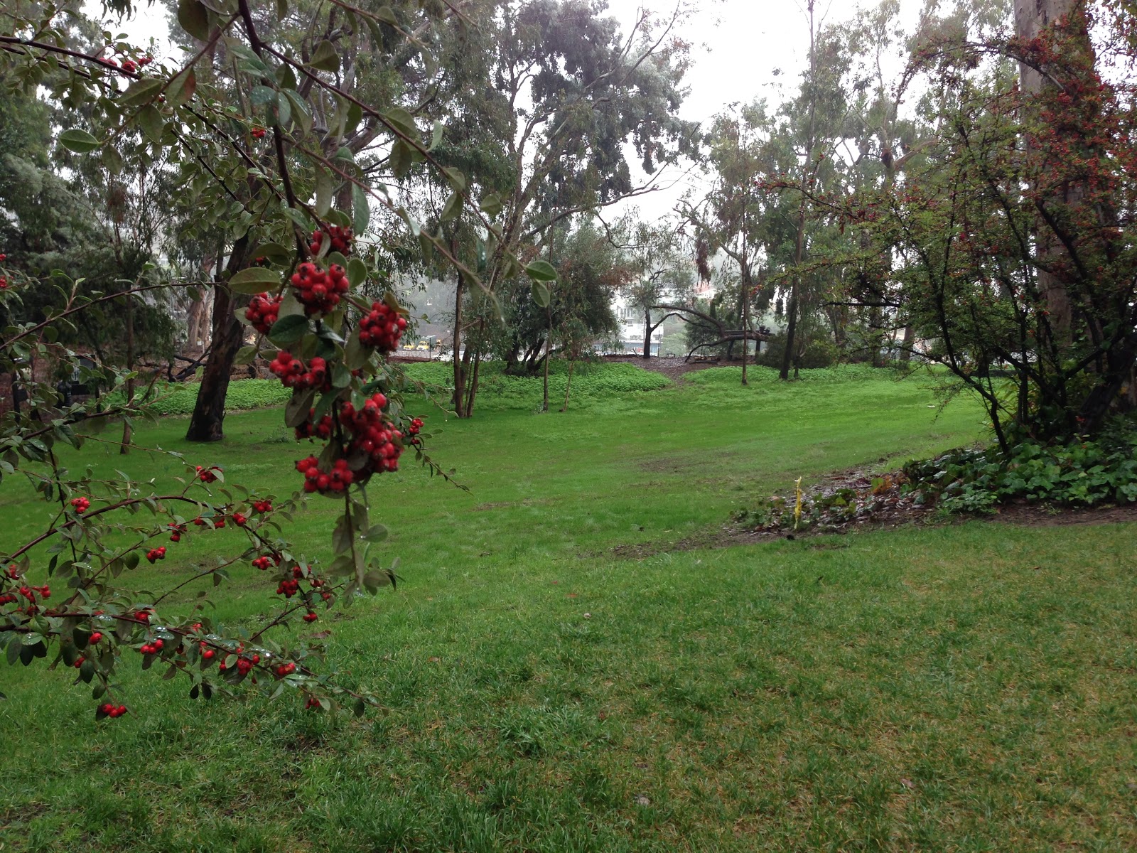
The house... rectilinear, modular, and modern. Divided into two 1) the study space and 2) the living space. Charles and Ray wanted a place where they could live, work, and entertain, PLUS a home that harmonized with nature. Thus, it was built next to a grassy meadow that overlooked the ocean. 


The Meadow!


The Eames were innovative and insightful in their approach to designing this house. Despite Charles's misogynistic affair with a younger woman, the Eames and the Eames house are forces to be reckoned with. I highly recommend the documentary, (found on netflix with 88% on rotton tomatoes AND narrated by James Franco). So on that note, I leave you with some boring iPhone pics...   


The Courtyard. Dividing the Living and Studio Space 


HOPE YOU ENJOYED! 

-- Feibi 

Tuesday, December 4, 2012

Map Art

This is an article that I found very interesting. It is about an artist who creates works using pieces from geography maps.

http://www.youthedesigner.com/2012/11/28/you-be-inspired-amazing-map-art-collages-of-matthew-cusick/

-Rajiv Ramakabir

Monday, December 3, 2012

Drawing Surrealism

Recently I went to LACMA, and one of the exhibits I visited was "Drawing Surrealism." A piece that really attracted my attention was E.L.T. Mesens's The Disconcerting Light (La Lumiere deconcertante) (1926). 
Its medium was a photo collage and photogram. The focal point of this piece is an eye pupil with a light beam extending across the black sky. The eye is embedded into a cityscape with skyscrapers and other city buildings. I can definitely see the juxtaposition of non-related items signature of Dadaism. What defines this piece from the earlier Surrealist works is the assembly of photos creating a non-seamless product. I liked this component of the piece—the photographs layered together added a sense of eclecticism. I also really enjoyed the contrast between the tones of the pitch-black sky and the white light beam. The composition was put very well together and there is harmony despite the contrasting images.

This piece reminded me of the whole gestalt project; I could image it in black and white gouache.

Tuesday, November 27, 2012

Street Art

This is a link to an article about a famous artist named Blu. He chooses to keep his identity concealed, but his street art remains amazing.

http://www.youthedesigner.com/2012/11/23/you-be-inspired-the-street-art-of-blu/

--Rajiv Ramakabir

Tuesday, November 20, 2012

Billboard

This is the poster that Sherin was talking about in class, that she wanted to see. It is our promotional poster of the walrus except its on the billboard scene.

--Rajiv Ramakabir

Sunday, November 18, 2012

Ken Price


Of all the exhibits I saw at LACMA, Ken Price was definitely my favorite. His style is so unique, I was drawn to his sculptures right away. The abstract shapes are very engaging, but I found his color schemes to be most impressive. His sculptures are coated in many layers of acrylic paint, each of which are revealed when the sculpture is sanded down to a smooth finish. Most of the colors he uses are very bright, though the sculptures overall do not look as bright because, in most cases, the two most prominent colors are complements. As seen in the image below, orange and blue are the two most prominent colors and this complementary color scheme gives complexity to the sculpture even before you start to look closer and notice all the other layers.
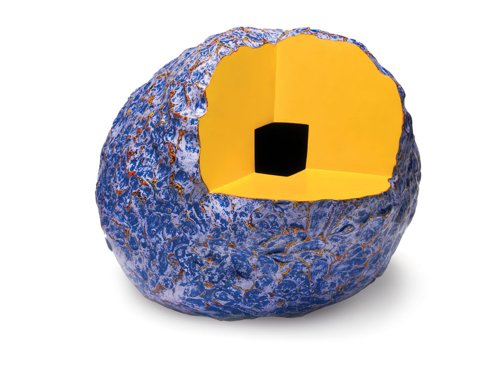
The first series of sculptures in the exhibit (two of which are shown) were by far my favorite because of the bright complementary color schemes and the overall metallic finish.  Price had another line of displayed sculptures where part of the shape was cut out (as in the piece shown below). I noticed that these pieces tended to embody a more monochromatic color scheme with a few pop colors. For example, the figure below contains a bright blue and a more muted blue with pop colors of bright orange and yellow.
This exhibit has definitely inspired me to experiment more with different color schemes. I especially would like to try forming different complementary color schemes using bright colors (which I love) is different harmonious proportions.