Wednesday, October 12, 2011

Possibilities with Paper

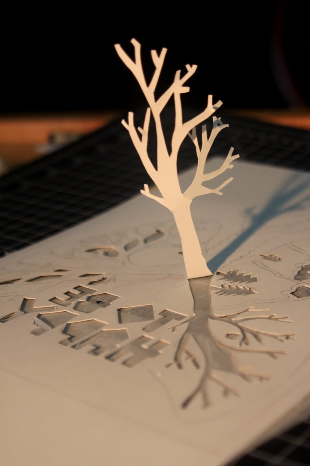
Sherin showed some us in her 2 pm class what one student did with his/her left over Bristol paper for the last project. He/she created this lovely, delicate, 3D piece that reminded me of Regina Spektor's "Samson" music video. Please enjoy!


I encourage you to watch the entire video. The paper stop motion gets more complicated as it continues.

Tuesday, October 11, 2011

Helvetica- A Documentary

I recently watched a documentary on the font, Helvetica, originally named Neue Haas Grotesk, by Gary Hustwit.
It was eye opening to learn about the importance of a neutral font and the world of typography in general.

The film talks about the importance of negative spaces around the letters that holds together the positive space together to form a coherent and clear type face. Made me think about our last project how we utilized negative space to frame our eyes to make strong compositions!

There is much more to the film, but you should definitely check it out for yourself. It's an eye opening 80 minutes into the world of typography!


Check out more information on the film by clicking the picture! 


- Lisa G. Yoo

Thursday, October 6, 2011

Project #2 - The Process

Hello friends!

I just wanted to stop by to share a few process pictures from Project #2. Below are some shots of my "Balance" painting, plus a few avian amigos from my "Proportion" piece.


I actually ended up with a lot of really neat cutouts from this project - hopefully I can use them for something else later on! That's all from me, congrats to everyone for wrapping this project up, I was beyond impressed with everyone's final results.

-Nikki D.

Tuesday, September 20, 2011

The Sky (Getty Exhibit)


I am always amazed on how the sky can make me feel so little, how it constantly changes, and can shift the ambience of a day. There's an exhibit at the Getty Center focusing on the sky from July 26 to December4.

Although this is a photography exhibit, I think we can learn a thing or two about composition through these photos. The sky is such a large expanse of space and we can see how the photographers compose their shots to create mood and illuminate the beauty of the sky.


Friday, September 16, 2011

Charles and Ray Eames...and Geology 125.

I was sitting in my Geology class the other day when my professor asked, "Have any of you ever heard of Charles and Ray Eames?" This of course caught my ear, and I couldn't help but think, he can't possibly be talking about the designers, can he?

Well, it turns out he was! (I mean, what're the odds of there being two pairs of Charles and Ray Eamses in the world?) We're currently learning about the structure and composition of the universe, and it turns out the Eames Office created a famous film in 1977 entitled "Powers of Ten," which takes viewers through the relative scale of our universe by you guessed it - powers of ten.


It reminded me of the Michael Bierut reading, which talked about how "not everything is design. But design is about everything." In this case, design was about everything from the nucleus of a carbon atom to the furthest reaches of the universe, billions of light-years away from our own galaxy.

Wrap your mind around that, space cadets.

All my love x 1010,
Nikki D.

WATERFALL!

Octfalls from RYOICHI KUROKAWA on Vimeo.


This one is the sickest installation/visual art, ever!

had to post them up here.


Cheers,

jb.