Tuesday, February 5, 2013
Accidental Art
This piece of accidental art does seem cliche in a way, since the medium is paint. But it was intended to destroy and disfigure the symmetrical sidewalk. Personally, it creates for me, it creates an obscure rhythm. Fading in and out of color and providing me with entertainment while I travel to and from campus
Sunday, February 3, 2013
Favorite Line Drawing
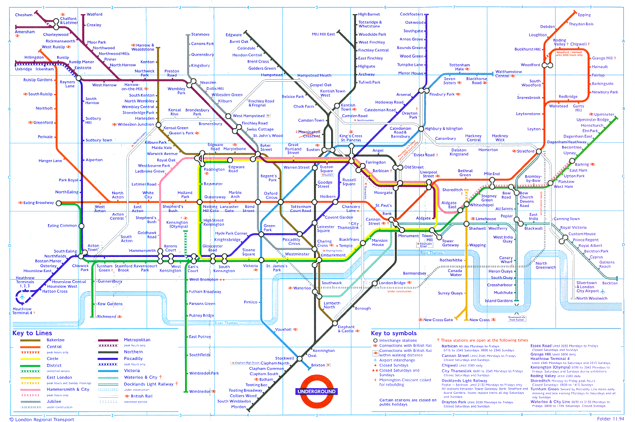
This was my favorite line drawing of the day because I really liked the thickness of the lines and the angles. The line thickness and the angles really reminded me of the type of lines from train maps.
To me, train maps are a wonderful balance between form and function. The color and spacing of the lines make it extremely easy to locate where you are, you destination, and how you want to end up there.
![]() |
| A train map of the London Underground |
Best Line Drawing 1/29/13
I like the use of negative space in this drawing. The lines frame this space, and have interesting characteristics that unite the piece. Each line is consistent in that it follows a rhythmic pattern of lines having a small angle, long smooth curve, and a rugged squiggle. This drawing stood out as unique to me because most of the other
drawings had the same consistency within the lines (i.e. all straight,
all curvy, etc.) but this one shows the variety within different parts
of the line. This balance of regularity and irregularity stimulates prolonged interest, and allows the viewer to continue to appreciate this drawing, each time observing a new nuanced detail.
Thursday, January 31, 2013
favorite art
City planning is my major, and I really enjoy looking at street plans of cities. This is the city plan of Washington DC, done by Pierre L'Enfant. Though its mostly a good design in terms of efficiently mapping a city, I also think it has an artistic aspect to it.
Best Square Design
I chose this square as the "best" design of the day because of its simplicity that also establishes a feeling of depth through the use of the rule of thirds and the lines that diagonally reach towards the horizon line. The image exhibits an aesthetically pleasing composition that guides the viewer along the diagonals lines that extend towards the focal point of the drawing (located in the center, two thirds from the bottom of the image) to give the sense of endlessness. The image's simple symmetric composure stood out to me as both unique and efficient, which earned its place as the most "successful" design for all that it accomplishes with only ten lines.
Best Square Design
This is the best square design because the designer took the material he was going to be tracing and turned it into the design. Very innovational, and creates an interesting balance between the positive spaces of the clovers and the negative white spaces in the background.
Best Square Design
The strengths of this design are the use of size, rotation, repetition, and point progression to create a feeling of central focus, movement, and depth to an otherwise flat image. Your eyes are guided from the edges of the square along various lines of length converging into multiple points forming a central point of focus. In my opinion a key component of a successful design is the ability of an artist to capture a viewer's attention while sustaining their interest.
Subscribe to:
Posts (Atom)