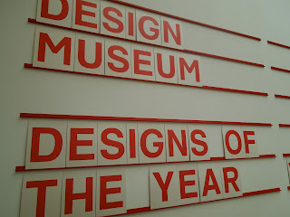
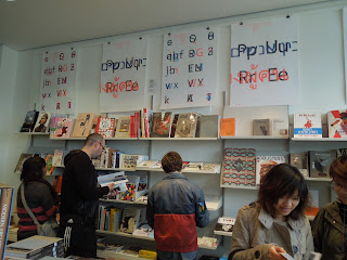
I also had the great privilege of checking out the Design Museum during my stay in London. This was by far the best museum I got to visit because of its simplicity and effectiveness.
First was the Terence Conran exhibition.
Terence Conran was a designer, engineer, restauranteer, entrepreneur, you name it. He had works in a variety of industries. There were items of crafted handiwork, magazines, and furniture.
This quote is dedicated to the business majors out there:
Design and business are completely interlinked -- one cannot succeed without the other. I've always thought design was 98% common sense and 2% aesthetics.
Reading some of these quotes and articles by Conran was very inspirational and thoughtful. Here was a figure who wasn't purely an artist or designer, but also a businessman. He also had his own design consulting firm, which is a testament to his success and influence.
Below are pictures from the MUJI exhibition. MUJI is a Japanese company that is very intentional in its product design. It dedicated a whole exhibition on how MUJI is trying to be more resourceful in the world with its design. Influenced by the loss the resources after the Japan tsunami, MUJI definitely sends a message on how wasteful the world can be.
This was a very obvious statement of being more resourceful. This is "Cotton bud fitness 80," and it basically says:
Cotton buds don't have to be that long. Think about when you use cotton buds, do they really need to be as long as they are? MUJI asks questions about even the most trivial matters.
These questions were asked of other items like clothing, toilet paper, and even houses and buildings.
The "Designs of the Year" museum was the best, most inspirational exhibition I've ever visited. It basically gathered all the nominated designs from various categories (press, fashion, automobile, etc) before the official winners in each category and overall was decided on. The winner was announced in April and it turned out to be the London 2012 Olympic Torch from the "Product Design" category.
You can see some pictures here:
Some notes I took throughout my stay include the following:
- Start with black and white to fundamentally communicate form and function
- Europe seems to be constantly innovating and redesigning products that are used the most, not ones that just seem "cool" and "artsy" (ie. ambulance)


No comments:
Post a Comment