Monday, October 18, 2010

Design and Branding: Miike Snow


So I went to a Miike Snow concert this past Thursday. Now, while I highly enjoyed the music and the concert atmosphere (but for the people standing in front of me who somehow brought sacks of confetti that they frequently tossed into the air and into my face), I was actually most struck by the visual composition of the show. The producers had combined a series of light effects with a fog machine to create an amazing, ghostly backdrop for the band.

(I did not take my own pictures, so I will have to giddyup on google to rustle up images that sort of illustrate what I mean)
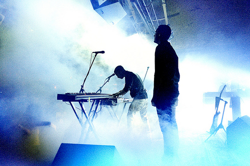


I was fascinated by the interplay between the fog's organic forms, and the straight, dynamic beams of line that coursed through them. Often the musicians were silhouetted against the halo of light, lending the performance an eerie, ethereal flavor.


I am always impressed by performers (or their publicity teams) who succeed in creating a unified brand. Miike Snow's music is itself a little haunting, and their live shows preserve that same ambience. The stage was flooded shades of blue, white, and gold, echoing the hues in their promotional images.
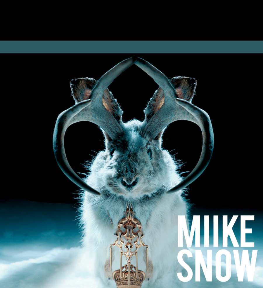


Check out their myspace also: how slick is that?

I believe Design is inherently commercial. Artists and designers are separate entities because of the different career paths they choose, though naturally the two may overlap. But given my definition of Design, clever integrated marketing and unity of brand strikes me much more than a design without a patron. Design is at its best when it is working to accurately and flatteringly represent a client. An entity gains dimension when all its components resonate to the same theme. For a musician, coordinating sound and sight gives performance a new fullness of experience.

Sunday, October 17, 2010

Field Trip!

The theme is "Action/Reaction" and portrays how certain artists use art to respond to/communicate current events. I thought that this theme was very relevant because it dealt with the theme of sustainability, the capacity to endure, and had pieces that dealt with current issues, like the environment and global warming. These artists responded to this theme by proposing efficiency through symbolism or materials used in his/her work.

For example, The Groop designed, "Live Earth Concerts Identity System," which was created for a concert that raises awareness for global warming.


In my opinion, the hybrid car ad campaign captured the theme most closely. I also think that this was the most interesting piece. This piece dealt with the current environmental issues and encourages individuals to "go green." Basically, the campaign project is designed to plant flowers on the side of highways in the shape of a hybrid car. These advertisements are aesthetically pleasing, they convey an important message, are extremely innovative, and connect to the theme of the show. I think that it also "takes action" and is a functional piece that is good for our environment.


The piece that I found least compelling was the TOMS Rag Rug. Although it provided multiple uses for the product, which is efficient and environmentally friendly, the presentation and overall look was not visually pleasing. I do not think that it was a practical product and that many people would actually use it in their homes.


Overall, I was really impressed with the exhibition. I thought that the majority of the pieces in the gallery were visually pleasing, relevant to the theme, and I thought that they were all strong. Even the weakest piece in the gallery still had strong elements.

Fieldtrip

I apologize for not having pictures since I do not have a camera yet!

1. The theme is "Action/Reaction" responding to current events. Even though the theme might be broad in words, I thought that it was interesting how different designers approached their arts with the underlying message of sustainability. Wether it be fashion, graphics, architecture, transportation, industrial, or product design; the designers were able to transformed simple recycled materials into new found arts that not only benefit the world, but is joyful to look at as well. The theme is very relevant to the present world because consumer wastes are increasing, and people are not utilizing the resources the right way.

2. The theme are expressed through the objects on display. Especially in the laundry detergent piece, IconA5, and the Virgin Galactic Spaceship 2. The laundry detergent project stood out to me because it was unique, and interesting how they used a lot less plastic to make the bottles while also making it more efficient per pump. Secondly, the IconA5 is a fuel efficient jet plane that I thought was very creative. Lastly, the Virgin Galactic Spaceship 2 is making space travel within reach for the less wealthy which was clever, and it does not require the normal amount of energy to launch.

3. I thought the 747 Wing House in Malibu was the most effective in capturing the theme because using the wings of an old airplane as a roof is not only creative but very resourceful as well. I was inspired by how the artist utilized this in his architecture that seems really complicated and expensive to execute.

4. The Farmosa Building (The Red Apartment Buildings) in West Hollywood was actually my favorite piece because the design is unique while also using the simplest of materials. The outside design was very engaging, and the interior design was very welcoming and homely. I really want to visit there someday.

5. The Heath Ceramics project where new tiles are being developed were the least compelling to me because I did not see any interesting aspects of it. I thought that the idea has been done by someone else before. I also found it to be boring to look at since they should at least add designs on the tiles before manufacturing them to give them identity or uniqueness.

6. I thought the exhibition did a great job at displaying, and selecting artworks that they represented. This collection was particularly interesting since all the artists and designers took a different perspective at Action/Reaction and tied them all in with sustainability.

Saturday, October 16, 2010

Field Trip


1.     The theme was Action/Reaction.  The exhibition had a variety of categories: industrial design, fashion, graphic, transportation, and architecture, but each piece was united by the concept of sustainability.  I found the theme to be highly relevant because sustainability has a huge impact on all of our lives. 
2.     Yes, the designs expressed current economic, political, and environmental challenges in various creative, inspiring ways.  The materials used, the messages emitted, and the purposes of the pieces showed viewers a new way of recognizing and reacting to the sustainability issues we all have to deal with. For example, one curator used recycled vinyl from billboards to create fashionable hobo bags.  There has been a trend taking off toward the use of more eco-friendly fashion pieces.  By recycling materials to create something new, attractive, and useful, we can help make the world a better place.
3.     I think that the eco-friendly car ad made from plants best captured the exhibition’s theme.  Gas-guzzling automobiles have a huge impact on the world’s environmental, political, and economic challenges.  This piece presents the transportation trend for more eco-friendly cars in a more eco-friendly channel for advertising.  The more economical, eco-friendly car is pictured using plants to create a design.

4.     I found the most interesting piece to be Tanya Aguiniga’s furniture piece, the felt chairs.  She challenged the coldness of recent industrial design trends by covering the usually harsh, stone cold, foldable metal chairs with her handmade felt in different colors.

5.     The least compelling piece was the new water bottle design.  I had broken my water bottle (remember, my favorite design object!), so I was so excited to come across a new water bottle design to potentially buy.  The description did a great job selling the bottle, but when it came to the actual product, I was not impressed.  The side-notes said that the design would make you want to drink more water, was easy to carry, great to sip from, and more.  I then found the bottle in the gift shop.  Not only were the $30, but they were heavy, hard to hold, it was difficult to open the caps, and they were hard to sip from.  I think the goal of the design was definitely not achieved.

6.     I love it! I think the different design categories came together into a dynamic message.  So many concepts can be associated with sustainability and the different design categories gave the museum an opportunity to present these themes in many different ways!

Fieldtrip


1. The theme of the Biennial is "action and reaction." There was an underlining theme of sustainability and recycling throughout many of the pieces as well. These works commented and responded to current events such as recycling, waste, high costs, and quality over quantity. I think this theme is very relevant to today's society. Many things are wasted even though they can be reused by another person.

2. Yes, the theme is expressed through the objects. For example one designer's work used beetle wings and feathers to make purses. They are high quality and are built to last. They use natural products and are completely hand made. Thus the artist is using natural/recyclable goods to create her work and is aiding in saving the planet.

3. I thought the clothes made out of fabric found at a thrift store captured the theme very well. These clothes are extremely well made as well as environmental friendly since they are made from tossed clothing. I especially loved the sweater made from an old sweater. I liked how the designer kept the collar on, but had it on the torso instead of the neck. These clothes are top quality and very fashionable even if they had previous use.

I also thought the freeway advertisements made out of plants was interesting. These ads captured the essence of "action and reaction" and sustainability. They are eco-friendly and they beautify the freeways. They don't use the vinyl that the usual freeway billboard use and thus save the vinyl from being tossed later. I think the simple designs are just as efficient at capturing the viewer's attention and maybe even more since they are so unusual. : )

4.I found the design that used the airplane wing and tail as a roof for a building was very interesting. It gives the building a space-age futurist-look. I like the idea that the artist was trying to save old plane parts that could no longer be used. I do find it regrettable that the artist could not continue to reuse these parts because of expense.

I also found the felt-covered chairs by Tanya Aquiniga very interesting. No one likes to sit in metal folding chairs, but the artist made these chairs appear warm, comfortable, and inviting. People would probably want to sit on a folding chair it is was covered in cloth and was colorful!


5. I didn't like the presentation of the gothic clothing made out of crystal (was it crystal?). I found the posters very boring. One couldn't see all views of the outfit as well. The spike-like pieces blocked out everything and one couldn't tell how it was layered without really studying each drawing. I think the design would had been more efficient if the designer would had made the posters more like a character design spread sheet so the viewer could see all views and angles of the costume as well as some zoomed in details of smaller pieces of the outfit.

6. I liked the exhibition. It was interesting for me to see since I don't usually look at design artpieces. I usually go to museums to look at sculptures and paintings. But I really liked how each piece made you reflect on your own life and what you are doing to respond to the same current events.

Wednesday, October 13, 2010

underwater sculptures videoooo

some of you might have seen this but it was on my internet homepage and i thought it was a really interesting idea, hope you like it!

Sunday, October 3, 2010

Artist-Brittney Lee


I don't know if anyone knows of this artist, but I really love her work. All her work displays good compositions and control of balance, proportion, economy and emphasize, and movement. Here is a link to her blog if anyone is curious! http://britsketch.blogspot.com/ I bought some prints from her at a convention once and they are very nice!

She does a lot of paper cutout work that are beautifully detailed!


She also does digital art.