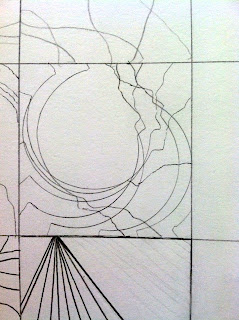
I consider this to be a successful design and arguably the best design from Tuesday's class because the designer was innovative with his/her line movement and subtly enforced direction. The negative space balances well with the several other larger shapes too. There are also different levels of distance and groupings of lines. What struck me most was the manner in which this was probably made--it seems like a tracing of an object, with each time being shifted slightly about the square. This mechanical movement, however, led to something extremely organic and satisfying.

No comments:
Post a Comment